


Packaging graphic design may have several hidden dangers that, perhaps, only a packaging designer and a pre-press specialist could help you find out.
There are some features concerning packaging visual design that even graphic experts, if not specialised in this kind of work, often ignore.
In the previous article, “Packaging graphic design: how to”, you can find some useful suggestions in order to take up the cudgels for the 2D-3D challenge. It usually happens, in fact, that some graphic elements, correctly placed on the bidimensional die-cut, are upside down or in more “uncomfortable”positions when the box is assembled.
But, trust me, this is not the only risk.
Full bleed or internal graphics
These two concepts should be clear to almost all graphic designers but, to be sure, we will restate them.
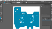
The print format is made up of different areas where you can enter your own graphics. While creating your own layout you need to take into account three of them: trimbox, artbox and bleedbox.
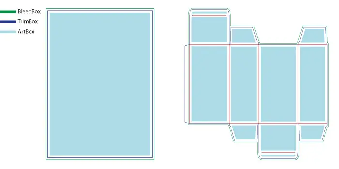
Trimbox: it defines the remaining print area after the print support final cut. It is about, then, the actual format of the artwork that, in Packly’s dieline, is marked by blue lines. Inside the trimbox, and until its external borders, may be included all the graphic elements to print until the edge of the support, without leaving any border. This kind of graphics is called “full bleed”.
Bleedbox: it is the safety margin, generally of 3 mm, over the trimbox. Full bleed graphics must reach this area in order to avoid visible white borders on the print sheet in case of misalignment of it during the manufacturing phase. Packly’s bleedbox area is marked by green lines.
Artbox: it contains all the graphic elements that must be entirely visible and readable. This section should be at least of 3 mm (or even better 5) smaller than the trimbox. That way, you will avoid the risk that internal graphic artwork is too close to the cutting and folding edges and is altered or compromised in case of issues during the manufacturing phase.
Graphic design: about the distance
If you desire that your custom packaging should get printed with different colours each side, in whole or in part, you need to pay deep attention while placing the various coloured background shapes.
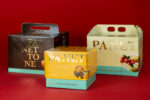
Let’s give an example. You are creating a classic standard tuck end box, a simple parallelepiped, and you want that the lateral sides have a colour different from the one on the box front and back.
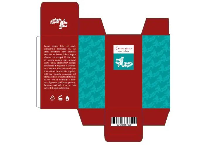
If you are a neophyte in packaging world you will surely enter two great rectangles, with your desired colours, inside the two lateral sides, paying high attention to perfectly reach the cutting and folding lines of your box (and, where needed, the bleed area, I wish!). Maybe I would do it too for you.
And if I tell you that, doing that way, the rectangle could be extended beyond the edge on the adjacent sides? Well, however, it could depend on the above-mentioned misalignment of sheets inside the die-cutting machine, but also on the degree of curvature of the various box sides.
How to avoid that?
To obtain the desired effect you should reduce the width of rectangle, or of any other shape, at least of 0,5 mm each side. Otherwise, you may intentionally emphasize the extended border area by increasing the same dimension with the same value. That way, in case of misalignment, you will have an higher safety margin whereby the possible flaws will not be perceived to the untrained eyes.
The various boxes may have some hidden parts, that are different due to the packaging type ( internal flaps, hooks, etc.). In these areas you could add the same safety margin in order to give a great print result to the visible box sides.
My graphic design is missing!
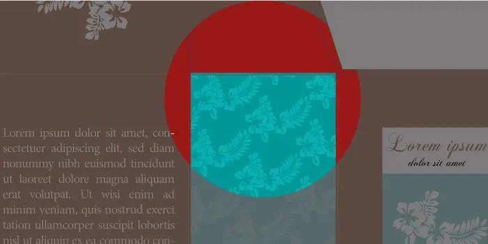
This situation may get you into a flap. It usually happens when print artworks have white graphic elements overlapping other colours.
White, both in offset and digital print process, is not a print colour. It simply happens that areas with this colour are not being printed and will have the colour of the support (generally white).
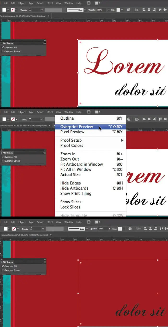
What happens when just that white symbol you accurately placed is no longer visible on the final product? Perhaps, while designing it, you set, in a more or less conscious way, the “overprint” attribute.
Overprint objects, generally overlaid on the same print sheet section, are being printed on each other according to the arrangement inside the sheet. That way the various inks are being mixed, giving life to chromatic effects different from that ones visible on computer screen (unless the overprint preview has been set before).
If the same overlapped elements don’t have this attribute only the last entered object will be printed, that one above, which will “puncture” the remaining area ( better known as “knockout”).
Concerning the above-mentioned white object, the overprint attribute involves the interaction between the background colour and that white colour which, however, not being a printing colour, will no longer be visible. The only ink printed will be the one of the background colour.
Remember, then, that white objects should not have overprint attribute, otherwise they will disappear.
As for elements like texts or graphic elements with black colour (K=100%) and small dimensions, instead, is supposed to always set the overprint attribute. In this case, in fact, knockout may cause, if there is a off-register, a white border around the various elements.
A matter of numbers
Another most common issue refers to the chromatic objection of the print result. A very thorny problem that may depend on several factors, some of them already met before ( print file colour method, computer screen view, chromatic metamerism, etc.)
In this article we will talk, instead, about colour percentages and their effect on the print final result.
The four-colour process, as the name suggests, uses 4 inks (cyan, magenta, yellow and black) that, mixed each other, give life to the rest of hues of the CMYK colour space. Each colour is composed of a specific percentage of the above-mentioned pigments.
The different inks are placed on the print sheet, overlapped, according to a specific arrangement of colour dots (regulated by specific patterns). The percentages for any colour will define the dimension of various points.
The ink placed should then dry off. In this step we will run across into the first issue: creating colours (especially the dark ones) whose CMYK amount exceeds 300% may result in different print problems, both while spreading the colour and drying it off. The print support, in fact, soaked in pigments may tear off, get dirty, etc.
Another issue refers to that colours we will define as “critical”. I can only give you some little tips about their composition.
This type of colours is characterised by a strong instability during the print process because it is composed with all four CMYK channels with very similar percentages. In these cases, you should realise the colours by mixing only 2 or at most 3 colour channels or, if using all four pigments, don’t set up percentage values which are very close to each other. That way, you can achieve a stable chromatic result that will reduce risks of nonconformity.
An example refers to grey, brown and various black hues.
A grey composed of the following percentages C=25 M=20 Y=23 N=12 is more unstable than the same colour composed of C=6 M=5 Y=8 N=33, where the prevalence of black guarantees a better balance.
Conclusions
Suggestions here shown come from several technical and manufacturing experiences we have been running across for years that may be useful in order to realise your packaging design project at best and achieve the best result as quickly as possible.