


In the previous post about the theory of colour we learned that a good colour combination is essential to obtain the most suitable emotional reactions by observers.
As we already said, colour comes from visual perception of light which is generated by the brain and affects both the vision and the emotional and psychological people’s responses as well. The influence that colour perception has on our brain is studied by the psychology of colour.
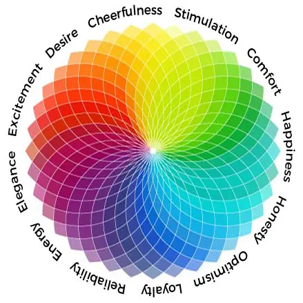
We should start stating that the human brain perceives external colours based on unconscious emotional associations, personal experiences and cultural background. In fact, there are colours that generate specific feelings and have totally different meanings depending on one’s own culture and traditions.
Generally warm colours are positive, exciting and have a huge emotional impact. Red, for example, is the boldest and most appealing colour, able to create quick emotional reactions thanks to its wide wavelength range, the widest, that let red colour appear vibrant and inspiring. In this case people’s response is physiological.
Cold colours are more comforting, quiet and trustworthy. In fact, blue can be seen as opposite to red: relax and reflection are the instincts recalled by this colour.
In addition, according to science, green and blue hues slow down blood flow, producing a cool sensation, whilst red and yellow improve it, giving a warm feeling.
These examples show how the choice of colours is essential when selling a product or trying to catch the attention of observers. That is the reason why the colours should be chosen after an in-depth study that will first establish project goals and emotions to arise in order to reach them.
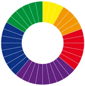
The effects of chromatic contrasts
Colour studies identified some functional and effective contrasts that could be a real source of inspiration for every insiders. We must always be aware that perception is relative and is influenced by the chromatic background. The variables involved are: brightness and saturation. There is another important point: some colours tend to influence whilst others tend to be influenced.
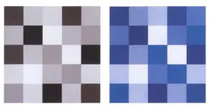
 Color relativity – Interaction of Color, Josef Albers.
These studies defined 7 different types of contrasts:
- pure colour contrast, originated by the combination of at least three colours at maximum saturation and characterised by a brilliance and a power as strong as their chromatic purity. For example, a contrast between primary colours is proportionally more forceful than that one between secondary colours, tertiary ones, etc.;

- light/dark contrast, a juxtaposition of one or more hues with a great difference in brightness. It is mostly used to emphasize three-dimensionality and to outline volumes, often generating a dramatic sensation;
- warm/cold contrast, mostly used to create perspective illusions because cold hues suggest distance while warm ones suggest closeness;
- complementary contrast, that generates a vivid effect able to catch the attention;

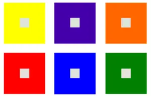
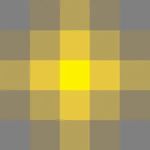
- simultaneous contrast, directly related to the ability of colours to influence each other: hues with the same brightness placed next to each other tend to get close to their own complementary ones, for example, a neutral grey square on a orange background will tend to blue, while on a yellow background to violet;
- quality contrast, achieved thanks to the juxtaposition of pure colours, bright and vivid, with less saturated and dull ones;
- quantity contrast, achieved when one colour is present in larger quantities than the others.
Concepts and theories described by the psychology of colour are just the starting point to take inspiration from in order to realise balanced, effective and compelling graphic and artistic works.
In the next appointment of “Graphic design in a nutshell” we will focus on the choice of colour from a graphic perspective.