


“Less is more”
Less is more: we need just this worldwide known phrase to explain the whole philosophy beyond minimalism. Adopted in the 70’s by the famous architect and designer Mies van der Rohe to describe his artworks, this concept gradually spread to many artistic fields and was widely used in packaging design as well.
With minimalism we refer to an artistic movement «characterised by extreme simplicity of form and a literal, objective approach» (Encyclopædia Britannica). It is an essential style, without decorations and frills, able to enhance the most important features of an artwork or a product improving a simple and effective communication with viewers.
How to realise a minimal packaging?
The graphic and structural minimal design of products and packagings is based on progressive and studied simplification processes aiming to strip down everything to essentiality and to create clear but appealing projects. This kind of operation requires very accurate analyses: it seems to be very easy to reduce graphic elements but it is more difficult to remove objects then adding them instead. At the end of a work, actually the risk to remove necessary informations is very high.
Here you can find some little suggestions for creating a minimal packaging.
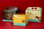
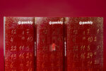
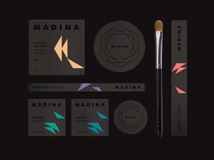
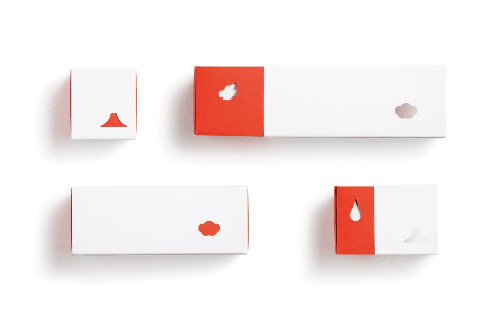
What you have to know is that such a product is characterised by big empty spaces. Therefore, I suggest using few elements: simple and linear writings and symbols, or basic geometric forms, ready to be artfully included in the negative space (the empty one) you have, in order to set apart graphic elements from the background and so highlight them. In this way, they will immediately catch the eye of the viewer.
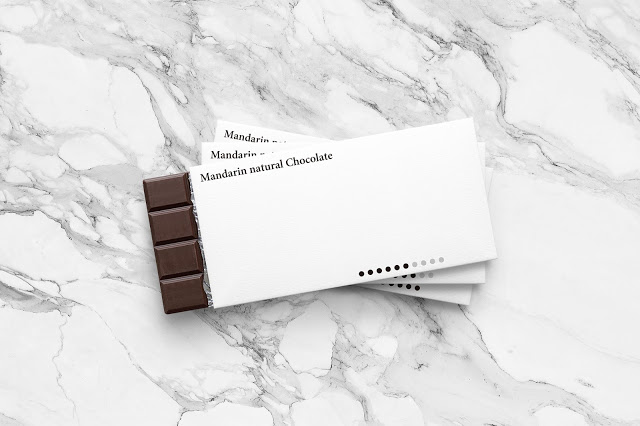
How to organise space is really important: give life to hierarchical compositions, where every element is placed depending on its communicative role. Then, choose fonts and images as simple as possible to interpret. As you can, use black and white…but not only them! Most of the minimal compositions prefer these two colours, but you are free to select bright and intense colours that will create together an eye-catching chromatic contrast: opposite hues will help you to distinguish the main images from the background and to underline them. If you want to overdo it, a glossy matte contrast, tone-on-tone, is exactly what you need!
Remember: every time you add or remove an element, you have to verify if your project still works and effectively communicates. Are there all the information? Are they clear enough? Have you removed the inessentials? Does the structural and graphic design work? Does it send the message you want to convey? If the answer is yes, you will have realised a perfect minimal packaging.
Why choosing a minimal design box may be your best option?
There are many reasons. Minimal packaging can suit a lot of needs, first a successful communication. In a fast-paced world, packagings able to transmit immediately their content, with no frills, are among the most useful and effective. Immediacy, together with extreme clarity, aims to limit any confusion or misunderstanding of customers. In addition, you have to think about aesthetic features: simplicity, sobriety and, so, minimalism give to packaging (and to its content) a sophisticated, pure and appealing look that can make the difference. In this kind of design, the product must be placed first: content overrides the container, which will be always an essential communication tool able to convey the consumers first choice.
And what about you? Could be minimalism the right solution for making your product successful? Try to create your custom boxes and remember, what really matters is: make it simple!