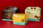


Color and packaging: green. Green in packaging traditionally symbolizes tranquility, health, growth, peace and calm. A precise, encouraging and reassuring choice for buyers. Let’s review how to best integrate it into our packaging design.
Color and packaging: green. Our journey through the most representative shades of packaging design and what they imply in the communicative message continues. Green traditionally symbolizes tranquility, health, growth, peace and calm. Given the obvious links with the concept of nature, this color is mainly used for natural and environmentally friendly products, but also by manufacturing or tech companies to indicate durability and stability.
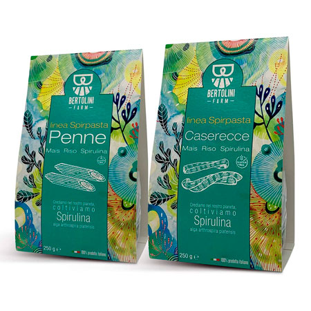
Within the design domain this color can have a harmonizing effect creating balance between the elements. Another important factor is saturation. Very saturated green colors, in fact, convey emotion and dynamism by capturing the observer’s attention. It is the case with this pack of organic spirulina algae-based pasta. It is a niche and strongly environmentalist product. The background is a mesh up between a Van Gogh painting and the bottom of an aquarium. The aqua green is predominant and the product inside, therefore the pasta formats, is only hinted at in a white illustration, but a window or a color code contextualizing it are completely missing. There is consistency however, because the emphasis is placed entirely on the theme of saving the planet and the sustainability of crops.
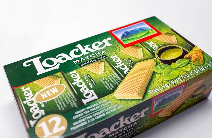
Let’s move on to the dessert. We see a special version of the famous Loacker wafers in the new variant of matcha tea. Loacker has always based his communication on the naturalness and wholesomeness of Tyrolean products. Never as in this case has the use of greenery, which resembles the mountains, been providential because it best introduces the main ingredient. From the point of view of graphics, a realistic photograph of a cup of Japanese green tea is enough in itself. The cream inside the wafers takes on the colors of the prairies and that’s it. We can assume that the target consumer is gluttonous, but attentive to the
genuineness of the products.
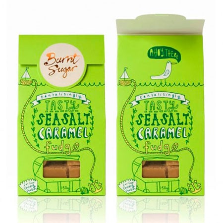
Let’s continue with delicious salted caramel toffee pralines. Green gives joy and captures the attention with very simple and intuitive graphics. This time we find a window that lets you glimpse the content. It is a very basic product, with no particular sophistication or artifice to drive sales. The game of tone-on-tone illustrations placing the product inside a casket at the bottom of the sea is very witty, with a boat that plows the waves and a seagull looking in the direction of the observer and greeting them, if they lift the edge of the package. The target is very young, perhaps even including children, but made up of humor-loving connoisseurs.
Let’s now turn to food supplements. Hemp oil has gained great popularity in recent years, with various nutritional and healing properties having been associated to it. The choice of packaging with two shades of green is interesting, since graphic elements are practically absent. We find a motif of leaves, which do not recall hemp at all, and an essential and solid typeface, typical of the pharmaceutical sector.

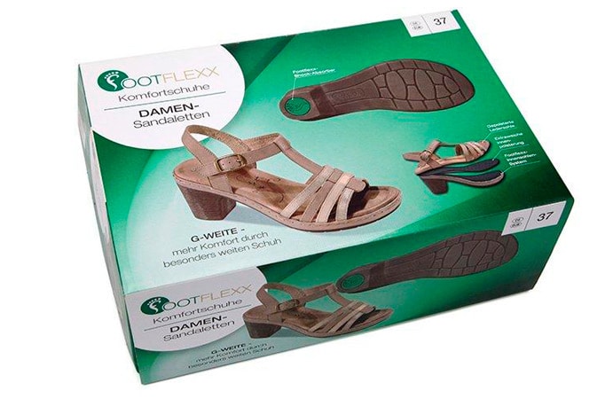
Now let’s move on to a different type of product, a German orthopedic shoe. It is a well-known fact that the stereotype of the average Teutonic is the tourist in Italy with white socks and sandals on. Here too the emphasis is placed absolutely on comfort and total convenience. The graphics focus entirely on the actual picture of the product, not particularly attractive we must say but functional. Green comes in handy to provide harmony to the whole, thanks to a slightly nuanced and soothing shade.
Let’s wrap this up with two items that are extremely trending.
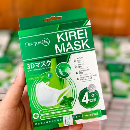
On the one hand, we find a surgical mask that has been on sale for some time on the Japanese market. Although the product is normally associated with the concept of disease, this packaging is particularly reassuring. The effect is obtained thanks to the very soft green tint, to the non-invasive graphics centered around the concept of multi-layer protection and the relaxing image of mint leaves. The bottom line is security and calm.
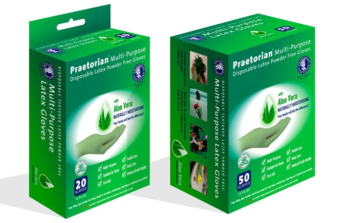
Latex gloves are very versatile. We previously used them perhaps to handle caustic products or to clean the house, but they are now a mandatory protective device to be worn by law on public transportation or in supermarkets. Why was the green background color chosen? The answer is soon unveiled. Unlike normal protective gloves, these contain a softening essence for the skin subjected, now more than ever, to the stress of numerous soaps and disinfectants. Here too we find the enveloping effect given by the transparency and shading of the main color, the graphics of the aloe leaves is predominant and complements the creative whole by enhancing it.
Conclusions
Do you have natural and / or sanitary products to pack and you would like to position them at best for the target audience? Easily done with Packly! Create a prototype with your reference graphics and you will get it to your door quickly and conveniently all over the world.