


Colors influence consumer choices more than you might think. It has been demonstrated that color accounts for 85% of the reasons that lead consumers to buy a product. Researchers at Delaware University explain in a study that people automatically associate each color with a specific emotion.
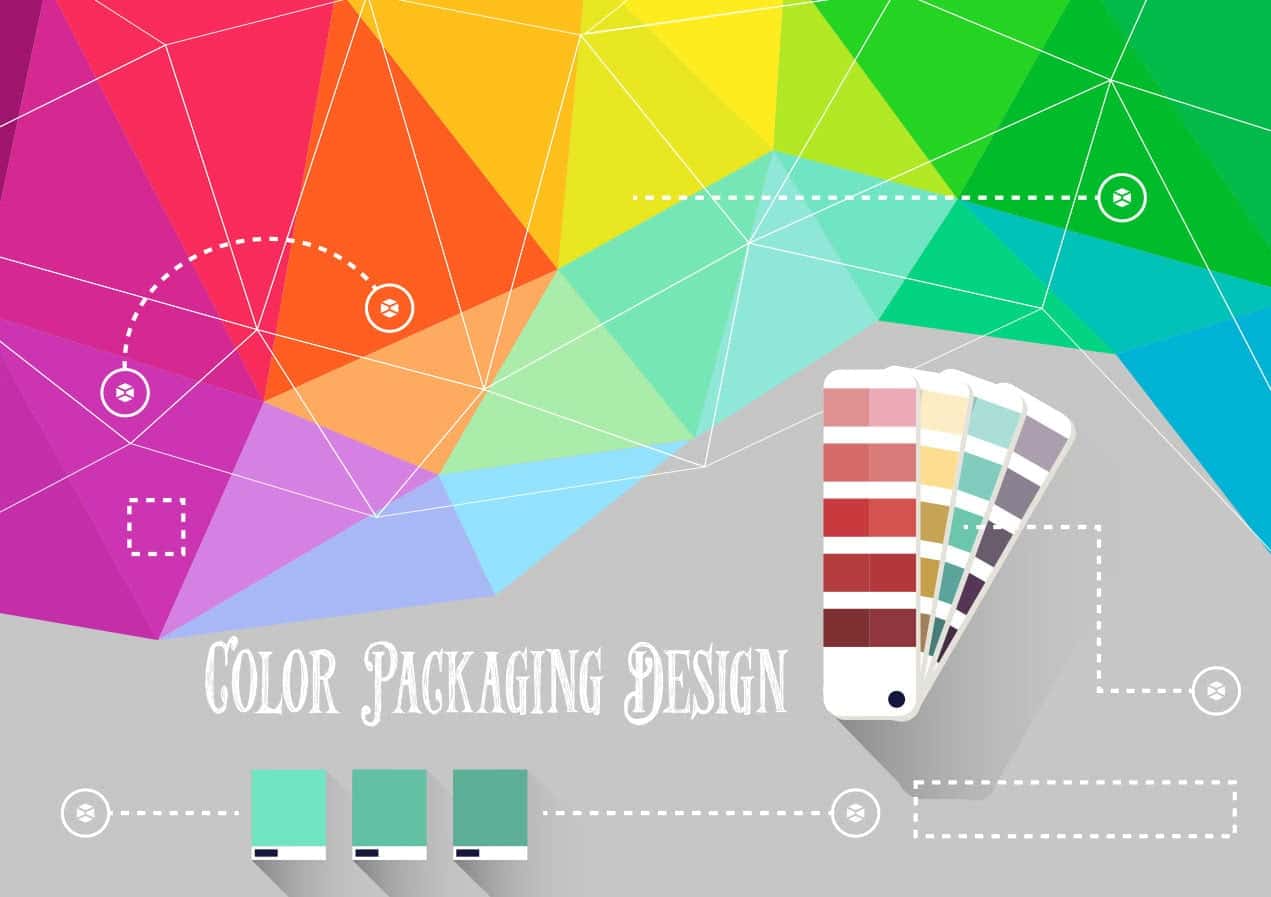
Communicating with color
You can leverage the association between colors and emotions to promote sales. The results of a test published on the College Student Journal highlighted the following correlations between colors and emotions: green is associated with calm and relaxation, blue with water and a feeling of comfort and peace, red with love and a feeling of dominance, black with power, and yellow and orange with happiness.
Another study on color (“The emotional connotations of color: A qualitative investigation”, published in Color research & application) confirmed this principle describing colors with specific keywords.
For example, the words most commonly used to describe red were anger, energy and passion (75% of participants). Orange and yellow were described as happy, while green and blue were indicated as clean, quiet, relaxing and calming colors. Black was associated with death, as opposed to white, that was associated with innocence, happiness and euphoria (88% of responses). Pink was linked to femininity by 70% of the participants. Brown, gray and purple, on the other hand, yielded a large variety of associations, that are not considered useful for this study.
Based on these results, it is clear that, when designing a packaging, it is essential to take into account the strong link between certain colors and the sensations they arouse, in order to increase sales and send a very specific message to consumers, which is what high-performing companies have been doing for a long time, to achieve a more effective and efficient communication.
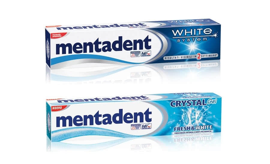
The packaging of some dental care products is predominantly blue. This color is, indeed, associated with cleanliness and emphasizes the toothpaste’s promise of clean and white teeth.
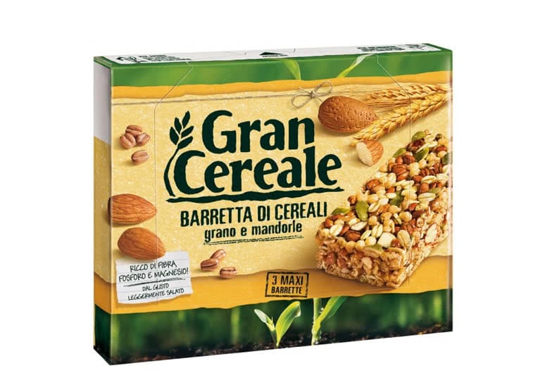
Food products that intend to highlight their use of natural ingredients mostly choose yellow and green as packaging colors. In fact, green is associated with nature and is very appropriate to emphasize the genuine, natural and healthy aspects of a product. Yellow is associated with sunshine and optimism, and promotes the product in a positive way.
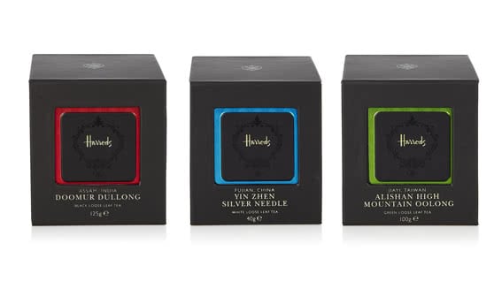
Harrods, the popular British brand, markets a line of teas that are packaged in black. This color can have a negative connotation, but in this context it is used to emphasizes the sense of luxury, exclusivity and high quality that the company wishes to communicate.
Brand recognition
Color, in addition to communicating feelings, facilitates brand recognition. A packaging that is clearly differentiated by its color and shape will be easily recognized by consumers.
Researchers at the Loyola University of Chicago found that color increases brand recognition by 80%. A group of people were shown a commercial ad for just 3 seconds, and over 62% of the participants recognized the brand solely based on the color seen.
Brand recognition has a strong impact on the buying behavior of consumers; many of them, in fact, try to identify the different products on the shelves based on color. Picking the right colors creates an advantage for the company, as it allows more effective identification of the packaging and recognition of the product, thus giving it an edge over competing products.
When a company is strongly identified by a specific color, it can be changed strategically for a short time to strengthen the consumers’ interest. A striking example is that of Heinz, the popular brand of ketchup, who altered the color of their packaging for a short period of time. The company, well known for its distinctive red packaging, changed the color to green, and this fact, also thanks to the associations that the new color offered in terms of perception, increased sales by $23 million.
Tips for a successful packaging
Colors can take on different meanings depending on the specific culture; for this reason, it is important to carefully evaluate the market in which the product will be sold. For example, the color white, that Western cultures associate with purity, in Japanese culture is associated with death.
You can follow the color association rules if you wish to strengthen your packaging’s communication, but sometimes it is also possible to go against the tide to promote brand recognition. As we said, there are colors that do not have a strong associative link to specific emotions, and that are probably little used by most companies. Thus, you can take advantage of a less used color to be easily recognized by your current and future customers.
Another trick is choosing the right colors when designing the brand logo, which could affect the success of a product in terms of communication, recognition and sales. The combination and interaction of the colors selected for the logo and packaging for different printed and/or digital media could be a winning card, or turn into a double edged weapon.
Conclusions
Colors are important to communicate brand values and to facilitate brand recognition, and should therefore be chosen carefully, analyzing the product’s characteristics and the target customer’s preferences in order to increase sales.