


Bulletproof studio led the rebranding of Toblerone. The result was a new colorful identity and a bespoke typeface.
Toblerone chocolate has undergone a decisive rebranding, leaving the public speechless. Although the Swiss brand is much loved, it was “in urgent need of modernization,” according to Nick Rees, Bulletproof’s creative director. The rebranding focused on Toblerone’s existing assets by adding “a new meaning and a multidimensional and powerful identity.”
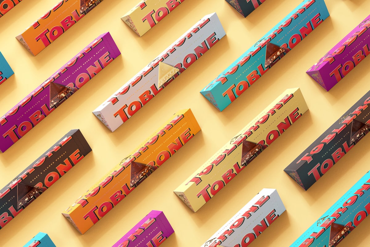
The color palette after the Toblerone rebranding
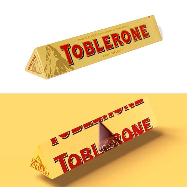
The most notable change between the old and the new brand concerns the color palette. The “timeless core shades of the brand” – suede (the cream color), red, black, and gold – still make up the new brand’s primary palette.
Rees states: “We introduced vibrant and punchy notes of teal, orange, and magenta.” This revolution gave us the modernity we needed while preserving the Toblerone tradition”. The new colors are predominantly present in digital touchpoints, such as the latest seasonal campaigns.
The “seasonal versions” are an extension of the primary visual identity. They include typical holiday elements, such as Christmas, Valentine’s Day, etc., and position Toblerone as “an intelligent spirit of the times.”
Elements of the Toblerone Tradition
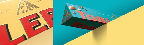
Although the rebranding reflects Toblerone’s desire for modernization, Bulletproof drew inspiration from its past. Rees states, “We dug into the archives that unearthed a wonderfully distinctive version of the 1908 Toblerone logo.”
This version is “full of quirks and typefaces,” some of which had gone missing over the years. There was also a change to the logo and the creation of a typeface called Tobler.
An example of Tobler in use is the signature appearing on multiple touchpoints. “The Tobler signature indicates the brand’s long tradition of quality,” says Rees.
The writing on the package now flows beyond the edge of the box to echo the brand’s message: we are all “defined by our borders.” This same principle reappears in many other touchpoints of the brand.
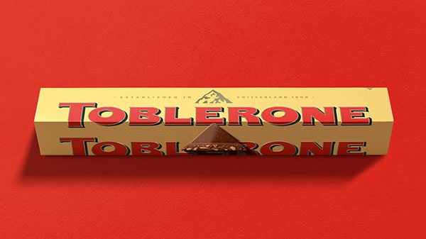
Bulletproof also introduced photographic elements of Toblerone into the box to act as a “beacon for the navigation of taste.”
Conclusions
Ultimately, the new identity embraces Toblerone’s “rich and bizarre” past, leaving behind some older elements. Do you also need to rejuvenate the packaging of your product? Packly is for you. Build a prototype with our wizard. The results will amaze you!