On our daily post we suggest 5 packaging for high-tech products that make the best of the communicative potential of the packs to send a strong and clear brand identity message to users.
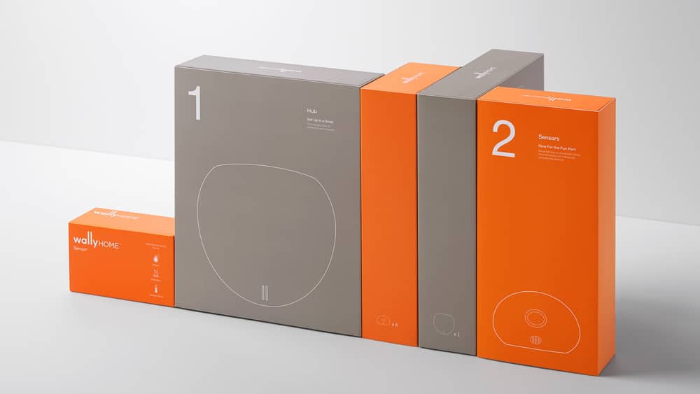
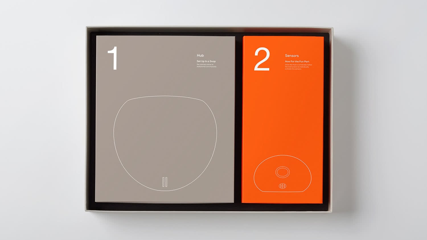
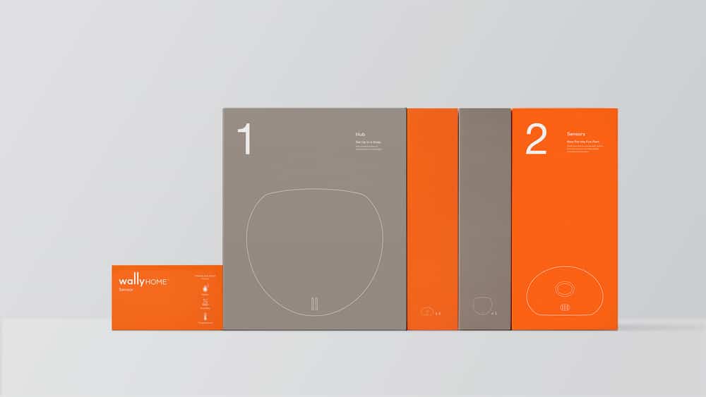
A minimal design by Character for Wally packaging, a brand that produces home automation systems. The linear and essential graphic design underlines the ease of installation and use of the product and generates a sense of security and reliability that reduces the gap between the high-tech nature of the system and the users.
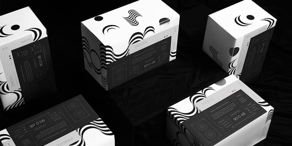
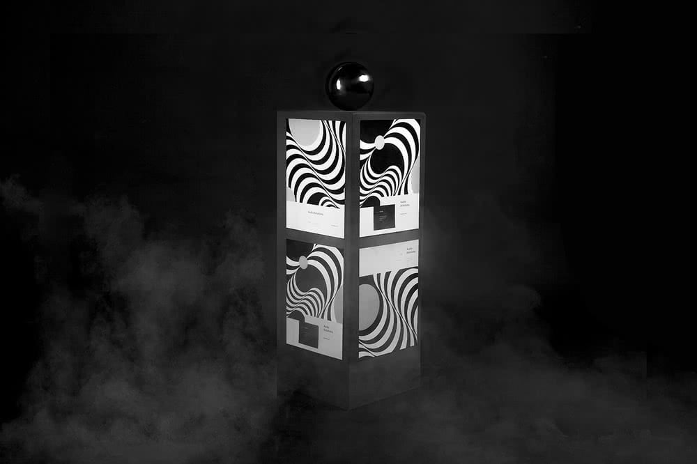
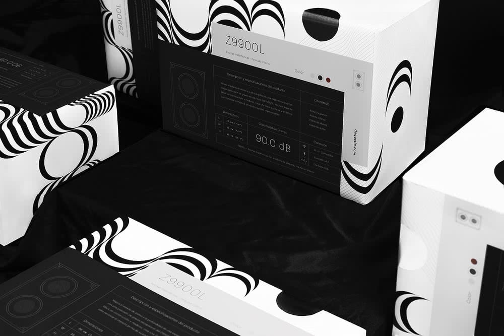
The Daqustic speakers packaging designed by Sabbath Visuals uses a design with a strong visual impact to recall the sound power provided by the product. The artwork is totally inspired by the featues of the speakers, in fact its curved, soft and sinuous lines remind the spread of sound by sound waves. The strong communicative power is also achieved through the use of black and white and reflects the strength and timeless nature of sound.
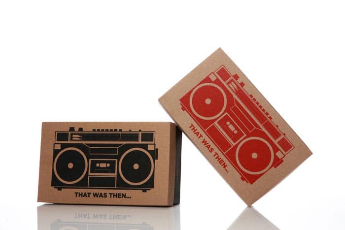
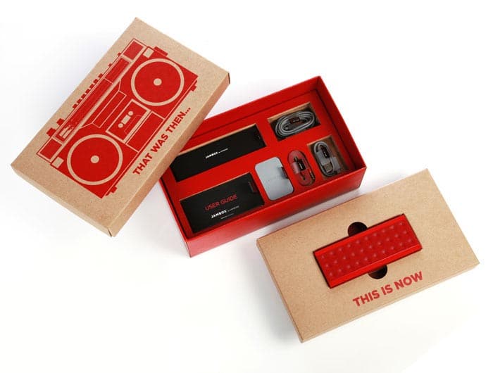
Fuseproject created a packaging to retrace the steps of technological evolution of technological devices to enjoy music. The packaging is made with natural effect paper with the typical 80s stereo (ghetto blaster) and “That was when…” printed on it. Whereas, when the buyer opens the box he finds a completely different and modern product: a bluetooth audio speaker and “this is now” printed on the holder.

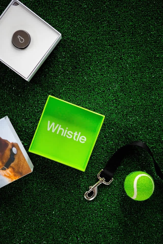
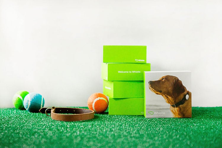
A complete packaging solution designed by Design Womb for Whistle, a company that produces monitoring systems of dogs activity. Its simple and balanced graphic design reinforces the perception of the brand in each package component. It also underlines that the high-tech nature of the product does not affect the habits of each dog, but complements them.
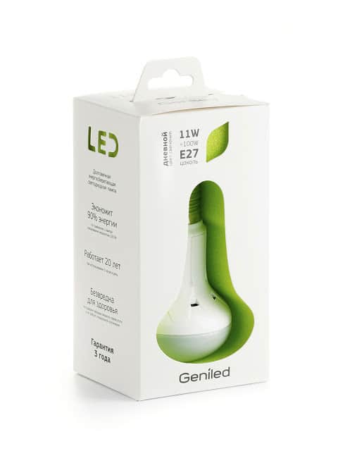
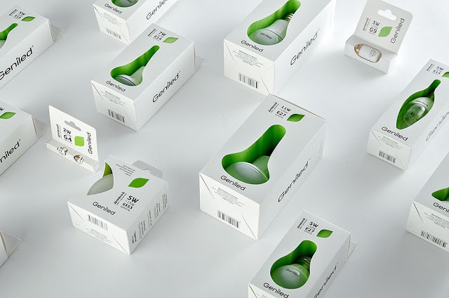
Evgeniy Pelin is a packaging designer specialized in the sector of consumer goods and appliances. He designed this series of LED bulbs packaging to underline the low environmental impact of the product. Each box presents a carved shape of the product and a leaf that represent the silhouette of a fruit.
