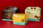


Colour and packaging: white please!, the neutral that goes – always – on trend. That colour that never gets tired but, on the other hand, never goes out of fashion! Cool in summer, icy in winter, it and its shades (What? Can white have shades?? Spoiler: yes) are the ‘tabula rasa’ where all ideas are born and creativity explodes, like a supernova.
Colour packaging has an evergreen: white! Luminous and spiritual purity, it is the primordial element from which everything is born. There is no need for genius, it is a detail we experience every day and we do it without thinking about it. What am I referring to? It’s simple: the paper you start writing on (whether physical or digital), what colour is it? White. The canvas on which you paint? White. What colour is spirituality associated with? With white – just think of the classic wedding dress! The use of the colour white has very ancient origins and its symbolic meaning varies between cultures and eras.
History of a colour
During the Neolithic era, our primitive ancestors discovered a special pigment: bone white. The name already gives us a hint of how this powder was created… When in Rome, do as the Romans do, fortunately (or perhaps not) in later times, the colour white was obtained through stones and minerals. Unfortunately, some of them turned out to be toxic combinations (such as white lead).
Hellenic and Roman culture, on the other hand, boasts the most beautiful temples built of marble – strictly white – which still inspires architecture and design today.
Over time, the meaning associated with the colour white has evolved in different ways. In the past, it was often worn by widows as a symbol of mourning. In addition, it represented valour and honour, such as the Knights Templar wore a white tunic. White became, in the 18th century, fashionable among the nobility and upper classes, and regardless of gender!
During the 20th century, the use of the neutral colour par excellence became even more widespread. Just think of the Bauhaus art movement, pioneers of modern design and minimalism, which adopted the use of this colour as an integral part of its rational aesthetics.
White in colour psychology
Colour psychology, which deals with studying how different colours influence our emotions and the feelings they tend to evoke in us, has revealed that white is associated with:
- Purity and innocence
- Simplicity and minimalism
- Clarity and brightness
- Serenity and tranquillity
- Space and openness
- Neutrality and versatility
PANTONE White
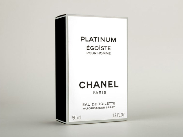
In the Pantone system, white is defined as a ‘silent language’, which has a powerful and incredible communicative power. Its code is PANTONE white, a pure, pristine and immaculate white. “White is a statement of simplicity and elegance” as Coco Chanel claimed!
Although it is considered an absent, unvarying colour, it is actually rich in terms of nuances. In the Pantone system, these shades can be influenced by light, material textures or colour combinations. Just as in reality, it is interesting to note that the perception of shades can vary depending on the surroundings and individual preferences.
Sand, off-white and cloud! And again, ivory, snow, ice, matt and pearl.
You have exactly imagined them as shades even if you don’t know them, right?
White in packaging design
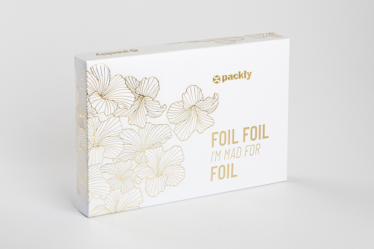
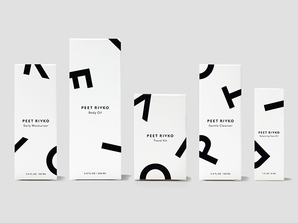
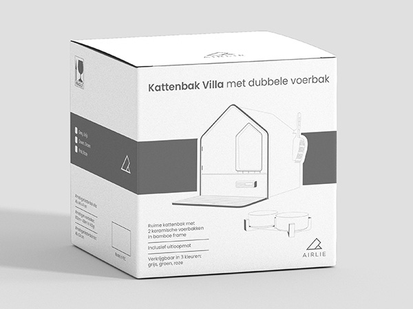
When using white in design or packaging, one often refers to pure white, which simply represents the absence of colour. Choosing to create total white packaging is an invitation to be brave in the ‘less is more’ approach of minimalist design. Did you know that this is a very popular choice in the world of packaging? Especially luxury packaging. Because yes, white is the master of minimalism. Its clean, sophisticated appearance gives packaging a distraction-free look and allows the product to shine.
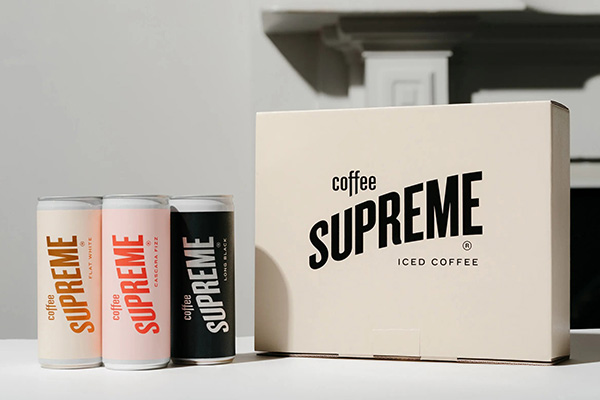
The neutral packaging design makes the box become a canvas, where elegance and style come together in an explosion of purity. What’s more, did you know that it also helps decorative elements such as fonts or logos? Such a bright, pristine colour allows the message to be conveyed more clearly and directly.
Conclusions
In conclusion, using such a pure colour in packaging is a true art, which succeeds in adapting to each product and complements the other colours, creating a harmonious combination. If you want to add ennoblements or special finishes to your total white packaging, just go to Packly!