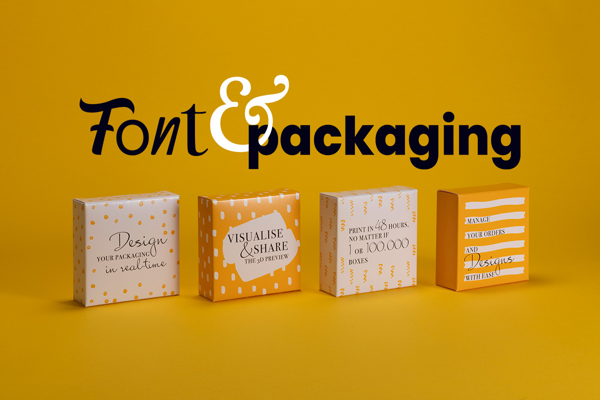


Packaging font is the concrete realisation of communication. When the beauty of the box finishes speaking, the text takes the floor, capable of giving voice to the packaging. So many letters put together have a communicative force that involves all the senses linked to the curiosity of the buyer.
Packaging font is a typeface that is mainly used in the design and production of product packaging. They are usually studied and designed to be attractive, readable and to effectively communicate the identity and characteristics of the product. It is important to emphasise, first of all, two golden rules:
- the font must be balanced
- and always contextualised! (would you ever write in a ‘badass, punk‘ font on packaging containing delicately scented candles?)
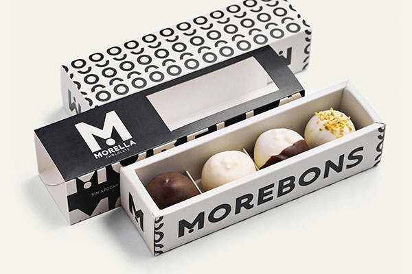
The choices we all make are the result of an emotional decision; even fonts for packaging are chosen to evoke emotions. Did you know that depending on the shape of the writing, you can experience feelings? I’ll give you an example to explain myself better: a ‘chubby’ font, with its round and nice full shapes, what makes you think of? A nice box of doughnuts or sweets, right? The sense of hunger and mouth watering, on the other hand, don’t come with thin, linear writing, do they?
If I’ve hit the nail on the head, then the font and its style have done their job well: speaking for packaging. Indeed, man is by nature a rational being, which is why packaging must be able to hit the psychological needs of consumers.
Words are important, packaging font too!
Packaging font has one mantra to follow: it must communicate certain words. Therefore, packaging designers usually have to think of a font that is easy to read, that immediately attracts attention. It is important to ask the right questions, such as: “What result do I want to achieve and achieve?”; “Which font lends itself best?”
The art of communicating through packaging is becoming a form of modern magic. Fortunately, there are criteria to follow that help us in the most suitable choice of typeface to use.

For example:
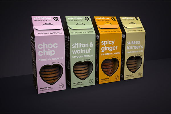
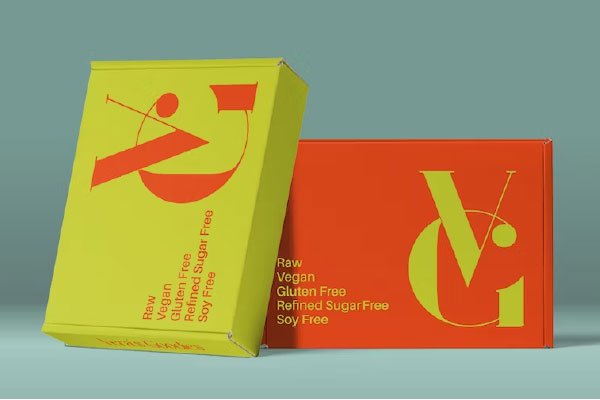
Context: its mode of use determines its effectiveness. The font must be well placed in context. Because shape, size and style depend a lot on the message you want to communicate and the way you do it. For advertisements, for example, you need more playful, geometric, large, colourful and original fonts. If, on the other hand, the packaging has informational spaces, the font becomes smaller, perhaps using a classic, clean Sans Serif.
Brand communication: there is much more behind the font than may appear at first glance. Each stroke has the power to convey personality – the elegant luxury of a product, the carefree joy of youth, or whatever else you want to communicate. And it is this personal touch that becomes the trademark, distinguishing the product from its rivals.
Readability: the font should be the perfect combination of aesthetics and readability. When a font is carefully chosen, its visual elegance allows consumers to immerse themselves in the message, to understand instructions, trivia and information immediately. The font must be easily readable to allow consumers to quickly understand the information on the packaging.
Differentiation: the font must be able to surprise. Every day we experience fonts, we are crowded, saturated with images full of writing. Packaging with the right font, therefore, must reach our brain, which receives stimuli unconsciously. It must remain imprinted in our minds.
Adaptability to packaging: The font must be adaptable to different packaging materials, such as paper and inks. It must be legible and retain its shape and quality even on different surfaces.
What are the best fonts for packaging?
The characteristics of a font for packaging can include a unique shape, a strong personality, good readability even at small sizes, good rendering on different packaging materials and an ability to attract attention and communicate the essence of the product. Some examples of fonts commonly used in packaging, which encapsulate these characteristics well, include Helvetica, Futura, Univers, Arial, Gill Sans. Typically, a hierarchy is used whereby the main messages are larger in size than the secondary messages, written in smaller fonts. The font is so important that big brands, instead of relying on classic templates, have created customised, recognisable, iconic ones, capable of independently communicating message, brand and values.
Conclusions
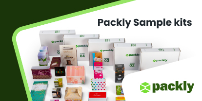
In conclusion, the font in packaging plays a key role in brand communication, readability, differentiation, visual appearance and adaptability. A careful and strategic choice of font can help create a lasting impression in consumers. Want to know how to reduce the margin of error and create packaging with the perfect font? Go to Packly and start creating now.