Rich black and plain black: what is the difference?
In the article “RGB or CMYK, which and when?” we described the main differences between the two color models, briefly dwelling on some characteristics of the four-color black.
Keep on reading!
Process color printing
Four-color black is a shade of black obtained through the combination of four basic inks: cyan, magenta, yellow and black (CMYK). Furthermore, printing in four-colour process (CMYK) is a printing method that uses these four inks, which are the three primary colours of subtractive synthesis. However, black (Key Value) is added for technical reasons. In principle, we should be able to get black by combining the three primary colors at 100%, but the print result is a very dark gray instead, not even close to an absolute black. Black ink was so added to achieve a complete full-color printing.
By balancing each pigment, in a percentage ranging from 0 to 100, you are able to create all the remaining colors of the CMYK colour space.
In any case, it’s important to know that some inkjet printers work only in tri-colour (CMY) and so get their black by mixing the three primary colors at 100% each. An example is the HP® Photosmart printer.
Black in print
As mentioned above, the sum of C, M, and Y, at 100%, should generate black, but not a rich CMYK black. In fact, the result is a shade of deep brown known as composite true CMYK black. Similarly, the black made of K = 100% does not correspond to the rich black to which we are visually accustomed, which is “enhanced” by the addition of a percentage of the 3 colors.

Plain Black
Plain black made of C = 0, M = 0, Y = 0, K = 100. You should always use this nuance for texts, threads, and small elements, preferably with overprint enabled. Overprinting is need to to avoid the appearance of unsightly white holes on the edges of the various graphic elements in the event of printing sheet misalignment. We do not recommend using rich black for these elements. Why? Because, with misregistration, this could lead to a bothersome visual splitting because of the misalignment of several colors.
Using this black for solid backgrounds or for big graphical elements, but is not appropriate unless you intentionally want to achieve a “faded black“. This happens because the paper absorbs part of the applied ink, which in turn looks washed-out and not saturated enough. The paper you use also plays a huge role, although the resulting colour is usually a very dark gray, not always homogeneous. For these bigger elements, an “enriched” black is advisable.
Rich black
To get a full and deep black it is essential to combine the 4 CMYK colors in percentages. Depending on the colour scheme, it is possible to achieve warm, cold or neutral blacks. There is no set combination of ink colors to get rich black; the colors can be balanced according to the desired final effect.
The most general and widely used rich black is made of: C = 63, M = 52, Y = 51, K = 100. This colour owes its popularity to Adobe Photoshop® software, which is why it is also known as Photoshop® black. These are in fact the percentages you get when automatically converting RGB black (R = 0, G = 0, B = 0) to CMYK using the Photoshop® factory settings.
Cool black is generally achieved by setting C = 60, M = 0, Y = 0, K = 100; while a warmer variant can be created by using the following percentages: C = 0, M = 60, Y = 30, K = 100.
Neutral black, on the other hand, has variable percentages that are generally chosen based on the printing technology used. For boxes made with Packly, we recommend using the following colour percentages to get an absolute black: C = 40, M = 30, Y = 0, K = 100.

Ink limit
Whatever your colour choice, the various percentages that make up black print, when added together, must not exceed 300% of ink coverage. Greater coverage could compromise the quality of the final product.
In the article “Packaging and graphic design: tricks of the trade” we explain: “The different inks are placed on the print sheet, overlapped, according to a specific arrangement of color dots (regulated by specific patterns). The percentages for any color will define the dimension of various points.
The ink placed should then dry off. In this step, we will run across into the first issue: creating colors (especially the dark ones) whose CMYK amount exceeds 300% may result in different print problems, both while spreading the color and drying it off. The print support, in fact, soaked in pigments may tear off, get dirty, etc. … “
The only exception is the “registration black” which is always composed of C = 100, M = 100, Y = 100, K = 100, and, therefore, from 400% coverage of the inks. This color is used only for register signs such as marks. and should never be used for other graphic elements.
Video display vs. press
An often underestimated issue is that all these blacks look similar on almost all monitors, except for the professional devices calibrated for the correct colour display. On common monitors, in fact, they are represented as absolute black (R = 0, G = 0, B = 0). While if applied on the various printing materials they keep their specific characteristics. In the table below we intentionally stressed the chromatic difference between the various colors just for explicative purposes. The colors displayed on the screen do not reflect the actual final print result.
Conclusions
During the design of projects intended for print, you must remember to set the document’s colour model as CMYK and pay particular attention to the colour percentages, to avoid the printing problems listed above. If you do not know which colour result is best suited to your needs, you can always opt for a print test of different blacks and compare them.
To start, download our handy table to always have the most used colour percentages at your fingertips!
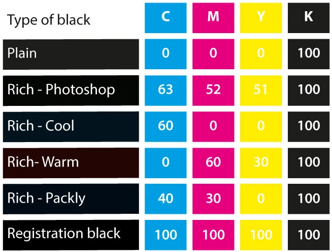
The blacks displayed do not reflect the actual final print result.
