Packaging is one of the most important tools for branding. Indeed, boxes, if properly designed, help to catch customers attention and to fix the brand in their mind.
For example, Crayola, a company specialized in artists’ supplies, is well-known both for its crayons and packagings. Its boxes are one of the most brand identifying symbol. Despite the mutations over time, they always preserved a certain level of recognizability. For this reason, their boxes have always been easily associated with the brand ensuring its memorability.
The packages have been modified both in their graphic and structural design. The changes have been made progressively to guarantee a visual and formal coherence avoiding sudden variations to the visual identity.
How was it done?
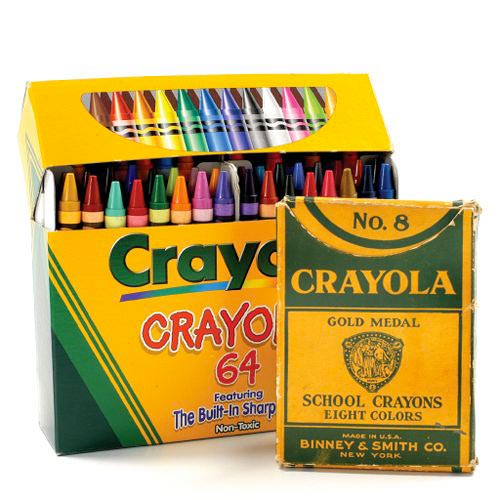
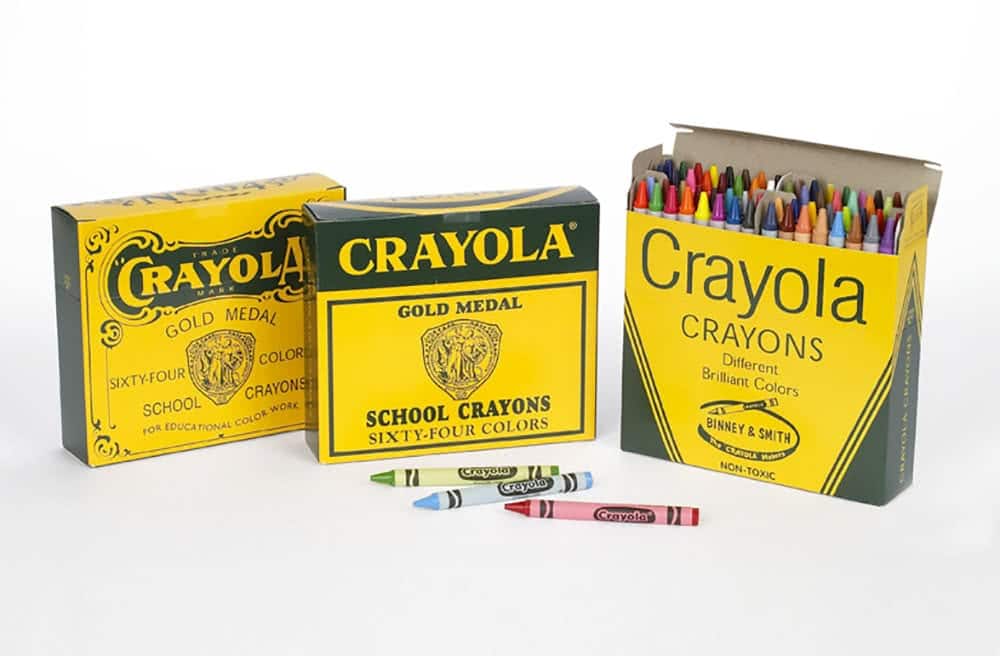
If we compare the first Crayola packages produced to the actual ones, the stylistic difference is glaring. However, by analyzing the evolution of the packagings it is clear that each change occurred slowly and gradually. The modifications have been absorbed almost unconsciously by the audience. This was possible by keeping some of the graphic features, which eventually became the core identification elements of the company.
Crayola teaches us that we could change but we always have to preserve our hallmarks.
Crayon boxes evolutionary stages
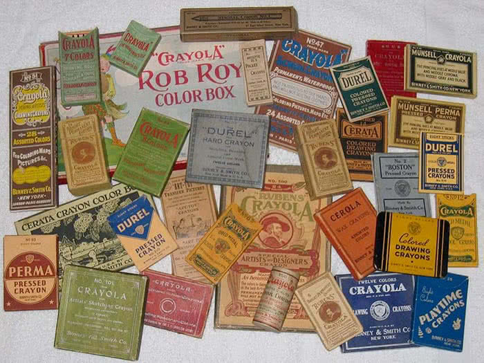
The first turning point in Crayola package evolution was in 1904. That year, after the victory of the umpteenth gold medal award in chemical and pharmaceutical arts, the company decided to to develop a new packaging strategy using the medal symbol to create a unique brand identity for all their products and crayon boxes.
The marketing idea behind this redesign process aimed to use the gold medal as showcase for crayon quality. The first line of pencil assortments customized with it was the No. 8.
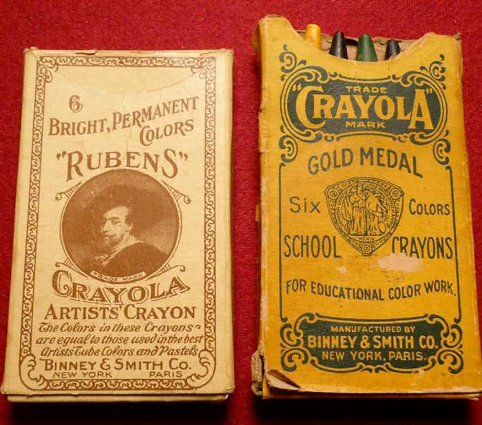
It was such a winning strategy that the company decided to renew all the crayon boxes. The new visual design created appeared on their packaging for the next 50-plus years.
At that time, the packages were printed in green on a tawny cardboard. The two colors have been gradually modified over time. The tawny background turned to yellow, whilst the green changed its hue. Nowadays, yellow and green are the identification colors of the whole brand.
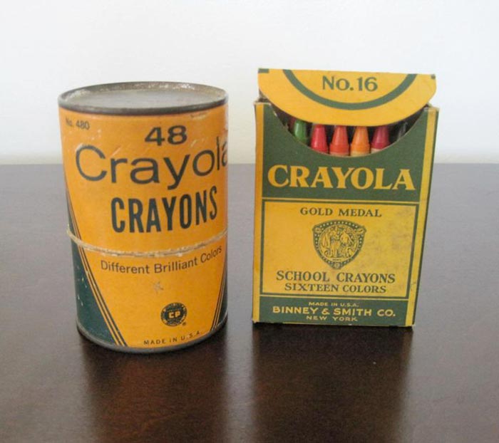
Initially, the graphic style was celebrative and heraldic then it became essential and geometric. The layout was composed of green shapes and lines placed on a yellow background. That style is now the official one of Crayola boxes.
Another characteristic element is the slice of colored pencils. Its origins date back to the first Crayola boxes. The primary packagings had a special cutout that, once opened, displayed the top of the pencils. The carving firstly had a specific function: it allowed to recognize the different colors at a glance. Then the semicircle became only a decorative element without practical functions. Now it identifies the brand, as you can see looking at the company logo.
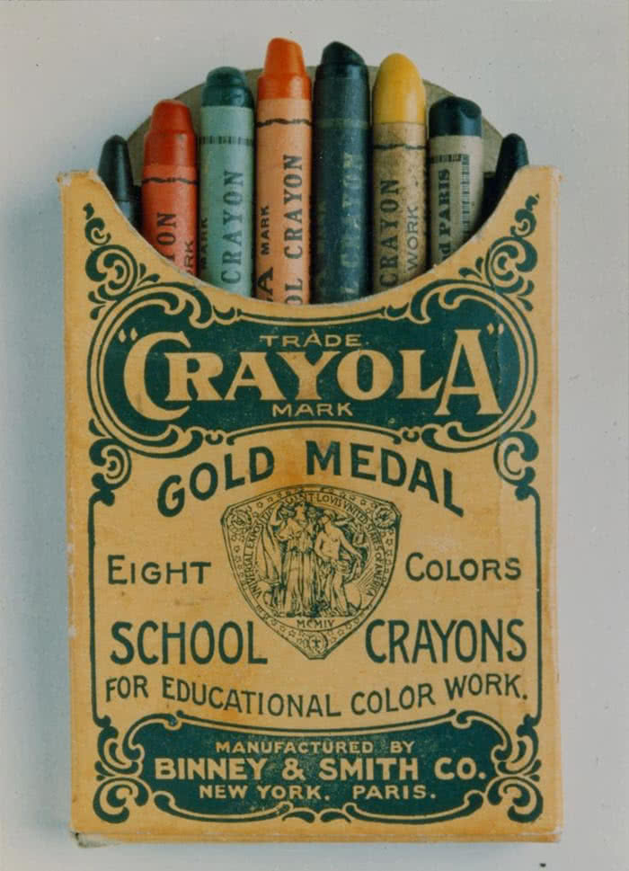
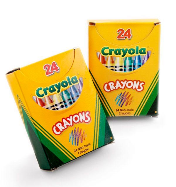
Crayola identity style has been created thanks to the persistence of some graphic elements, which became the identification symbols of the company.
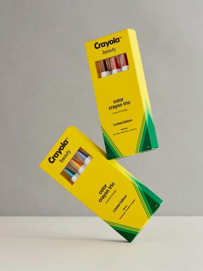
Obviously, the firm also produced some limited edition of its custom boxes in addition to the standard ones. Recently Crayola launched a makeup line on Asos which is packed into the classic crayon boxes. But that’s another story 🙂
