Pernod Ricard presented the Chivas Regal redesign in response to changing tastes and needs of the market. Let’s see what are the fundamental steps of the transformation.
The redesign of Chivas Regal. The evolution of consumption paradigms and lifestyle changes have influenced the spirits & beverage sector. The main themes that guide the choices of younger buyers in terms of alcohol are the following:
Quality. The trend is to look for premium products, following the logic of “drink less, drink better.”
Sustainability. Consumers care about the ethics and impact of how much they consume.
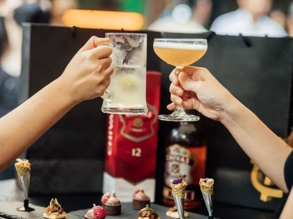
Virality. We discuss what we drink with friends and acquaintances, influencing each other’s choices with word of mouth.
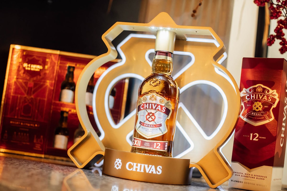
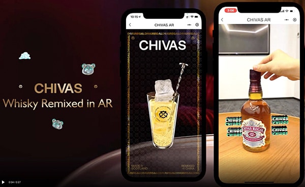
Blended Scotch whiskey, Chivas, has taken these cues, unveiling a new look for its flagship blend. It is indeed the most significant redesign in the liqueur’s 112-year history. Chivas 12 – one of the world’s best-selling Scottish whiskeys- has extensively reshaped its bottle, label, and packaging. The new look combines boldness and modernity while continuing to represent the luxury and tradition associated with Chivas.
The elements of Chivas Regal redesign
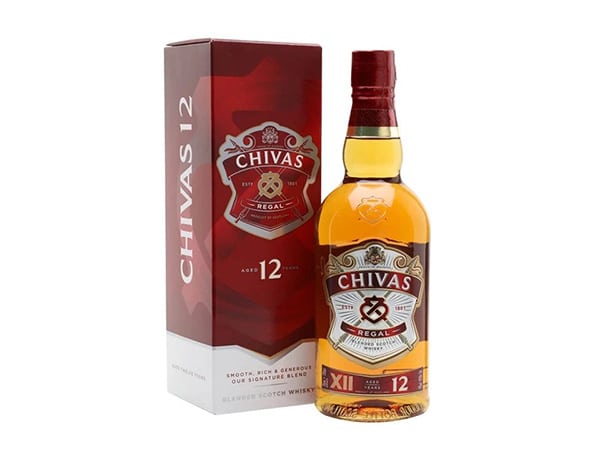
The relooking sees the iconic Chivas 12 bottle reshaped and elongated. Despite the recognizable rounded shoulders, the effect is of greater height and solidity. A redesigned emblem illuminates the beating heart of Chivas: the “luckenbooth.” The latter is a symbol that embodies the values of ambition, generosity, and success.
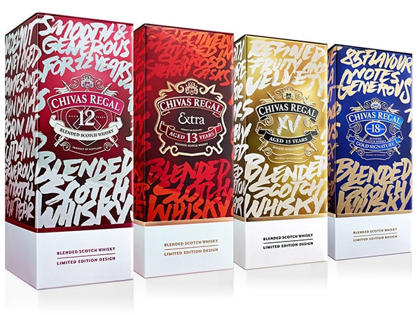
The outer box got a vibrant burgundy instead of silver and gold as the color combination. The packaging retains the woven details and background patterns loved by Chivas fans worldwide.
The entire redesign project revolves around sustainability. The company aims to have 100% recyclable, reusable, compostable, or organic packaging within a few years. The new bottle is lighter and saves over 1000 tons of glass annually. On the other hand, the outer packaging now consists of entirely recyclable materials. The whiskeys in each bottle retain the same renowned smooth, rich, and generous Chivas 12 blend.
The redesign certainly correlates with the new generation of drinkers, changing consumption, and the concept of luxury.
A spokesperson for Pernod Ricard India said: “This is a colossal change, offering the new generation lively choices. The new design adds boldness, modernity, and a bit of sparkle to Chivas’ iconic and timeless legacy. As a matter of fact, we aim to strengthen the bond with millennial and generation Z consumers. They make profoundly new life choices. Sustainability has guided the reconceptualization of Chivas 12 for a more equitable and conscious consumption”.
Conclusions
In short: do you need to redesign a standard package to make it modern? You have found us. Experiment now by creating a prototype. You can refine and test it before putting it into large-scale production.
