Most coffee packaging on the market are plastic bags or cans. Nevertheless some companies try to design packages that catch consumer attention and are functional at the same time. In this post we suggest some examples of coffee packaging of brands that moved in this direction.
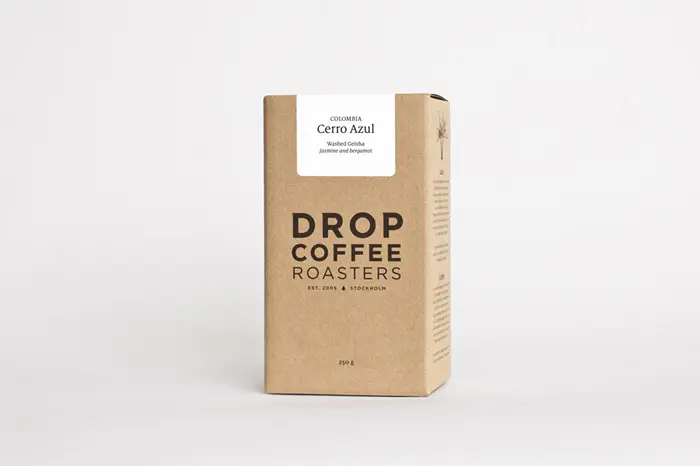
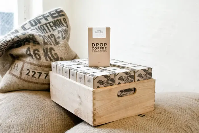
Drop Coffee Roasters, a Swedish brand, uses a simple but attractive packaging – designed by Simon Ålander – that communicates all the simplicity and naturalness of the product.
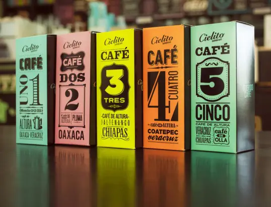
Cielito coffee packaging inspired by Mexican history, its native land. This packaging characterized by cheerful and vivid colors, symbolic language and illustrations inspired by the late ‘800 and’ 900 that marked that particular historical period.
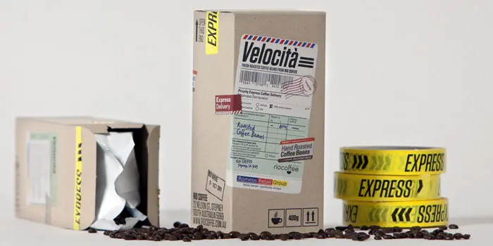
Velocità is a brand of a company that produces locally roasted coffee delivered to its buyers in a short time. To highlight that feature the packaging looks like parcels delivered every day by couriers with even hand-applied labels indicating the date of roasting and the date by which it is advisable to consume the product. There is also a tape that says: express.
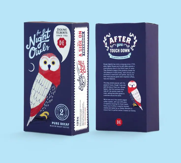
Packaging designed by Chris Dunlop for the Dutch company Douwe Egberts, founded in 1753 is now active in several countries. The blue background stands up remarkably against the most used colors for coffee packaging. Although the brand is old it shows its propensity to modernity by invoking social networking sites on one side of the box.
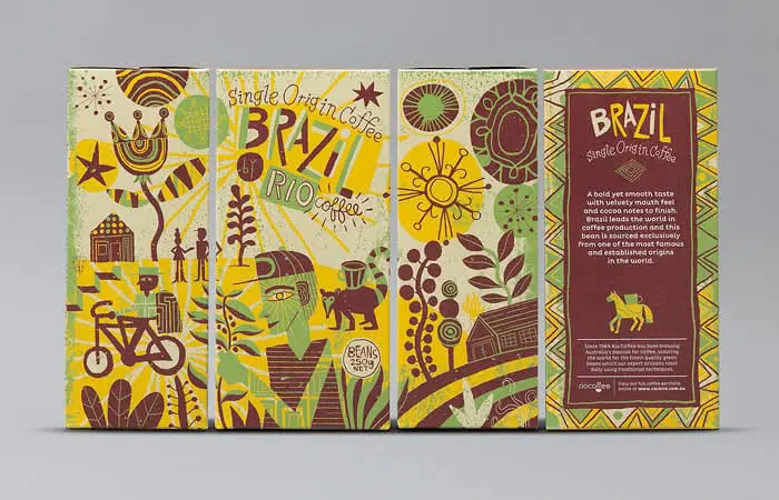
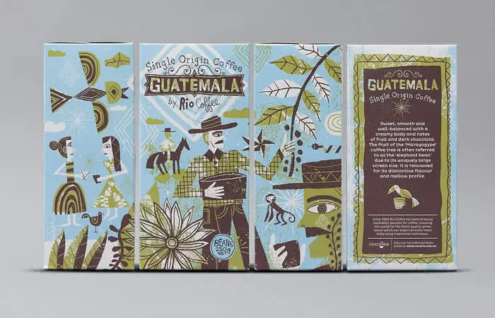
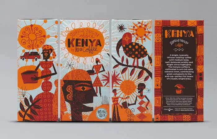
Rio Coffee produces high quality coffee that comes from different geographical areas: Australia, Guatemala, Kenya and Brazil. On each box there are illustrations of people, places and production methods that perfectly represent the different geographical origins.
