While designing a package, after defining its technical and structural parameters, it’s time to deal with its visual design. During the graphic design phase, it is important to identify the most appropriate visual style to spread your message, to communicate the brand and catch the consumer’s eye. Then, according to the chosen style, you can decide the visual representation techniques that mostly suits your needs. In our daily post, we will talk about how to take advantage of illustrations for the graphic design of packagings.
The term illustration generally refers to “any type of picture or decoration used in conjunction with a text to embellish its appearance or to clarify its meaning” Encyclopedia.com. In this article, we will consider the illustration as a drawing created by an illustrator to convey a specific content.
The packagings we selected have illustration as a recurring and central component, this is because that representative technique if properly used might generate powerful results both in visual and communicative terms. Indeed, illustration allows depicting every kind of thoughts or visual concept in a flexible and effective way. It is a communication tool with excellent narrative and evocative skills, which is able to immediately move and amaze people and to arouse the observers’ emotions. These strong feelings will remain imprinted on their memory more than a thousand words.
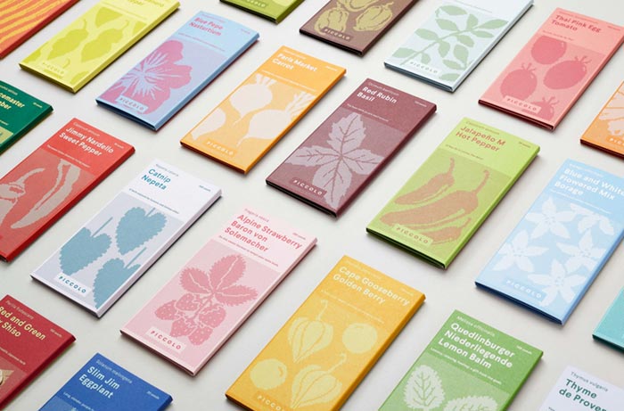
However, immediacy and semantic flexibility are just some of the traits that distinguish images from words. Often the skillful use of illustrations is essential to effectively convey a message. By skillful use, we mean the use of illustrations that have been designed according to certain indications and targets and taking into account the communication and marketing requirements of the project in order to reach specific goals. For example, a good illustration is the one which defines and characterizes the graphic design of a packaging giving a strong personality to the product and strengthening the corporate identity at the same time. It is, therefore, an excellent technique for positioning the product, distinguishing it from the competition and increasing its attractiveness.
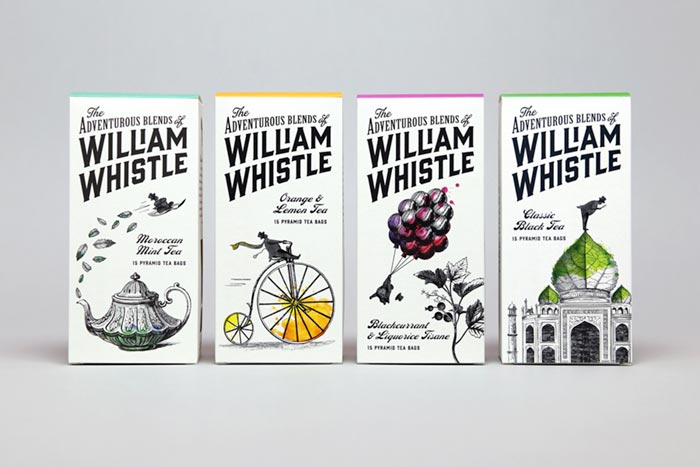
Illustrations are also useful for the brand building process. Indeed, by creating a custom illustrative style and using it through any promotional and sales channel, a company will be easily recognized by its target, that will quickly associate the images to the brand.
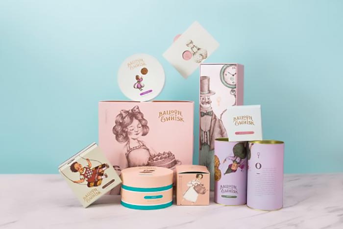
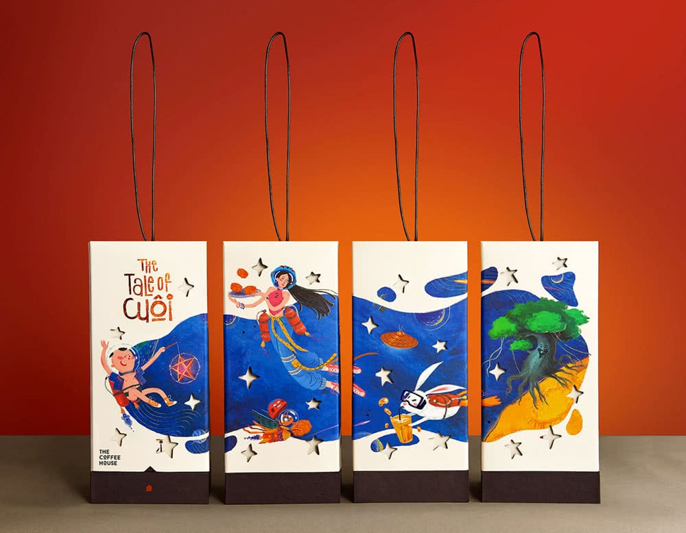
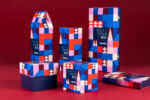
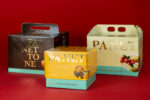
The projects we shared are a clear example of the skillful use of illustration in the graphic design of a packaging. The selected packages move among singular illustrations, single images split into panels and sequential pictures that tell a story. You can notice that their illustrative style is always different, highlighting how it is important for a brand to create its custom style.
Enjoy them!
