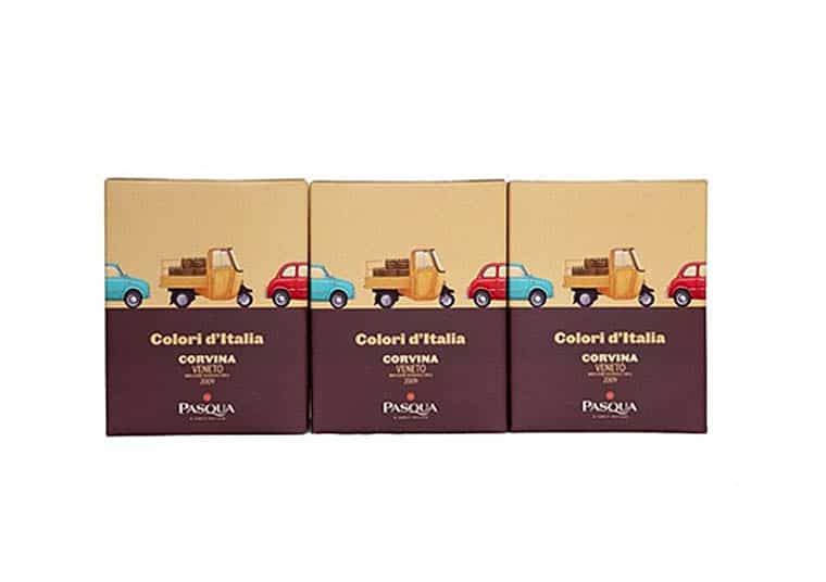
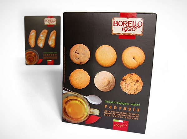
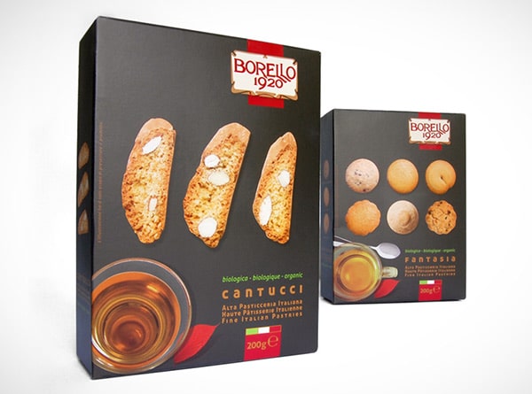
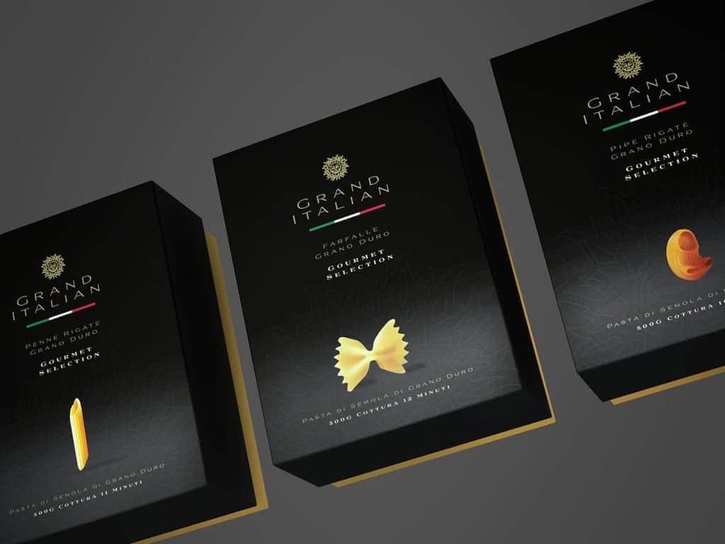
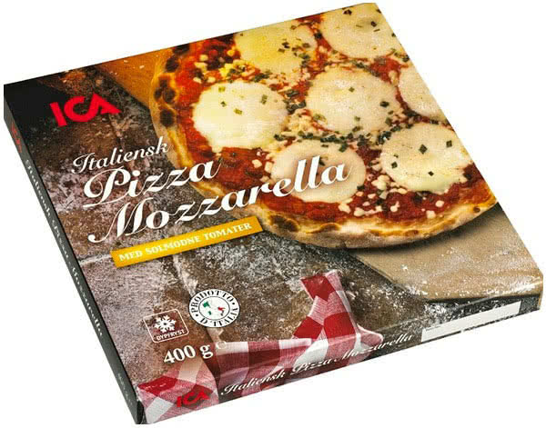
Italian design, since its inception, achieved a prominent place in international markets thanks to its products of high technical and aesthetic quality. Over the years, Made in Italy has become increasingly synonymous with beauty and reliability, especially in the 4 key sectors of the Italian economy: clothing, agri-food, furniture, and cars.
Packaging has gained enormous importance as the portrayal of the product has become essential for sales and Italian-style packaging has often set itself apart. Consumers, conquered by the quality promise of Made in Italy, often prefer the Italian options among similar food products. Therefore, Italian and foreign brands are betting on Italian design as an essential tool for the sales and success of their products. The outcomes of these efforts vary: they range from packaging with typical but innovative graphics to more traditional styled boxes.
However, given the worldwide diffusion of Italian products, not everything that is or appears to be Italian achieves commercial success.
To design successful packaging, one must identify what consumers are looking for and what can instill confidence and get them to purchase. When placing an Italian product on the market, it’s important to understand what the typical buyers perceive as Italian: are tricolor flags, traditional colors, and typical imaginary sufficient? Or would it be appropriate to focus on a somewhat traditional but original look to set yourself apart from the competitors?
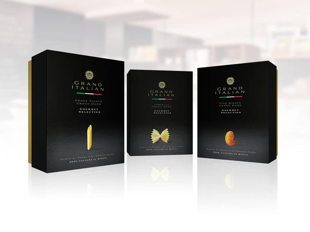
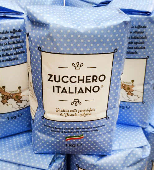
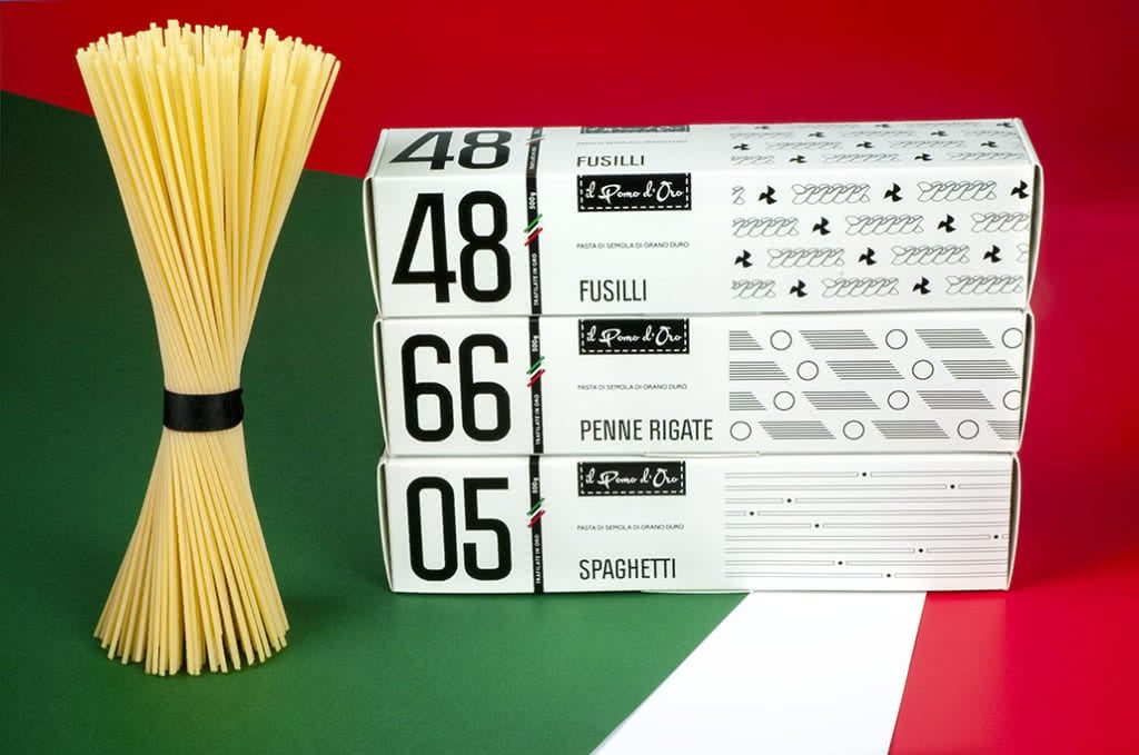
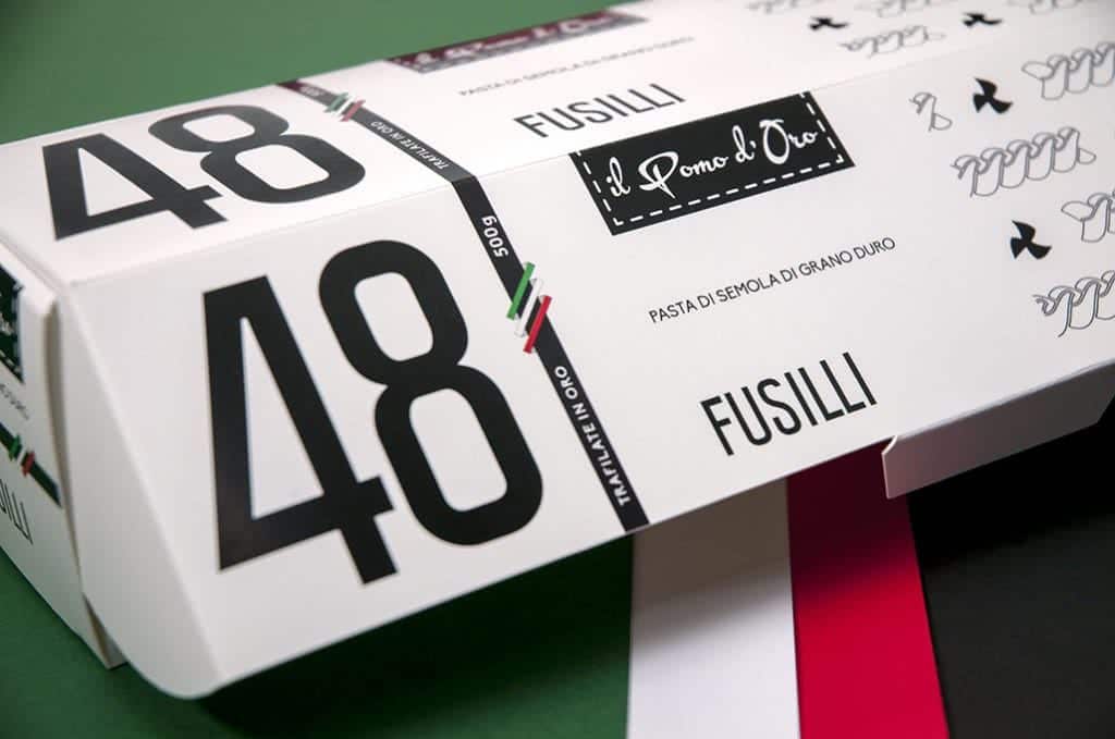
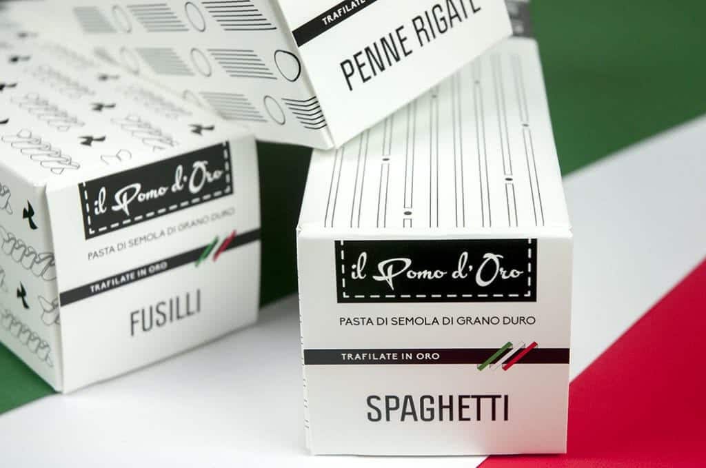
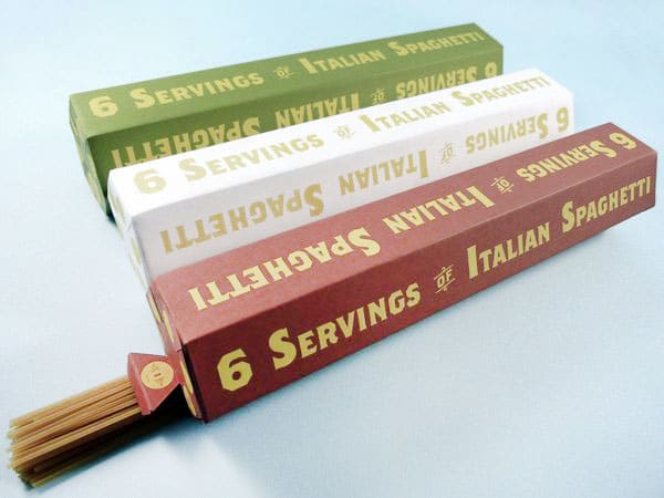
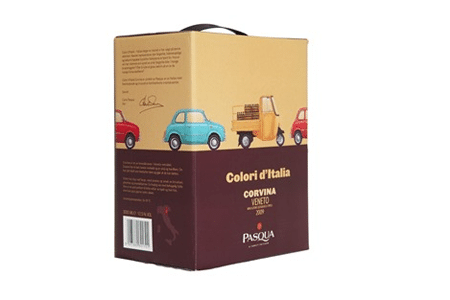
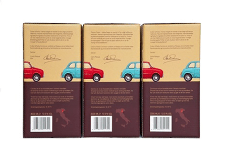
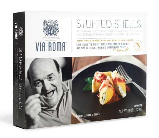
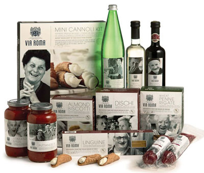
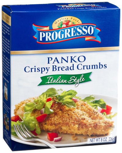
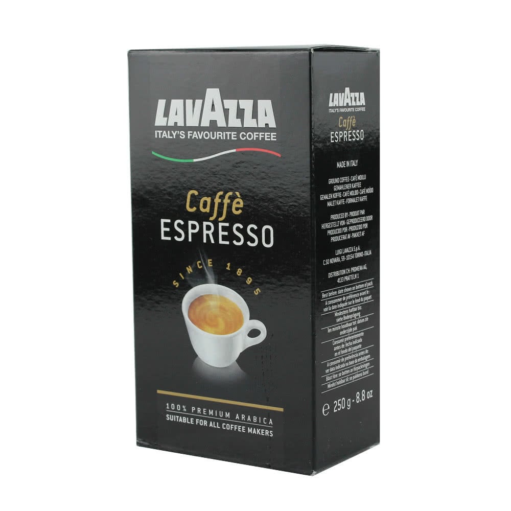
You be the judge! Take a look at our collection of 10 Italian style packaging designs.
What are you waiting for? Design and print your own Italian-style packaging with Packly!
