Compelling communication
Appearance matters, especially in packaging design…or at least in the winning one! Food boxes should appear tasty and inviting, drink packaging lip-smacking, the medical ones trustworthy and reassuring, while all the other packages designed for daily use objects should be eye bobbling. Don’t you think?
Certainly, if it were always like that, it would be perfect but, sometimes, monotonous too 🙂
The point is, regarding medical packaging, that it is really important to design pharmaceutical boxes that are beautiful, of course, but that are extremely clear and effective as well in order to avoid confusion by patients while purchasing and using them.
Drugs, you know, aim to nurse the patient and to soothe this or that pain. Pharma packaging must be able to communicate, first of all, features of the product inside in a clear and simple way.
Medical packaging: a style choice
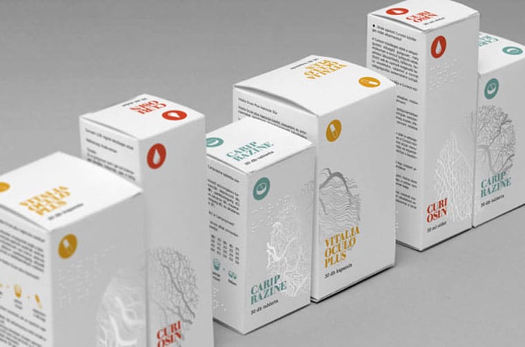
That’s the reason why pharma packagings are generally characterised by a clean design with a white background, synonym for purity and sterility.
The name of product and the various textual information tend, or should tend, to the extreme legibility: it is very important, in fact, to immediately figure out both the name of medicine and its features (composition and use) entering all the essential information on packaging. To guarantee sufficient clearness of information some specific regulations for pharma packaging (as for other products) have been promulgated that regulate minimum dimensions of types, bar codes, etc… as well.
Colours are usually essential to differentiate the various dosages: cold and tenuous colours often refer to regular or light drugs, whilst warm hues are about stronger and more powerful and higher dosages.
Instead, concerning images, we start from medical illustrations of organs and various apparatus, until pictures of pills and tablets, passing through representations of chemical elements and molecules more or less stylised.
The importance of target group
Graphic choice may change based on the target audience, especially concerning medical products for adults and children.
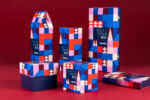
A minimal, elegant and well defined graphic artwork contrasts with a more lively and colourful design, provided with images of kids, or designed for them, to let us know at a first glance the product target, reducing the margin of error and improving the purchase.
Here following an interesting medical packaging collection, commercial and not, that explains all the above mentioned concepts. Enjoy 🙂
