How many times did you happen by in products with colours of the same hues, in a specific lighting conditions, that appeared then fully different if under another light source? How many times did your customers notice this colour variation instead, and did they reject your design project? If you guess you are losing your touch, never mind, it happened to everyone, even if unconsciously. It’s all about, indeed, a case of metamerism. What is it? I’m going to explain you it in this post.
Metamerism
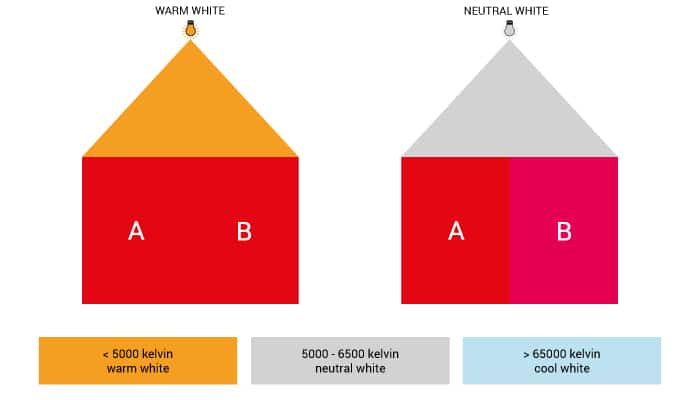
Metamerism is a special phenomenon of perceiving colours that happens when at least two colour samples, called metameric pair, appear identical under a certain light source, whilst they will result totally different if placed under another light source.

This chromatic difference originates from our brain processing about visual stimuli that occurs when the colours are obtained from a mixture of similar pigments. These tints are characterised by a different spectral composition that sometimes can’t be seen because of the limited perception of the human eye.
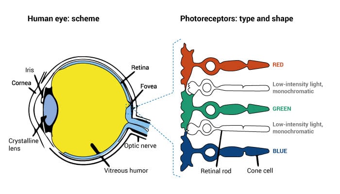
Our eyes can perceive just some specific wavelengths, whilst others will result totally invisible to the naked eye. The electromagnetic spectrum is characterised by only three visible areas which our photoreceptors are more or less sensitive to. Any pigment absorbs and reflects specific wavelengths: just when the remaining reflected light strikes the eye, we will perceive a certain colour than others.
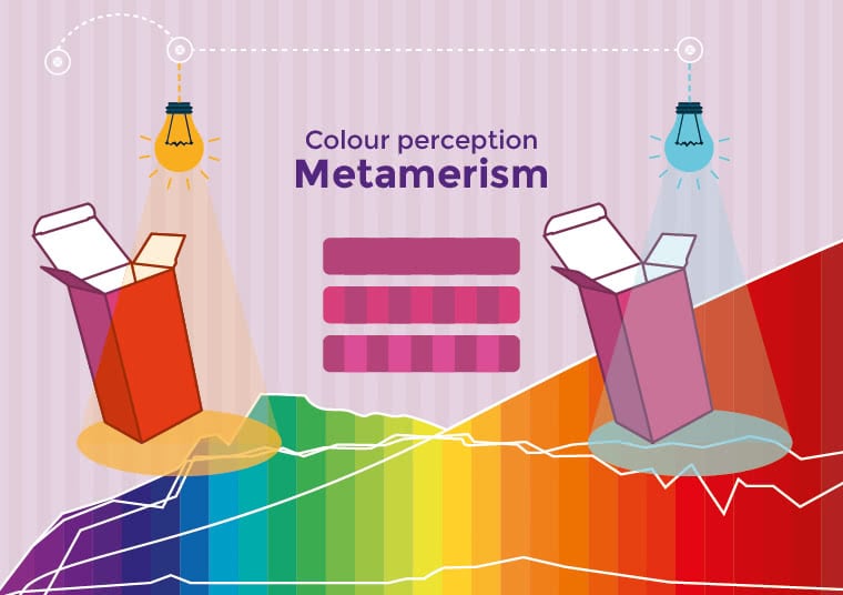
Depending on the energy the light uses to strike an object (measured in lumen per seconds), the percentage of reflected light within the visible spectrum can be established by its reflectance curve. This concept is fundamental because it exactly explains what happens with a metameric pair: colours composed of common pigments may be characterised by reflectance curves that, referring to some wavelengths, intersect themselves giving life to tints that will appear identical to the human eye, especially if they hit the areas with the photoreceptors less sensitive to the light. In these conditions, we can assert that these colours are “partially identical”.

Type and intensity of the light source are then the first factor behind the metamerism, yet not the only one. The sensibility to colours by the viewer, that changes from an individual to others, and the observation angle influence even more the chromatic perception.
When the colour variation depends on the observation angle of the object, we are talking about geometric metameric failure, for example. In textile industry, this chromatic variation effect is usually wanted through the creation of specific textures able to reflect the light in different ways, depending on the angle they will be hit with.
In many other industries, the problem concerning metamerism is likely to occur in different steps of production and it is not always considered as an added value. Therefore, over the years many tools, both hardware and software, were born in order to control and limit as far as possible that this phenomenon might occur. Then, there are specific laws as well that regulate it in certain contests: norms that have established special tolerances in order to control and accept this chromatic difference.
During the creation and introduction of your chromatic proposals, you have to consider these important elements:
- Colour temperature of the light source, a parameter that establishes the hue referring to the light
- Possible objects of large dimensions or internal coloured walls, that may influence the light composition
- Perceiving differences between people, that may occur depending on a more or less sensibility of the photoreceptors within the human eye
In order to avoid any possible claims due to metamerism by your clients, you need at least to establish specific light conditions where to observe the product: a provisory remedy rather than a real solution of the problem.
A more efficient solution is to use, during the production process, professional viewing and colour control methods and tools that allow to check the quality of coloured surfaces and materials, as, for example, JUST Normlicht products.
Viewers, lighting installations and highly certified spectrophotometers in accordance with different regulations (ISO 3664; 2009; 3668; ASTM D1729, DIN 6173-2) and international standards (e.g. ASTM, ISO, BSI ) designed for colour quality management. Systems that are realised referring to the parameters and controlled light conditions based on different industries standards that allow the chromatic reproducibility and the colour matching of a wide range of materials, avoiding mistakes as far as possible and properly managing the chromatic variations that may arise due to different light sources.

Color Vision Viewer, JUST Normlicht.


