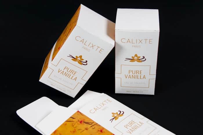
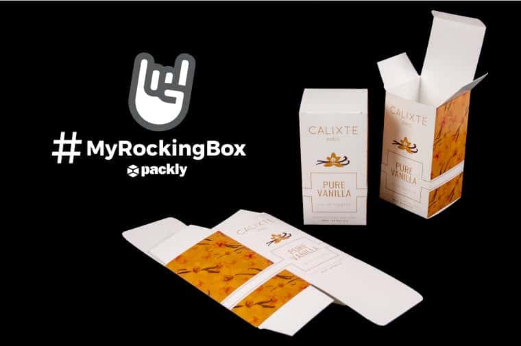
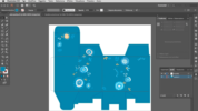
The first graphic design project selected for the contest Packly #MyRockingBox comes from one of our dearest readers, Marco Agustoni, Bergamo-based graphic and web designer with a great passion for drawing and visual communication, who realised his own Calixte perfume packaging, starting from our diecut templates, for the case history in his post “Packaging Design con Illustrator: come progettare la confezione di un prodotto”.
As described by the designer, a creative packaging design project always starts from analysis and researches about inspirations and stimulus…wherever! In his case, before start drawing his graphic sketch, Marco decided to have a look at the interesting projects posted on Packaging of the World blog.
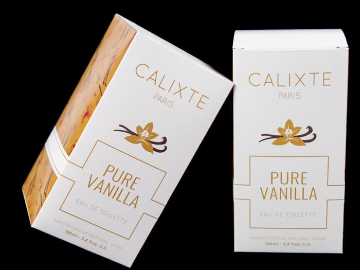
The simple and essential layout and the harmonic composition of the various graphic elements are the main features of his artwork: a perfume packaging needs to immediately convey the scent inside, and Marco chose a clear and direct way to do it, avoiding any misunderstanding.
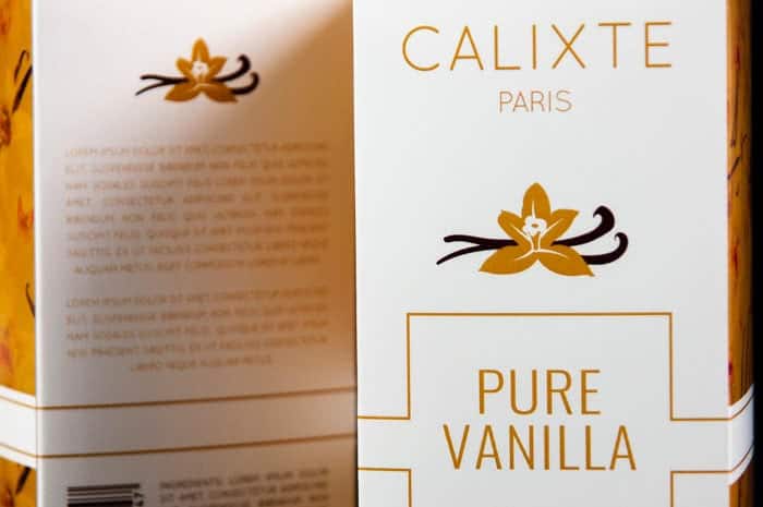
The vanilla aroma has been artfully positioned in more areas: the stylized flower just beneath the Calixte perfume logo, on the front of the box and again on the back side, and the floral texture, together with some fluttering butterflies on a mustard-coloured background, on the box side faces. Marco chose a minimal and elegant style, one of the most popular in this industry.
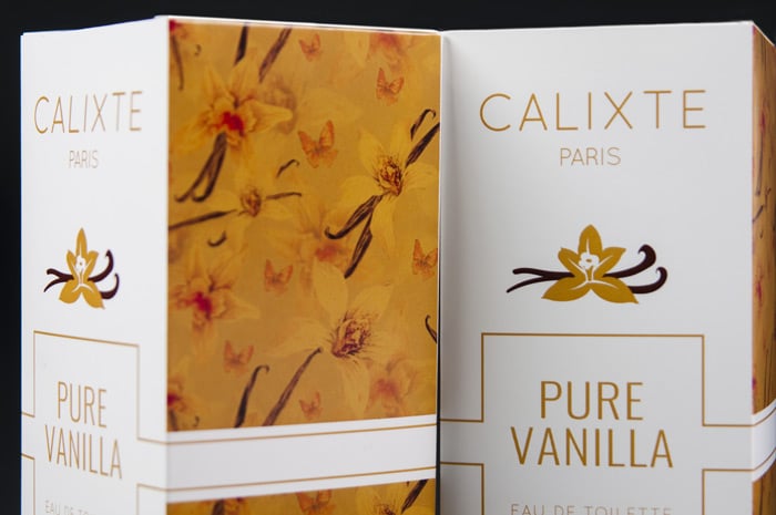
The main information regarding brand and product are well placed on the front of the packaging, so that they are clearly visible, while technical and more descriptive information move over on the back side together with the most common packaging symbols, usually used by cosmetic industry to give specific information to the consumer.
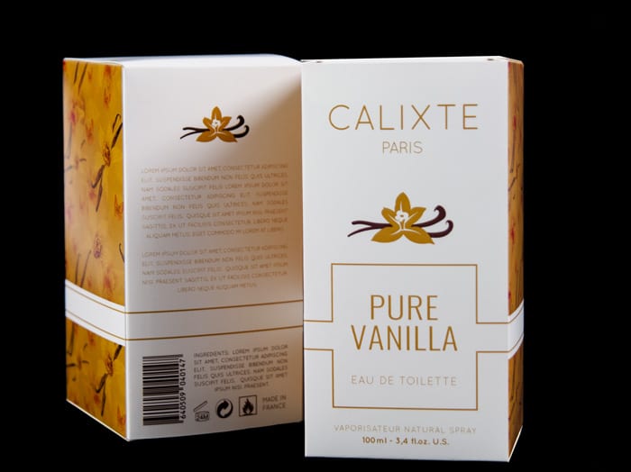
Last but not least, we need to focus on the colours he chose: the analogous colours scheme has been realised starting from a mustard yellow, used to realise the logo design, with some soft tonal shadings and ends with the brown used for the small branches of the flower. White represents the main background colour in order to give a sense of purity and able to capture the most sophisticated observers.
As Marco suggests, you don’t have to leave to chance the choice of colours, a suggestion worth spreading across all the graphic and communication aspects, and not only! In-depth studies and practical tests are fundamental to realise effective design projects that are clear and will exactly convey the desired message.
Thanks Marco for sharing his Calixte perfume packaging project with us. Take part in the contest #Packly #MyRockingBox: the next published box graphic design may be yours!
Packaging technical information:
Packaging type: Standard reverse tuck end box
Dimensions: 74x74x142
Printing method: four-colours process (CMYK)
