Italian-American graphic designer, Louise Fili is well-known for her undisputed artistic talent and for her wise and creative use of typefaces.
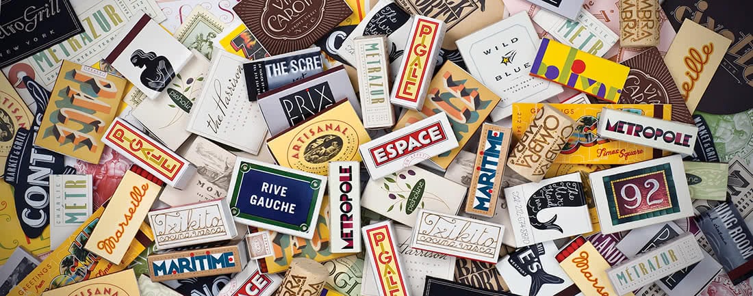
In love with Italy, Modernism and Art Déco, Louise created her personal style combining all these elements, whose influences are evident in each creation. In fact, all her artworks are characterised by the use of historical typefaces juxtaposed with colors and compositions of modern imprint. Creator of thousands book jackets and corporate identities, Louise, due to her innate passion for typography and after her studies in visual arts, immediately began her career as graphic designer, firstly as freelancer, then as art director in publishing and ultimately founding her personal studio, Louise Fili Ltd, specialised in the design of packaging, restaurant identity and food-related logos. Concerning her typographic passion, the graphic designer herself tells in a video that at almost 4-5 years old she already carved typefaces on her room walls, even before learning to write.
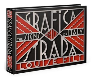
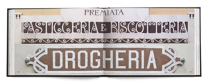
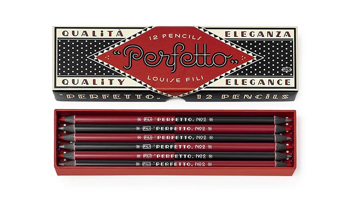
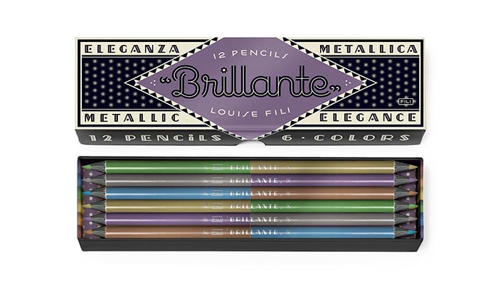
During her career, in addition to the works already mentioned, the famous artist also written and curated several books of design and typography. Strongly inspired by the vintage Italian lettering and packaging design, in several occasions she decided to honor her origins in her artworks. Among the various examples there are the book “Grafica della strada” and the amazing bicolored pencil set: Perfetto, Tutti Frutti and Brillante.
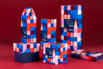
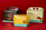
To have an idea of the elegance and the talent of Louise Fili I strongly suggest you have a look at her beautiful works. In our daily image gallery we collected some of the packaging projects curated by Louise Fili Ltd that we liked the most. Enjoy this elegant and refined blast from the past 🙂
