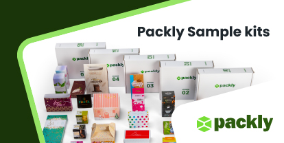
Packaging and organic, preserving food is not enough. The box is a real marketing tool to persuade consumers to buy. Let Packly guide you so that your products always go straight to the cart.
Packaging and organic products: an essential synergy. Organic is a trend that has become mainstream both in the short chain, from which it started, and in the large-scale retail trade. Step by step, it won the hearts and palates not only of environmentalists and fans of eco-sustainable nutrition, but also of general buyers. It is quite common now to see small themed shops, organic supermarkets and even dedicated departments in retail stores.
What are the packaging design strategies to get straight to the heart (and cart) of the reference consumers?
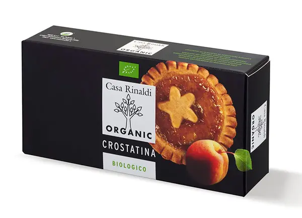
1. As far as food is concerned, packaging must guarantee the perfect preservation of the product. The size of the pack should not be too generous, so as not let the inside hang loose, nor too narrow, because in handling it you could damage or crumble the contents.
Let’s take the example of this package fromCasa Rinaldi Bio Tarts. The box is linear and low, even the depth is limited, so that it contains and perfectly wraps the cookies inside, preventing them from moving. We also expect that the tartlets are not individually packaged in plastic, but are lying on a paper cup.
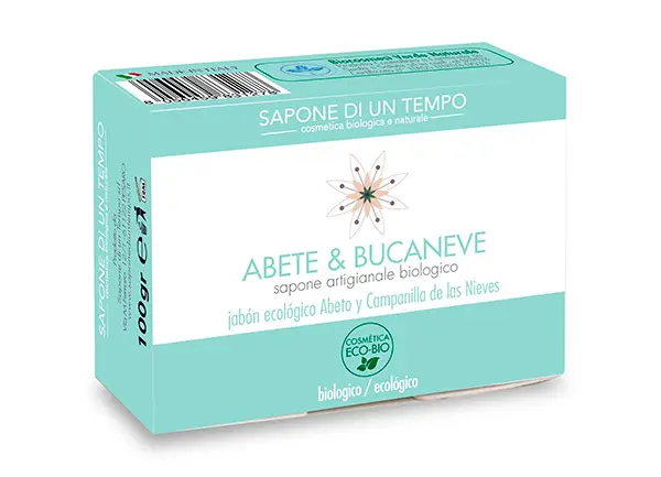
2. We are talking about organic so even if it might seem obvious, we need to use materials that are as natural, recyclable and eco-friendly as possible. We would not be credible talking about nature and sustainability if we had polluting packaging or excessive waste.
Emblematic is the Abete and Bucaneve soap, contained in a basic cardboard box with reinforced flaps. It does not dirt, it does not pollute, it does not slip.
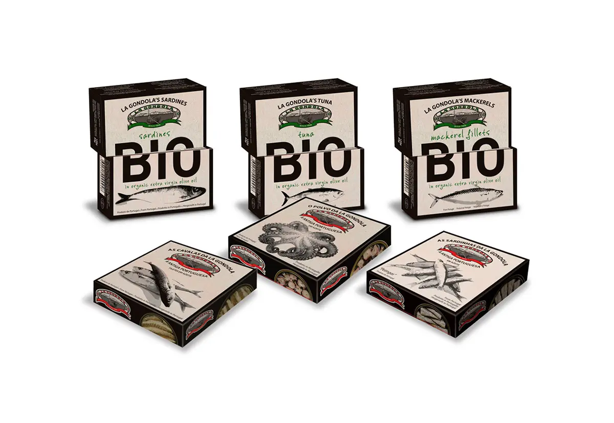
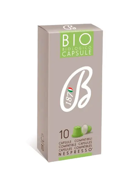
3. The key word is simplicity. No glossy graphic finishes, complex or baroque artwork and futuristic technological solutions. Whenever possible choose solid cardboard, clean graphics and essential design in line with what we are trying to sell. It is not just a purchase choice, but a declaration of intent with respect to our lifestyle.
Just take a look at these Nespresso compatible organic coffee capsules. Besides a stylized logo, there is nothing but a small reproduction of the capsule itself at the bottom, with the relevant quantity. So much empty space, relaxing, not noisy, talking about the product without overloading information or annoying consumers with tacky labels.
4. Transparency, it is an element that cannot be missed. We are referring here both to the completeness of the product-related label, and to the actual possibility of peeking inside through an insert or a window that lets you see what is in the package.
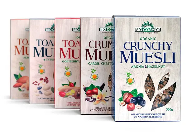
What about these slightly vintage muesli boxes with romantic transparent leaves that reveal the tasty mix of cereals and organic fruit contained inside? Nothing sells better than the truth, no strings attached.
5. No to intense and bright colors. As much as we like Andy Warhol’s pop art, we should definitely turn towards Provençal, shabby chic. The tones must be natural, soft and not too contrasting or mixed together.
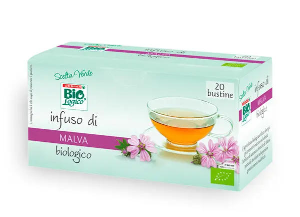
An example is this infusion of green mallow whose box reflects the colors of the flower petals and that of the leaves, which is diluted in the background. Realistic, relaxing, pastel shades, anticipating the feeling of extreme refreshment provided by the warm natural drink.
Are you ready to develop a prototype optimized for organic products that will win merchants and consumers? Try it now, follow our guidelines and let us know how it went!
