


Christmas is coming and we want to suggest 5 packagings that stand out for their unicity, even if they use classic color palette and traditional graphical elements.
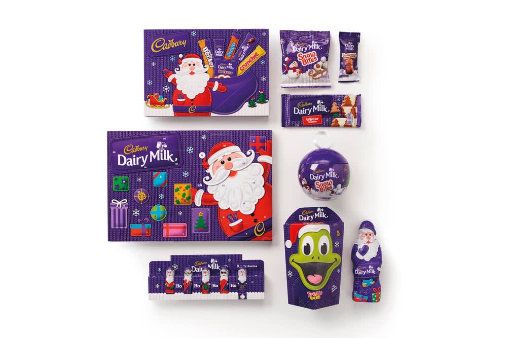
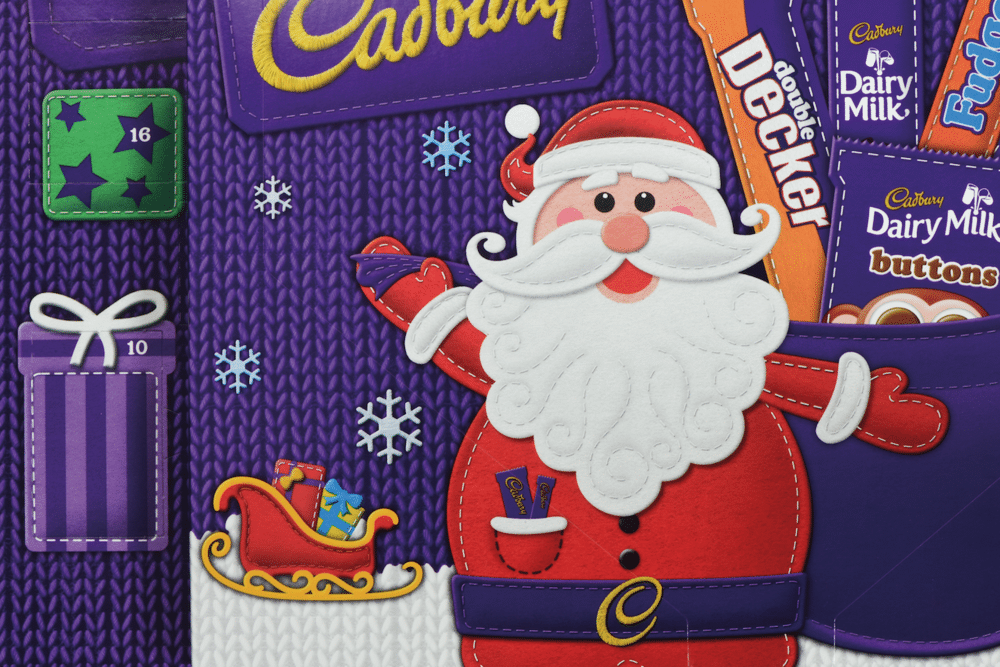
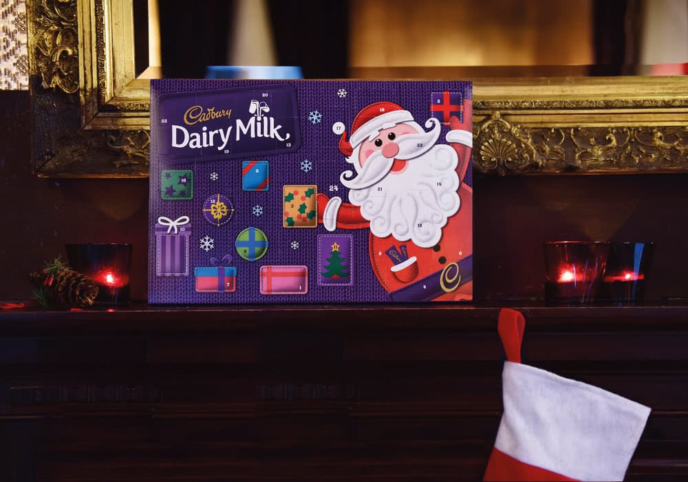
Design Bridge realized for Cadbury’s products a series of packages with a unique design that communicates joy and fun. The boxes are made using felt fabric details layered on top of knitted winter landscapes. The 22 different products packed in these boxes call to mind the authentic, homemade Christmas crafts.
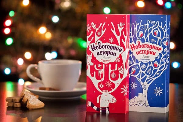
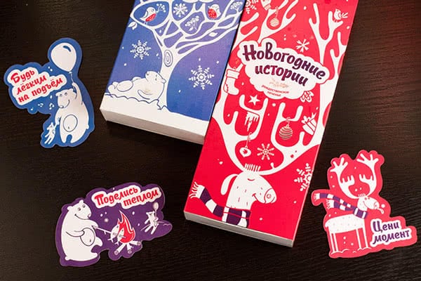
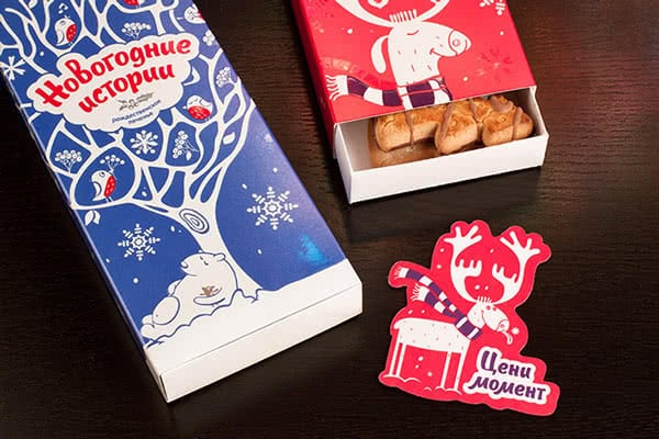
The creative agency Brandiziac wants to create a packaging solution that brings the consumers into the Christmas spirit. The project “New Year’s Stories” consists in a set of biscuit boxes printed with the characters of the Christmas stories included in the packagings: the sleepyhead polar bear and the moose dressed as a Christmas tree make the packaging feel joyful.
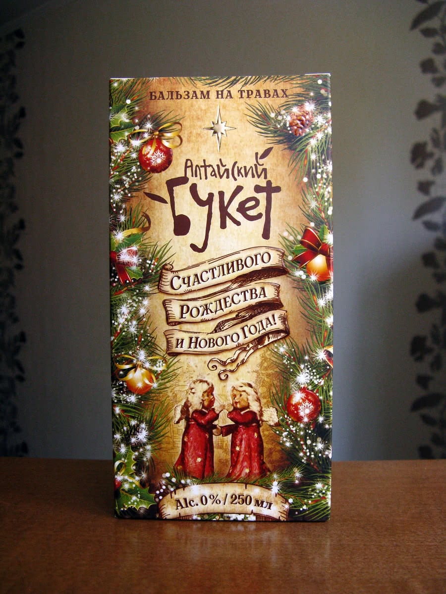
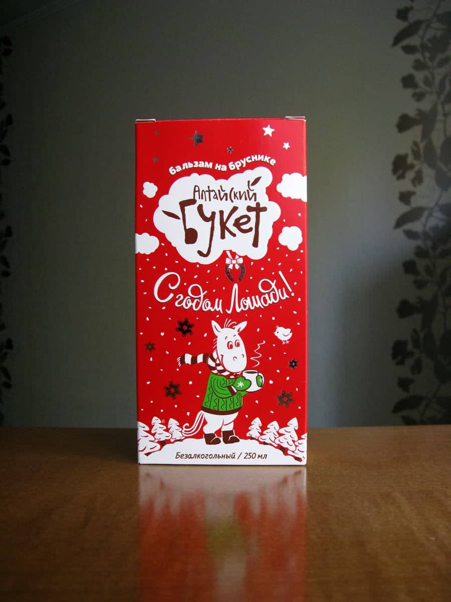
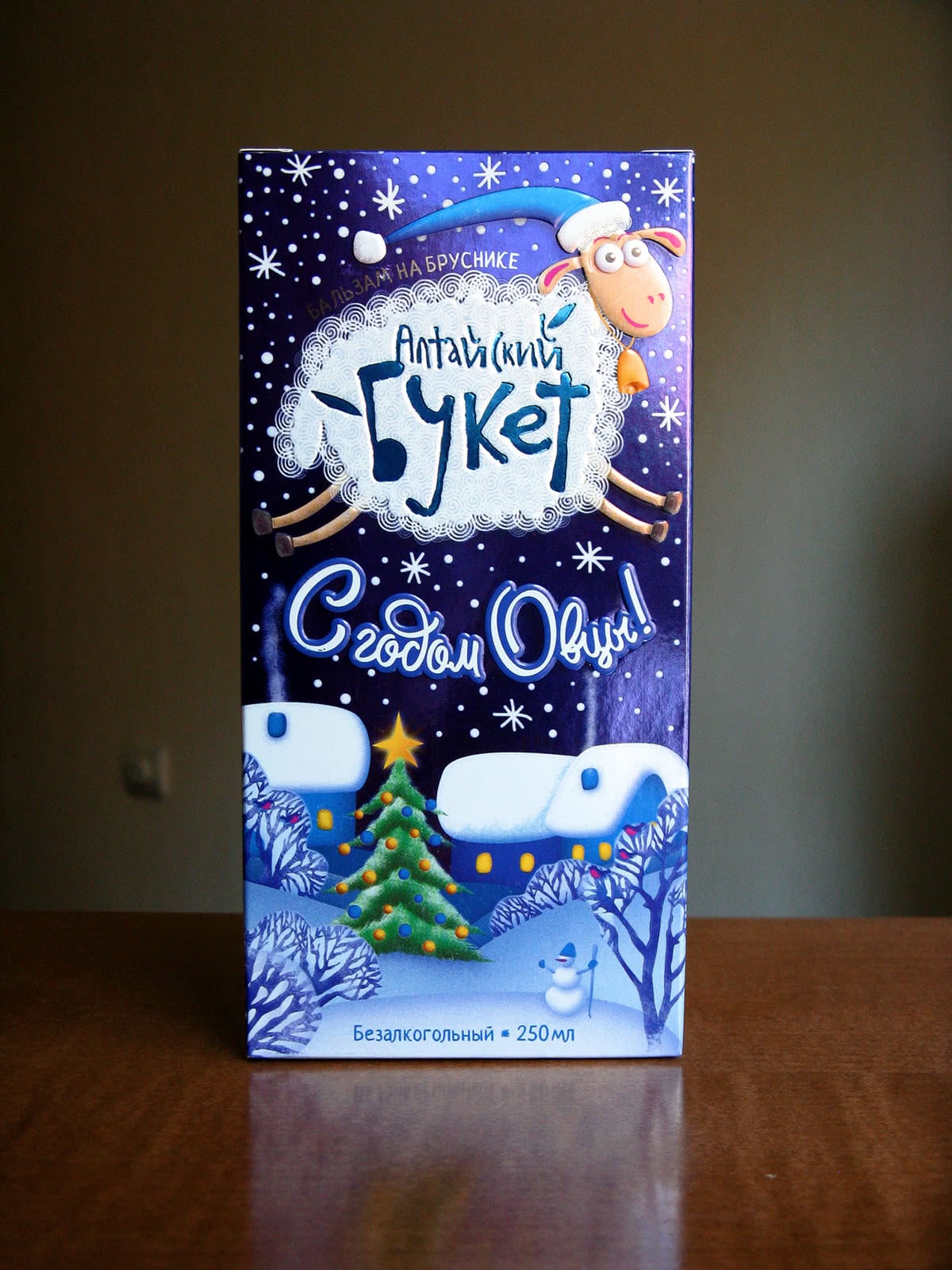
Dmitry Vassiliev designed a set of balsams packagings entirely inspired to Christmas festivity. Snowflakes, snowmen, shivering animals with Christmas dresses and a playful bright graphics make the boxes look hearty and familiar and also make the consumers feel at home.
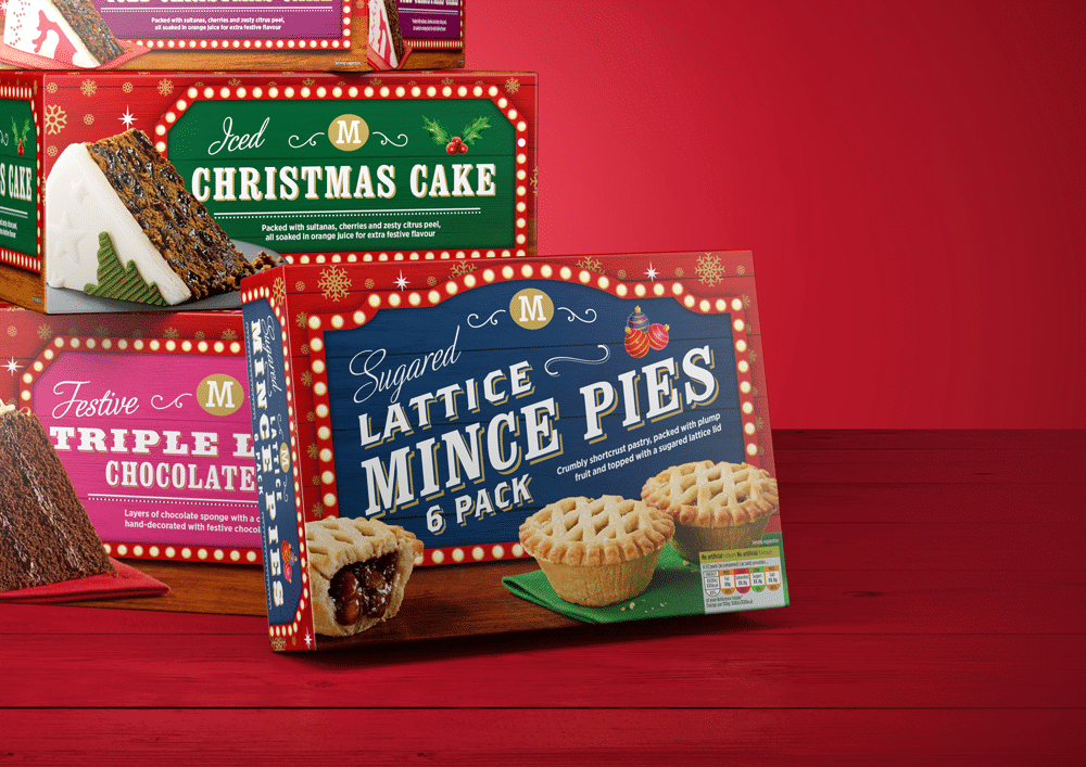
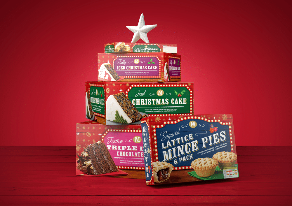
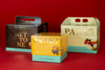
Morrisons commissioned Gary Austin to design new packaging for the line of Christmas products. The packages had to be distinctive and easily identifiable. Austin created boxes with typical Christmas colors (red, green and gold) and a design that doesn’t go unnoticed even if it is strongly traditional.
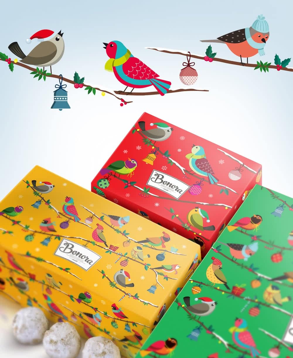
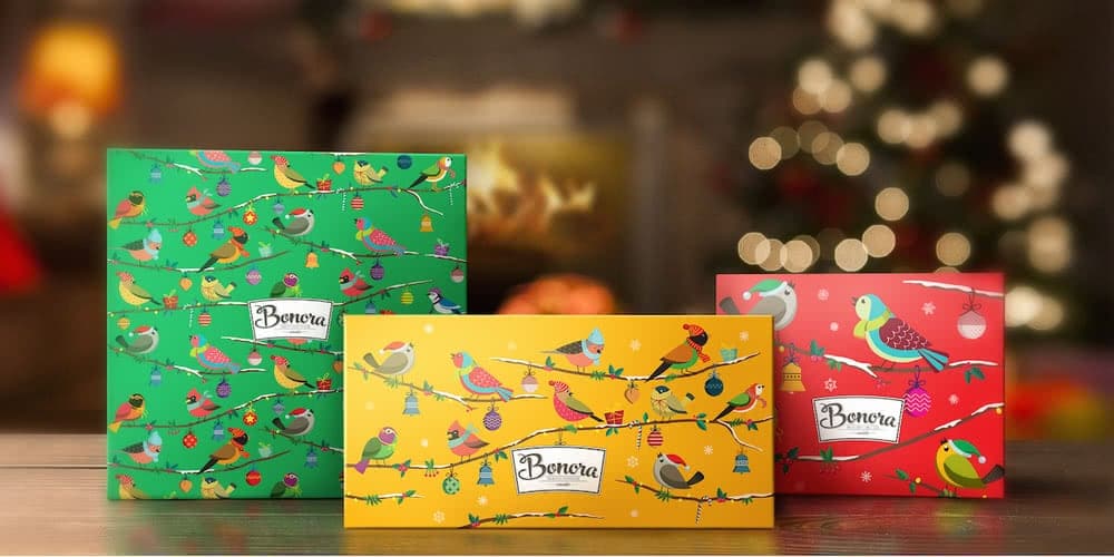
A completely different strategy was used for the Bonora chocolates. A reinterpretation of the traditional graphics created a specific variant for Christmas: the classic Bonora birds wear winter clothing perching on snowy and decorated branches. Continuity with brand image doesn’t change the perception of the products but enhances it with the typical warmth of Christmas time.