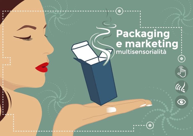


In a world that bombards us with digital technology, sight and hearing are constantly under stimulation. It’s time for brands to engage, not two, but all five sense in order to conquer the consumers’ hearts. The market is becoming more and more competitive. The simultaneous use of images, sounds, smells, materials and flavors in multi-sensory packaging is crucial. This design strategy is what is more commonly known as sensory branding.
By adopting this commercial strategy, the brand creates its own, all-round personal identity. Think about shopping venues that give off delightful scents. Or products that are particularly pleasant to the touch. Imagine, for instance, a packaging that makes an unmistakable sound whenever you open it. All these factors, in truth, help to create lasting bonds with consumers and lead them to choose one product over another. By now it is common knowledge that most purchasing decisions are made on an emotional basis. The more engaging, the more the users will want to recreate the experience and re-purchase the product. The goal of multi-sensory marketing is thus to both establish a relationship with the consumer and boost sales.
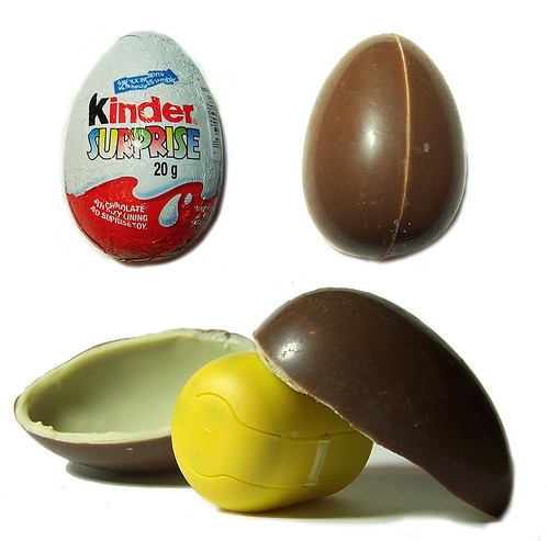
An example? The Kinder Surprise egg! Hearing it’s name is enough to recall the familiar rattling of the surprise within. Not to mention the ritual of splitting it in in halves. With that being said, are you really buying a hollow piece of chocolate, or the experience it allows you to live? In these cases, the recollection, alongside with sensory stimuli, creates a specific corporate image. This kind of image helps both to retain the consumers and to power-up the brand’s recognition.
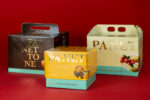
The packaging is the first touch-point between the brand and the consumer. It can, therefore, directly influence his senses. Boxes with certain instructions, those with a distinctive scent or a specific sequence of steps to open them, send continuous messages to the observer until they make it into his sensory memory. Try to recall all the times you stopped to take a better look at a package. Or those times you touched it and really liked the texture or the sound it made upon opening. Unpacking anything can turn into a real ritual. It can surprise and, more often, conquer consumers. This is exactly the concept behind the The Grand Opening project. We looked at it in depth in this blog post.

Sometimes, however, multi-sensory packaging can serve the opposite purpose. That is, to prevent consumers from buying the product. This is the case of cigarette packs that sported the Pantone 448 C color, “drab dark brown”. The color was selected in 2016 as the color for plain tobacco and cigarette packaging in Australia, after market researchers determined that it was the least attractive color in the world. For more information about what happened click here.
Would you like to take a look at more examples of multi-sensory packaging? You can find them in the article “Interactive packaging that engages and conquers consumers“.