


Packaging with Earth-inspired colors was a must-have trend in 2023. Now, halfway through the year, have the promises and expectations been fulfilled?
Colors are nature’s smiles; they speak a universal language and inspire with their various shades. We left off with the trends of the new year in packaging design, understanding how crucial colors, nuances, and details are to capturing attention. Every package becomes a blank canvas upon which to paint and create a unique experience for the consumer. Colors signify creativity and emotion – that’s a fact. They are co-protagonists in all the details that transform packaging into a must-have item; they evoke sensations and convey subtle messages that can be read between the lines
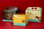
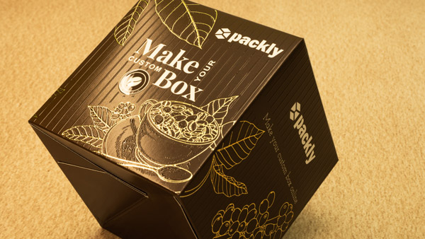
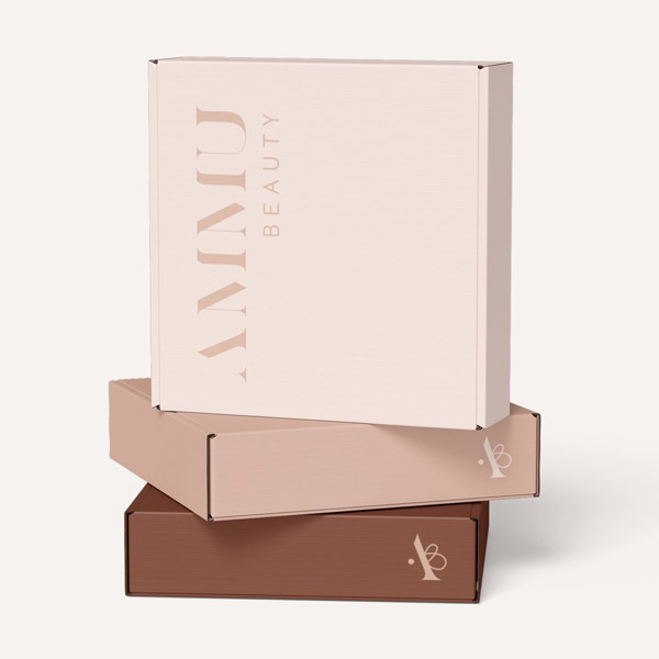
A detail that we encounter almost daily is that linked to the colors of nature, the Earth. Earth-toned colors, among the top 5 trends for the current year, provide an intriguing and authentic option in the world of packaging design. Earthy tones and shades – from warm terracotta to deep browns – conjure images of natural landscapes.
Can you already envision them?
Each color is a stroke of psychological significance that influences the consumer’s mood and guides their decisions. In the crowded aisles of supermarkets, colors become silent messages that lead us to what we desire.
Let me explain why!
The psychology of colors. It’s all its doing! You must know that, much like many aspects of our lives, there’s careful research behind purchasing choices, acting as a bridge between packaging, the mind that decides on that packaging, and the hand that picks up that very packaging.
Your buying process is “programmed,” and no, we’re not living in a simulation where someone else decides for us. In the realm of packaging, colors go far beyond aesthetics; they contribute to shaping the perception of the product and the brand itself. These colors finds a perfect expression in the realm of food packaging, particularly when it comes to products like chocolate or coffee.
The Flavorful Reflection
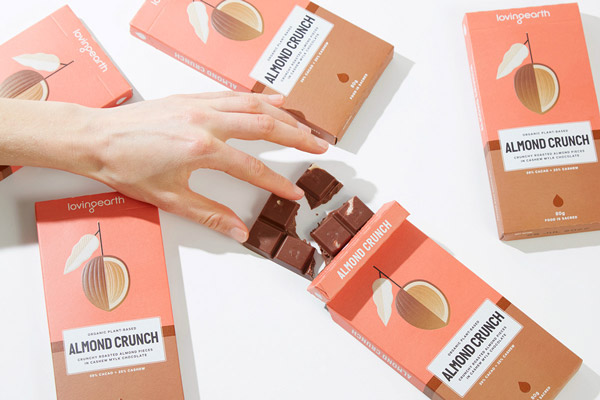
Union of these Earth shades and food packaging is, indeed, a perfect match. Products like chocolate or coffee fully embody this harmony.
Just by looking at the shades of dark chocolate, rich cocoa, and deep coffee brown, you’re already experiencing mouth-watering sensations. Don’t deny it; I know it’s true!
They evoke not only the flavor of these products but also the sensation of pleasure and comfort that often accompanies them. When a consumer gazes at packaging with Earth-inspired colors, they can anticipate a rich and satisfying gustatory experience.
Beyond the Surface: The “Negatives” for packaging with Earth-inspired colors
Amid the symphony of packaging with Earth-inspired colors, even “negative” shades find their place. What am I referring to? The intriguing beauty of:
- Grey
- Rust
Their mysterious and unconventional charm can add depth and contrast to packaging. Often underestimated, grey can create a neutral backdrop that emphasizes the protagonist, while rust adds a touch of timeless sophistication, like a story engraved in the grooves of time.
Conclusions
Earth-inspired colors in packaging design are more than mere shades; they evoke authenticity, a connection to nature’s nostalgia, and the simplicity of well-crafted things. Through careful use of earthy tones, packages become bridges to authentic emotions and tangible sensations. Packaging with Earth-inspired colors is a breath that invites contemplation. It reminds us that beauty resides in the connection with the Earth we tread upon, which nurtures us. The next time you choose packaging with Earth-inspired colors, remember that you’re embarking on a sensory journey into the heart of nature, framed by the touch of human artistry.