Color and packaging: yellow is the symbol of optimism, clarity, transparency, attention, warmth and naturalness. Discover how to best use it in your packaging design with Packly.
Color and packaging: yellow. Today we woud like to talk to you about a color that is a symbol of optimism, clarity, transparency, attention, warmth and authenticity.
Application sectors
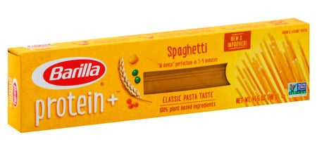
Yellow packaging is very related to food. It is the color of the sun and of wheat. This shade sends a message of authenticity, of a profound link with nature. In many instances it is used as a packaging baseline color by pasta manufacturers.
It is the case with this superfood Barilla spaghetti box, with an improved supply of proteins and ingredients of 100% vegetable origin. The background is warm and enveloping like the sun. The graphic elements are minimal and there is a window revealing the product inside, with no frills. Some nutritional indications are provided that do not upset the general balance and that’s it.
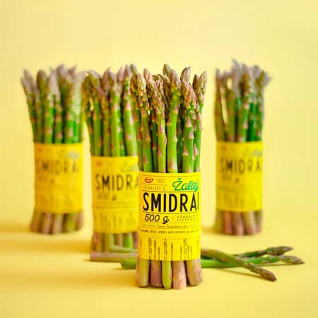
Now let’s move on to a fresh and delicious bunch of cultivated asparagus. Contrasting with the vibrant green of the stems, an unpretentious yellow sleeve was placed to hold them together. We have an indication of the weight alongside the name of the manufacturer. On the lower end of the sleeve we also find a black sketch depicting the asparagus, but in our opinion this element is completely superfluous.
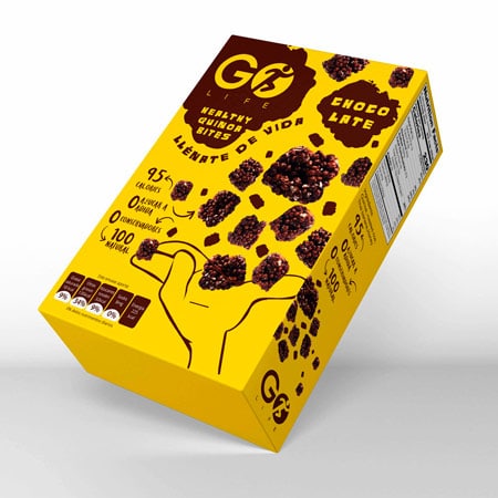
Now let’s move on to another product combining taste and wholesomeness. These are delicious quinoa snacks covered in tantalizing chocolate. Here too, as in the case of Barilla, there is a clear indication of the nutritional values, with very enticing photographic illustrations and a stylized hand catching the snacks. Yellow has the dual function of developing cheerfulness and symbolizing authenticity.
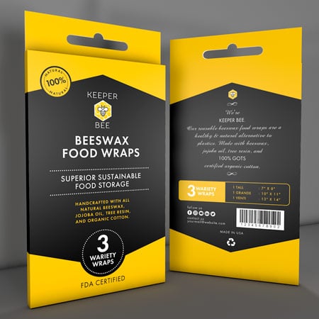
Let’s switch do an adjacent subject. There has been a lot of talk about this 100% natural food film made with beeswax. It’s an extremely interesting answer to the issue of polluting packaging and the need to produce compostable waste. The graphics are stunning in their essential elegance. The symbol of a bee inside a hexagon that recalls the beehive, the yellow and black colors like the busy insect indispensable for life. Nothing else is needed to solve the design.
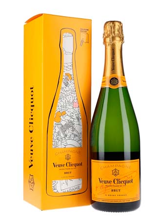
From eating we get to drinking. We want to showcase the beautiful packaging of one of the most classic French champagnes. The yellow tending to ocher recalls the color of the golden grapes, which constitute the raw material, but it is also the tint of gold, of royalty, of celebration. It is a special box inside which there is a vintage-themed poster to color. A virtuous example of reusable packaging and gamification.
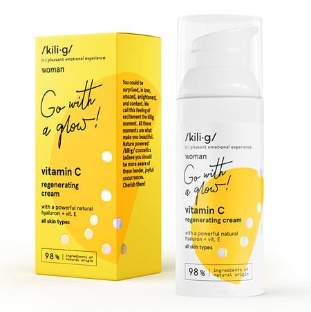
Now let’s move on to cosmetics. Let’s take a look at the packaging of a vitamin-rich regenerating cream, communicating a sense of modernity, positivity and energy. The mood is sparkling and it is embellished with some nice iridescent bubbles and a typeface similar to cursive writing, very young and witty.
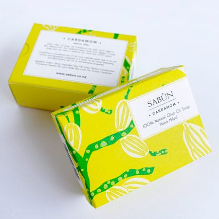
A hand-made olive oil soap follows this baseline, but uses more of a lime shade. The background features a naive sketch of olive branches, with the stylized juicy fruits in plain sight. The label is marginal and non-invasive and enhances the general ensemble in a simple but classy way through minimal and old-fashioned typefaces.
Conclusion
Yellow resonates with all age groups. It is the non-conformist color par excellence and it adapts both to contemporary and traditional graphics. Do you also have a particularly crackling product to pack that yellow would bring out in the right way? Create a prototype with Packly. You can also come up with different versions and do an A / B test. There are no minimum quantity requirements, We await your orders, which we will turn around as soon as possible!
