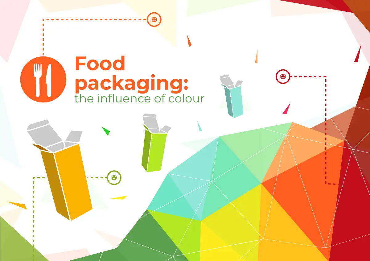


Food packaging is one of the key elements for the success of food products as it directly and actively influences their sale. The food industry, in fact, is full of numerous similar, if not identical, items: similar types of pasta, chocolate bars with varying percentages of cocoa, breakfast cereal. Products are often distinguishable through the box alone.
Precisely for this reason, the creation of food packaging has always required numerous design and communication efforts. Studies ranging from choosing the right form of transport and consumption to research on the visual perception of a product based on the appearance of the package and its colours.
In the articles “The psychology of colour” and “Why packaging colours influence consumer purchases“, we have already discussed the influence that colour perception has on our brain. In this post, we decided to analyze specifically what graphic and marketing choices are behind the design of food packaging.
Graphic designs, both printed and unprinted, are made using colours chosen specifically to arouse certain emotions and associations in the observer’s mind. Each industry usually distinguishes itself by the predominance of certain colours depending on their effects on the observers. Generally, food stores mainly feature products and packagings with warm shades. And it is no coincidence. In fact, huge food labels spend millions yearly to carry out tests on the effect of colours on consumers.
The choice of colours can influence choices both mentally and physiologically: some of them can even stimulate the appetite. Below is a list of the most popular colours for food packaging alongside the description of the sensations associated with them.
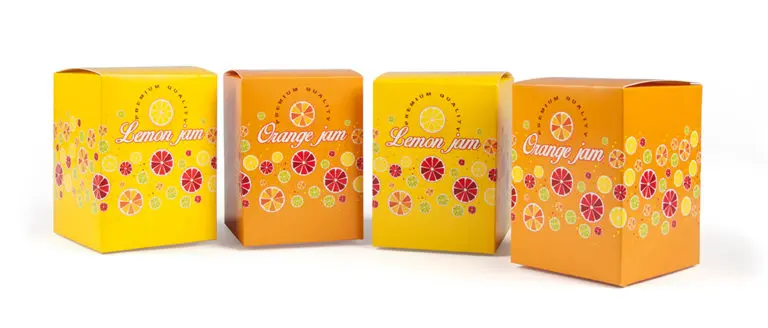
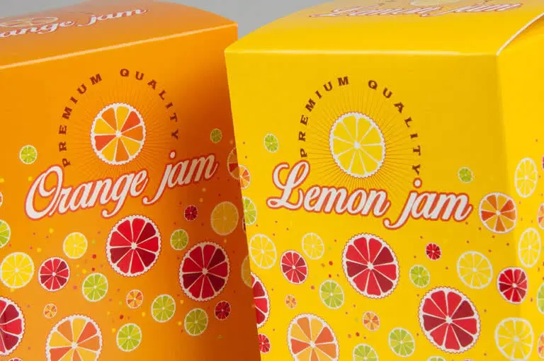
As anticipated, the ideal colours for food packaging are the warm ones, mainly: red, orange, yellow and brown.
Red is considered one of the most dynamic and stimulating colours, it is often used for its proven influence on appetite; the same applies to orange, which enjoys high visibility and at the same time evokes feelings of health and vitality; while yellow, a fruity and energetic colour is often associated with warmth and authenticity.
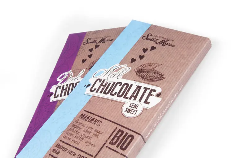
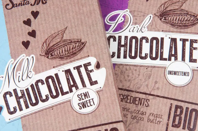
Brown, the colour of the earth, is also linked to authenticity and simplicity. It’s a traditional and rustic colour. If tending towards red it can recall feelings of warmth and pleasantness, while it’s colder hues evoke humility and austerity.
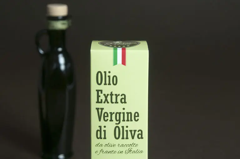
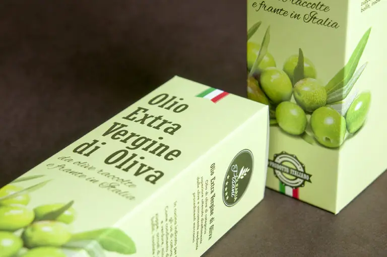
Green is also widely used. Since it recalls nature, it often arouses feelings of calm and relaxation. It’s often used for packaging containing organic or plant-based foods.
Blue is one of the least inviting colours, in terms of appetite, because in nature there are not many foods of this colour. Nevertheless, it is widely used for its calming and reassuring aspects. It evokes feelings of freshness, cleanliness, and authenticity. It is also very elegant and sober. Many products with a fresh and natural taste are packaged in blue or light blue packaging.
White, a pure and clean colour, is particularly suitable for foods that are “light”, genuine, free of additives and are low in fat. It is often used for cheeses and dairy products or for low-calorie snacks.
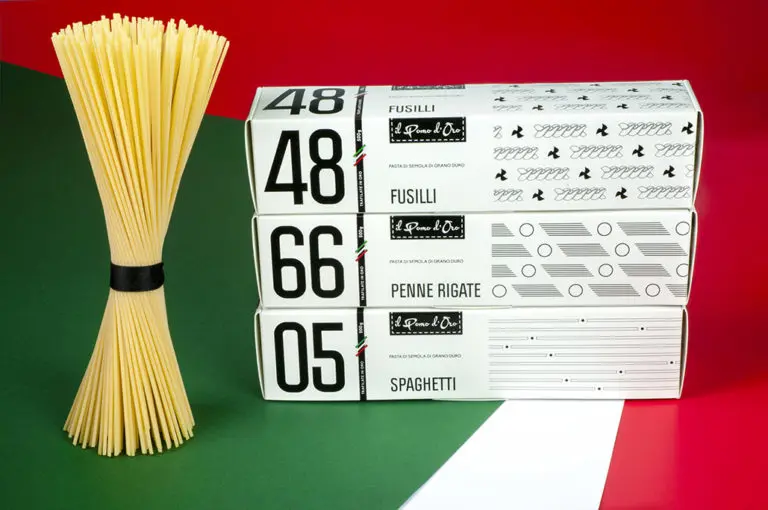
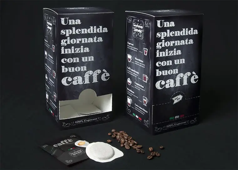
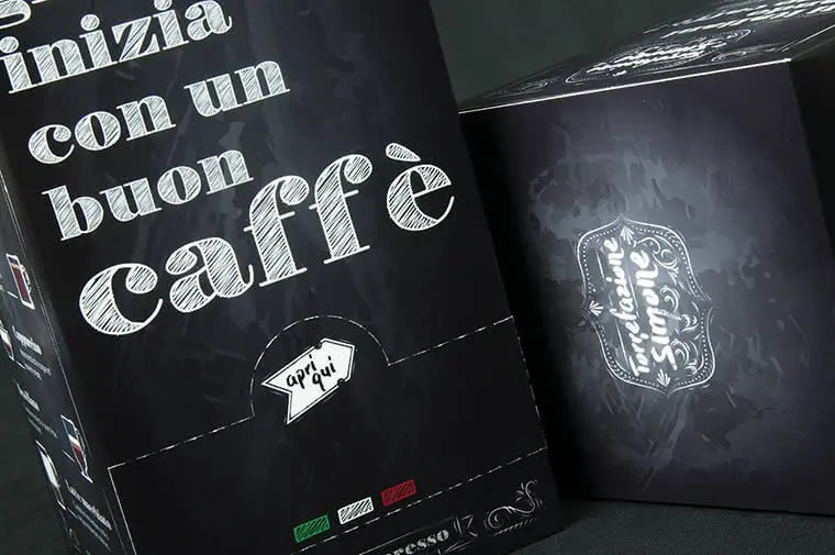
In packaging, black, together with gold and silver, is elegant enough to increase the value of the product by enhancing its image. Its use is frequent in coffee and waffle boxes, in dark chocolate packs and also in high-end foods such as truffles and their derivatives.
It’s important to note that the choice of the hue also depends on another important factor: the overall environment of the store.
The story of any food can be told through its colour, which is why its choice is of paramount importance. Everything must be carefully studied in order to send an adequate message and capture the attention of customers. It’s one of the many ways to ensure the success of your product.
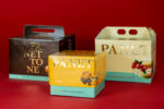
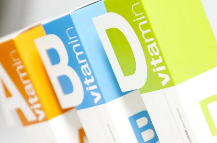
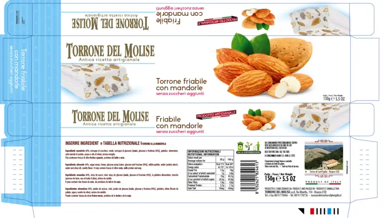
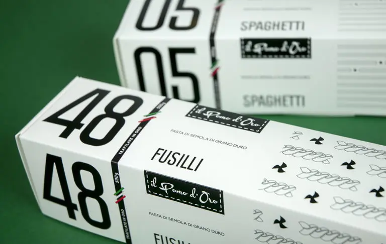
Oh, and by the way, all of the packagings shown in the photos above were made with Packly.