


Colour is light, everyone heard it a million times. Colour, in fact, is the visual perception generated by our brain after receiving nerve impulses sent by photoreceptors that absorbed electromagnetic radiation of light.
Any colour is characterised by a frequency of the visible electromagnetic spectrum. All these frequencies together generate light – perceived as white – that, while hitting a body, can be absorbed or reflected, partially or totally. When a body absorbs all the light frequencies it will be perceived by human eye as black, while reflecting all of them we will see white colour. Refraction of one or more light frequencies gives life to colours.
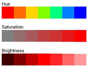
Colours can be broken down into the following basic components: hue, saturation and brightness:
- hue represents the pure colour generated from just one wavelenght, that turns into tints with no white or black added;
- saturation is determined by the light intensity of a colour, by its purity;
- brightness refers to the quantity of black or white added in a colour instead.
In the art field colours have been classified based on specific features:
the 3 primary colours are divided in subtractive (cyan, magenta and yellow) and additive colours (red, green and blue) and, once mixed, they give life to all other colours, including the neutral ones, made of the same percentage of primary colours; warm colours (like: red, orange and yellow), that seem to get close to observer, giving a warm feeling, and the cold ones (green, blue,violet) that create a distance, appearing far away. According to colour psychology, cold and warm hues generate specific emotional reactions to the observers: blue is usually associated to feelings of calm, quiet and peace bringing you into relax, red is exciting and energizing instead.
Colour combination has always been an important topic that gave life to different theories supported by techniques and tools that are still very used today.
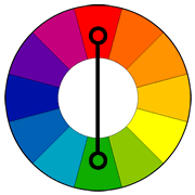
Among them, one of the most important is the colour wheel, originally developed by Newton and composed, in its most common shape, of 12 colours, divided into warm and cold. The wheel is a guide to obtain harmonious and lovely colour combination, of two or more colours, based on a fixed relationship.
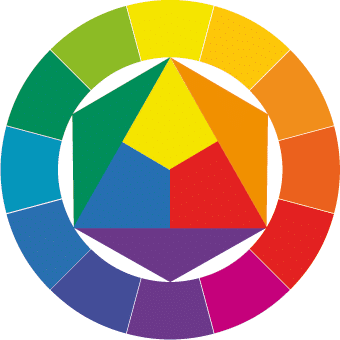 Colour wheel (Farbkreis), Johannes Itten.
When using just one colour shade, in its several values (brightness level), it’s about monochromatic combinations, unitary and balanced, that, if correctly used, will generate very interesting visual results.
 Monochromatic scheme.
Instead, when using tints composed of a common colour we refer to compositions of analogous colours. Those one, being similar, tend to blend with each other, creating a peaceful feel.
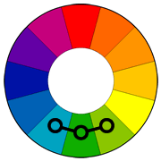 Analogous colours.
Tints across from each other on the wheel are referred to as complementary colours. Their use gives a lively effect that draws the attention, thus complementary colours, if side by side, stand out and seem to vibrate. That’s why you have to carefully use them, trying not to generate a disharmonic effect; in addition, they are not supposed to be used for texts.
 Complementary-colours.
We will go through the various chromatic contrasts in a future article.