


Packaging and limited editions. When the touch of an artist renews the packaging of famous products turning them into masterpieces
Packaging and limited editions. It is fairly common for the packaging of famous products, especially in the luxury or food sector, to undergo more or less frequent revisiting and restyling. Today we will show you several examples that have turned into real collector’s pieces thanks to the contribution of exceptional artists and designers.
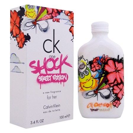
Packaging and limited editions: The One by CK
Let’s start with a classic: the perfume The One by Calvin Klein. The cardboard box is essential and minimal in itself. We find a timeless white background with black stylized typefaces. This packaging is designed to overcome time and fashion and remain etched in the memory of consumers. Every now and then, however, imagination must be stimulated and creativity refreshed, to try to extend the target audience and awaken the interest of new buyers.
Here the disruptive flair of a street writer is superimposed on Calvin Klein’s minimal approach in an explosive mix. Bright colors, with the fluorescent pink being the master. New graphemes and a style suitable for millennials or even for generation Z, because it uses their symbolism and their language. Please admire the special edition of CK’s The One curated by Miss 163, aka Sharon de la Cruz, a street artist in Bronx, NY.
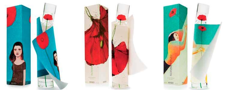
Limited edition for Flower by Kenzo
The timeless inclined bottle of Flower by Kenzo has been multiplied by three. In 2006 the packaging was revisited by Rebecca Dautremer, Lorenzo Mattotti and Pierrer Mornet. The basic element is the symbolic and notorious red poppy.
In the first version the flower is upside down with the stem that is about to be cut off from the corolla, letting all the black pistils get dispersed in the air, corresponding to as many scented notes of the famous essence. The second version, instead, introduces a water-green background with two united but distant lovers holding out their hands sharing the red flower, a symbol of sensuality and love. In the third version the painted face of a woman appears, with a style vaguely reminiscent of Gauguin. Her gaze is absent-minded and intense at the same time. In the background we find a pervasive turquoise, which contrasts with the red of the theme and enhances the charm and romanticism of the iconography.
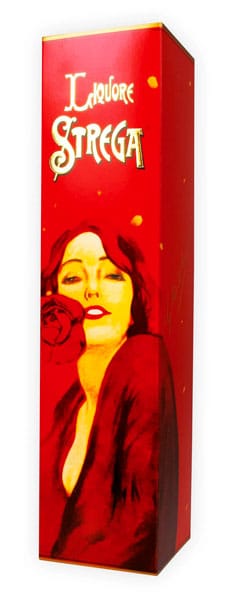
The powerful box of the Strega liqueur
Marcello Dudovich was a renowned painter and poster artist who interpreted numerous atmospheres through thin, haughty but sensual women. This is the case of this special vintage package for the famous Liquore Strega. We see a girl who wraps herself up in her dressing gown between allusive signs, a red rose on her mouth, a sparkling mood, her smile as a promise to bewitch consumers. The result was a vermilion red package, elegant but seductive, decidedly intended for connoisseurs and design lovers.
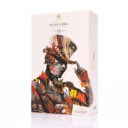
Johnny Walker revisited by a writer
Tristan Eaton, born in 1978, is another Los Angeles street artist called to renew the packaging of the legendary Johnny Walker whiskey.
The traditional English baronet with cylinder and walking stick becomes a mixture of textures, characters, hues and contaminations in a collage style, to form a modern, multifaceted, young and irreverent yet brilliant image, resolved in its balance and unchanged elegance.
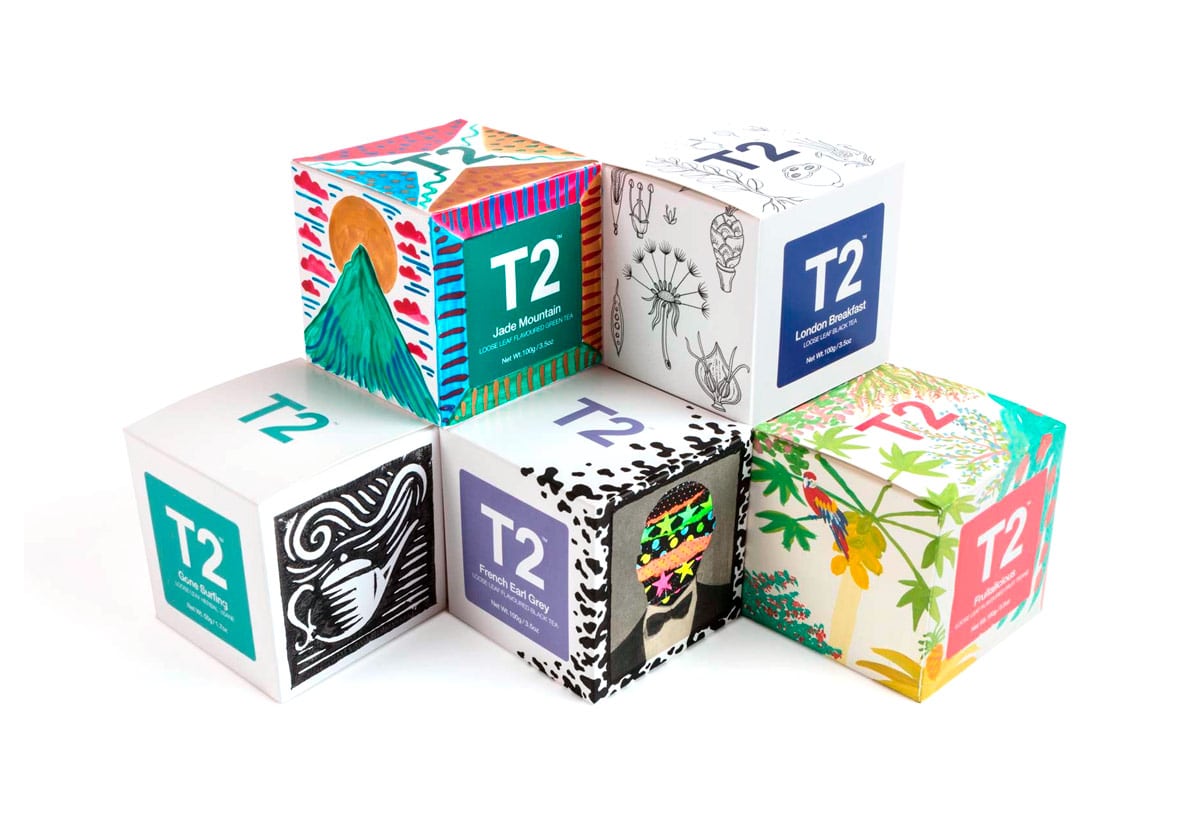
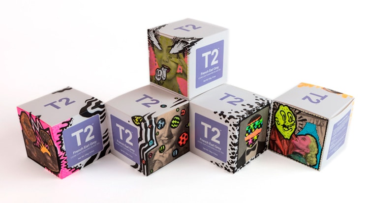
T2 tea: limited editions of packaging
Let’s linger on the British culture with the timeless five o’clock tea. T2 promises to integrate differences and enhance diversity while sipping a hot cup of English tea. The iconic orange cube-shaped packaging will be replaced by a white version on which different artists will take turns to draw the sensations generated in them by the different blends they tasted. The results? Diametrically opposed but equally effective and stunning. More than ever here, the images speak for themselves.
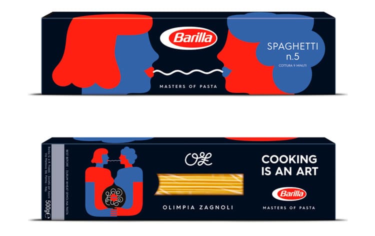
Barilla: the Olimpia Zagnoli limited edition
Barilla has hired the illustrator Olimpia Zagnoli to design new packs of pasta reflecting on the themes of equality and gender fluidity.
Zagnoli’s design portrays two women, probably lovers, who share a plate of spaghetti late at night. It is a form of direct and evocative expression, as well as a celebration of creativity and freedom that unite different fields such as art, food and civil rights.
The illustration, based on simple lines, is characterized by the strong and contrasting colors taking over the blue background typical of Barilla. It was difficult to improve such brilliant packaging, but they managed anyway.
Conclusion
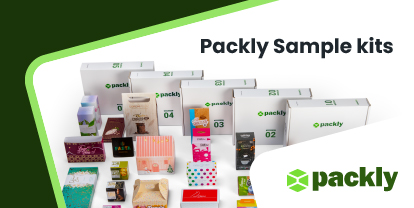
Are you thinking of that artist you always loved, of that illustration that has remained in your heart, hence you would like to create a contamination, a free inspiration to use for your packaging? Easily done. Build a prototype now. There are no limits to the imagination and the number of pieces you can order: even one is enough. We will turn your idea into reality and deliver it conveniently to you. Packly is your trusted partner!