Packaging design mistakes. Let’s find out the 5 flaws to avoid for a truly successful packaging with Packly.
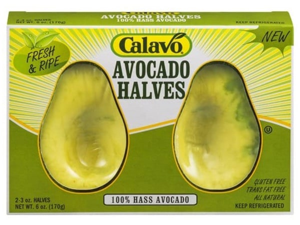
Packaging design mistakes. As a matter of fact, everyone has made some, even the big brands. For example we had already told you about the restyling by Tropicana. Today we would like to expand the topic and help you design a silver bullet packaging. Are you ready? Let’s go.
1. Ignoring the KISS – the first packaging design mistake
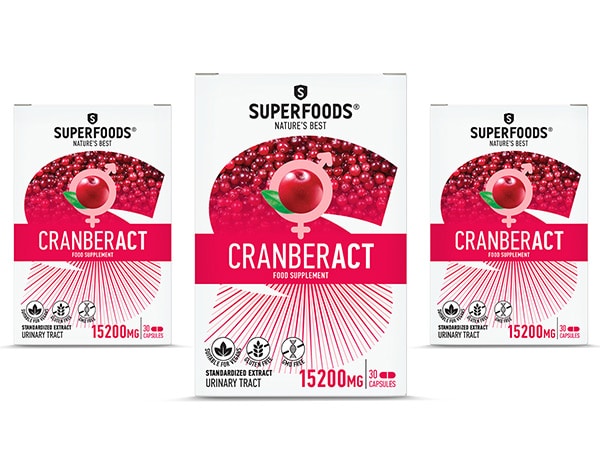
No, we’re not talking about Licia and the Bee Hives cartoon from the 80s. Kiss is an English acronym representing a design mantra in all its forms. The acronym indeed stands for Keep It Simple Stupid. The key to successful packaging is always essentiality, not to be confused with minimalism. The user does not want to puzzle over to understand packaging. The interaction must be simple, immediate. If we ask our buyer to make too many inferences, they will tire and leave us for a competitor.
2. Focus on aesthetics – beautiful and impossible
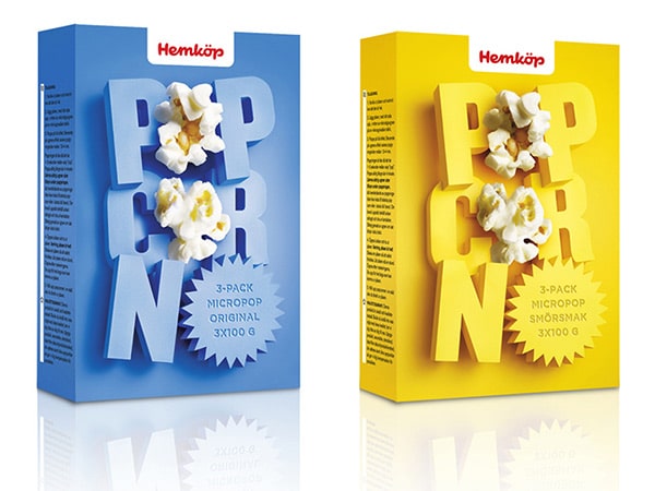
Beauty plays a role, but not as a protagonist. A frequent error by creatives is to prioritize aesthetics over functionality. To clarify, we are not telling you that the ideal packaging is plain or insignificant. However, the focus must always remain on usability. Stunning packaging sacrificing protection and product presentation will most likely fail. There are many effective ways to combine visual impact and ease of use. Check out our inspirations.
3. Choosing the wrong material – the costly mistake
The golden rule is to choose the packaging material based on the final product. Packly offers both flat and corrugated cardboard. The latter is preferable for bulky or fragile product packaging. The storage process and shipment should also come into the picture for the design process. Just select the right sizing and avoid polluting additions. The rest will follow.
4. Creating waste – the hidden mistake of packaging design
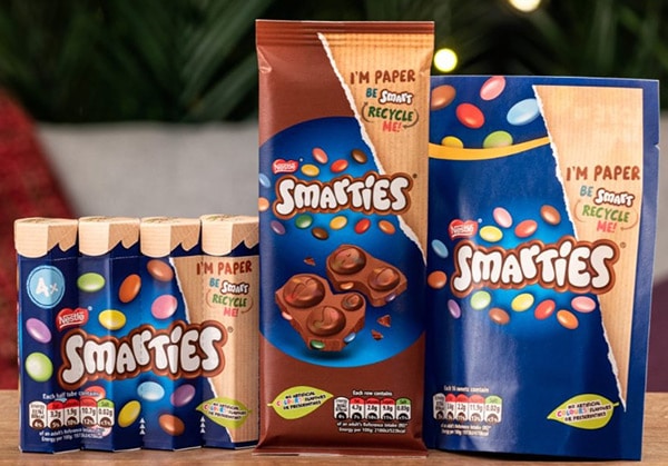
The box dimensions need to be based on the specific product features. You should always avoid exceed packagin. Also it should not entail bulky fillers or multiple materials. The use of versatile models, cutouts and inserts for space optimization helps a lot. Depending on what you intend to pack, you should choose a single medium, whenever possible. This will greatly facilitate the disposal phase.
5. Labeling – if incomplete packaging design does not work
As we anticipated above, you must provide all the information not only on the product, but also on how to dispose of the packaging itself. Meanwhile, an Italian law on environmental labeling recently came into force, and you should always abide by it. We at Packly had certainly already spilled all the details in a dedicated post.
Conclusion
In short, do you need to launch a new product or redesign packaging to improve it? Firstly, choose a model from our catalog with millions of possible combinations. Secondly, apply the principles we listed above. Lastly, choose the graphics and finishes viewable in 3D and that’s it. You can print it yourself or we will do it for you, even a single copy. What more could you ask for?
