


Tropicana restyling: a drastic change in packaging that caused a sharp drop in sales, forcing the company to a sudden u-turn.
Tropicana restyling, or one of the most interesting cases of packaging transformation without a happy ending. Nonetheless, this example demonstrates once again how packaging and design are instrumental to the success of a product, hence their basic rules cannot be upset. In addition, testing with your target audience is a winning strategy that ensures savings and maximizes profits. Let’s learn from these 5 mistakes and make the most of all the possibilities offered by Packly for bombproof packaging.
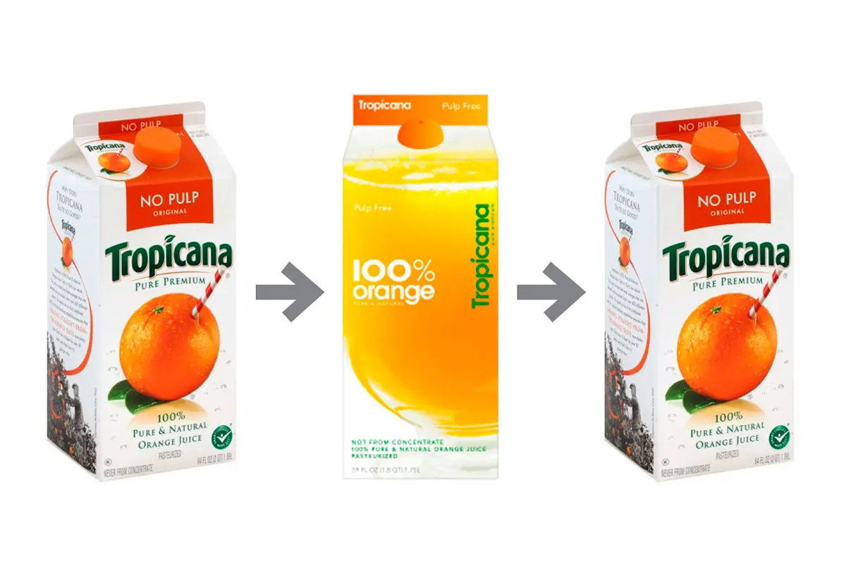
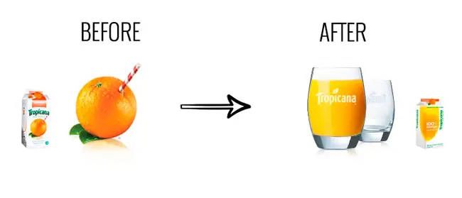
It is 2009 when the famous Tropicana orange juice brand entrusts an important marketing agency with the packaging redesign for their flagship product. The assumption from the creative team is that the look and feel of the Tropicana packaging was dated and a little obvious. They therefore decided to make it more allusive, elegant, metaphysical and contemporary.
There would be nothing wrong with the intent itself. In doing this, however, major errors were made in the graphic treatment that caused 20 million dollar losses in the first two weeks from the product launch, thus forcing the company to return to the previous version. Let’s see why.
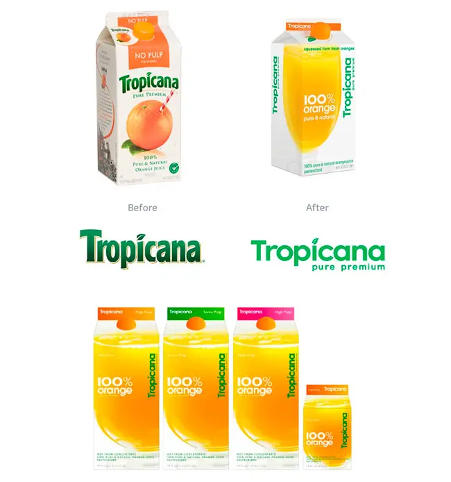
1. The Tropicana logo after restyling
The Tropicana logo font has been thinned out and shrunk, which would not necessarily be a problem in itself. The big oversight was making the orientation vertical. When we are in the supermarket aisle choosing products, it is difficult to correctly read writing perpendicular to our visual angle, unless we have the articulated neck of a flamingo. The logo must be legible and prominent, regardless of other choices such as font and color, which however in this case had been preserved fairly well.
2. The main graphic element
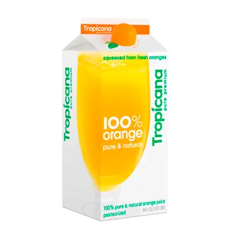
The distinctive element for Tropicana juice packaging was the central orange skewered by the straw. Of course one could argue that it wasn’t tremendously original or innovative, but it worked at a glance for memorability. This unmistakable item has been replaced by a glass of orange juice, not immediately recognizable, positioned not in front of the observer, but printed in an extended format on two sides. The result was that if you didn’t look at it from the right perspective, the image was reduced to an indistinct spot of color. Of course, for once they wanted to portray the real product, therefore the juice and not the raw material, but the visual impact was low and the realization was cumbersome.
3. Distinctive product information
On the previous Tropicana juice package the wording “no pulp” stood out. Evidently for a large portion of consumers, the fact that the juice was velvety and did not contain fruit strands was a decisive factor for the purchase. This information, which was previously highly distinctive, was made secondary and hardly visible. You need to keep in mind what are the data influencing the choice of final buyers and highlight them correctly.
4. The package functionality
A very nice design, which in this case had been obtained, can do nothing against functionality. The life of the buyer was made more difficult by the lack of clarity in the principal design elements. The orange that we reference at point 2 has been moved to the cap on top, taking on its shape and appearance. Let’s ponder for a moment though. Does a highly functional element need to be modified with such a complex shape and texture as that of real orange? The answer is no, plus production costs have skyrocketed.
5. The reference consumer test
Tropicana’s restyling, despite involving an investment of 35 million dollars, was conducted and finalized without subjecting any design alterations to the judgment of reference consumers. In fact, there was no prior knowledge of what worked in the old layout nor how the restyling would resonate with buyers. A serious mistake considering that focus groups can be easily conducted both in presence and through a simple online survey. The ratio between cost and benefit of such an operation leans decisively in favor of the pros.
Conclusions
Tropicana restyling helped us understand the essential laws of packaging design. Particular emphasis should be placed on the testing phase. Packly is your privileged partner, because it allows you to create one or more prototypes, without minimum orders, and do all the needed experimentint before the final launch. Ready? We await your projects!