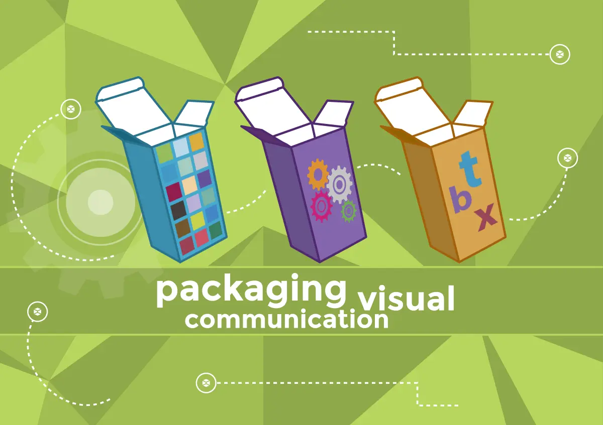
Visual communication is vital in packaging. Wikipedia defines visual communication as the “conveyance of ideas and information in forms that one can see”.
“The SAGE Handbook of Political Communication” claims that the human brain can process images 60,000 times faster than words.
Albert Mehrabian, a psychologist at UCLA University, claims that 90% of the information we process is visual. It comes as no surprise that well-designed packaging has a lot of potential in terms of visual communication.
When launching a new product most marketers rely on verbal communication. Packaging design, however, requires a mainly visual approach.
The packaging is often the last link in a long communication chain that exploits many channels. Advertising promotes the product and attracts customers to the stores. Whereas packaging is the only physical element of contact between consumers and the brand. Therefore, it is packaging that has the final say in convincing potential customers.
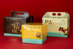
Good visual communication in packaging is adopting a unique design to foster the brand’s awareness in a competitive environment. Creating a mix of unique elements can make a product distinguishable at a glance. Play with the combination of colors, graphics, symbols, and fonts. This is the secret of visual design and can generate a big competitive advantage.
In one of his books Riccardo Falcinelli, a famous Italian designer, claims that packaging can show a product’s soul and history. Its design can become so distinctive that sometimes it can identify the product itself. Packaging, therefore, becomes one with the product and its brand. Consumers will identify a packaging even just by shape or a combination of colors.
We can’t help but consider the examples of Coca-cola (“share a coke”), Nutella (“you are Nutella”) and Starbucks. These companies have promoted debranding and packaging customization campaigns by replacing their logos with the names of ordinary people. Despite all this, the packaging continued to be unmistakable.
