Let’s take a look at 10 packaging design ideas that use typography as an essential means for communication.
The graphical presentation is crucial in packaging and makes it an excellent marketing tool. For instance, just think about emotional packaging. However, when we think about the graphical aspects of packaging, we imagine boxes covered in photographs, illustrations, and colors that anticipate their contents or, at worst, fill empty spaces.
Typography and lettering are often fundamental elements that we should never underestimate in the design phase. In fact, if used correctly and creatively, it can become a key element to increase the communicative effectiveness of the packaging, strengthen the corporate identity and showcase the brand and its values. To use fonts effectively, one, therefore, needs to gain a deep understanding of their history and the sensations they can convey to the end-user. Packaging should reference its content and do its best to convey the right message to the consumer, it shouldn’t, however, be crammed with unnecessary clutter that could mislead and distract. The typeface, if chosen appropriately, can, therefore, become the protagonist of a package and make it extremely successful.
Many brands have used lettering on their packaging to modernize the corporate image, while others preferred to mix it with shapes and colors to obtain creative designs. Get inspired by the examples below.
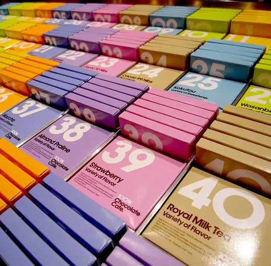
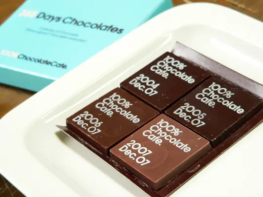
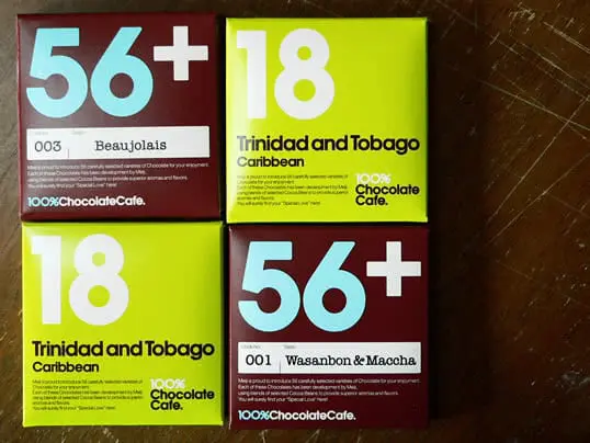
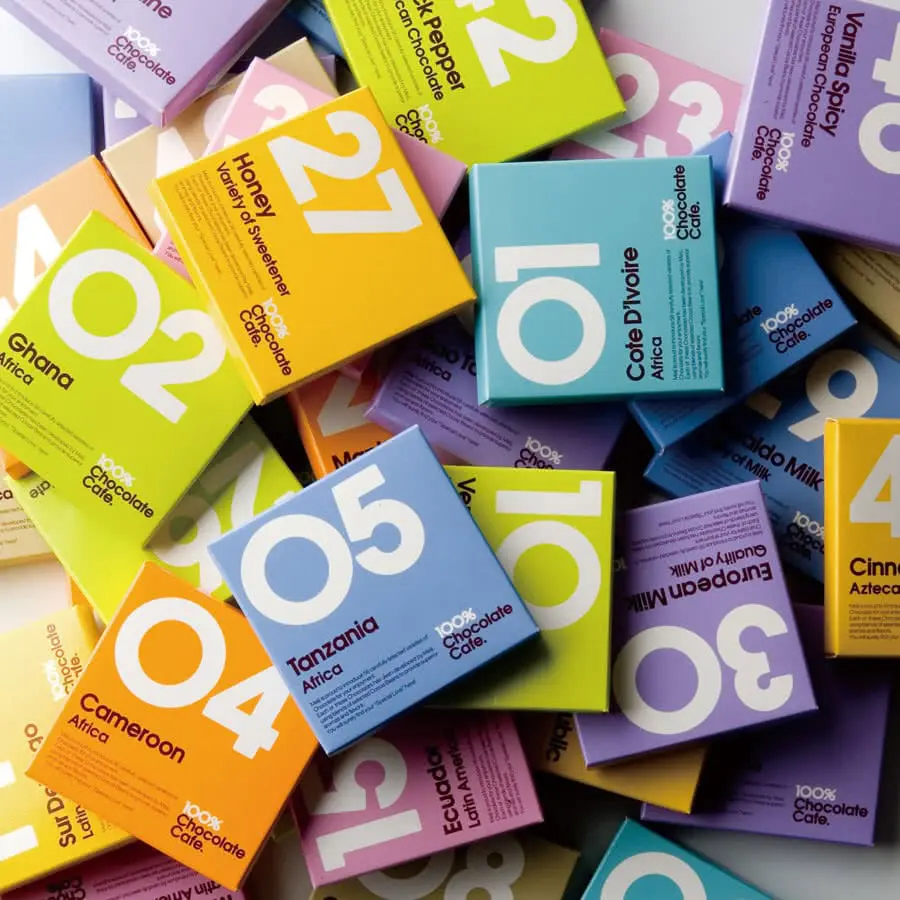
100% Chocolate Cafe’s chocolate boxes.
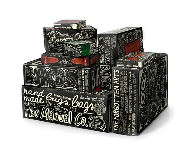
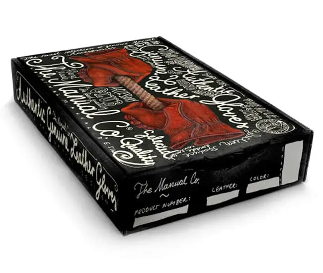
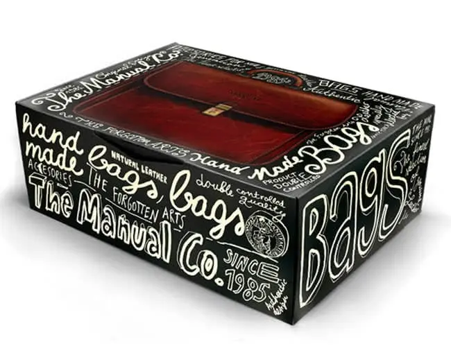
Leather accessory boxes by The Manual Co.
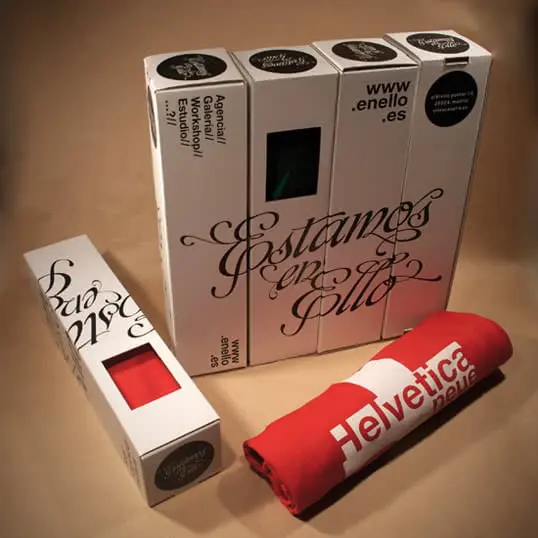
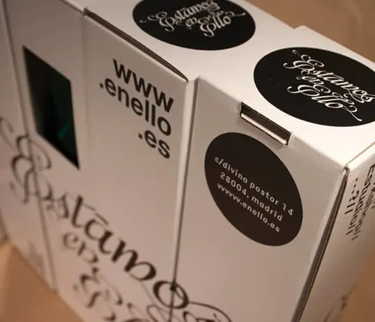
T-shirt packaging by Estamos en Ello.
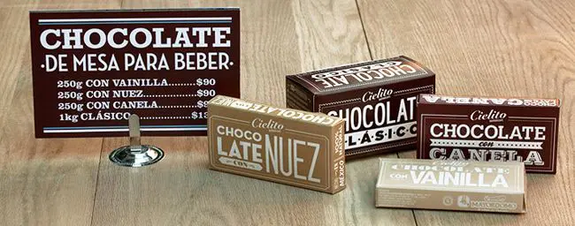
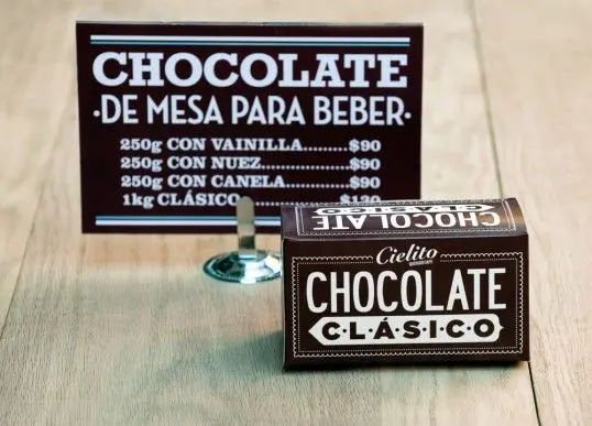
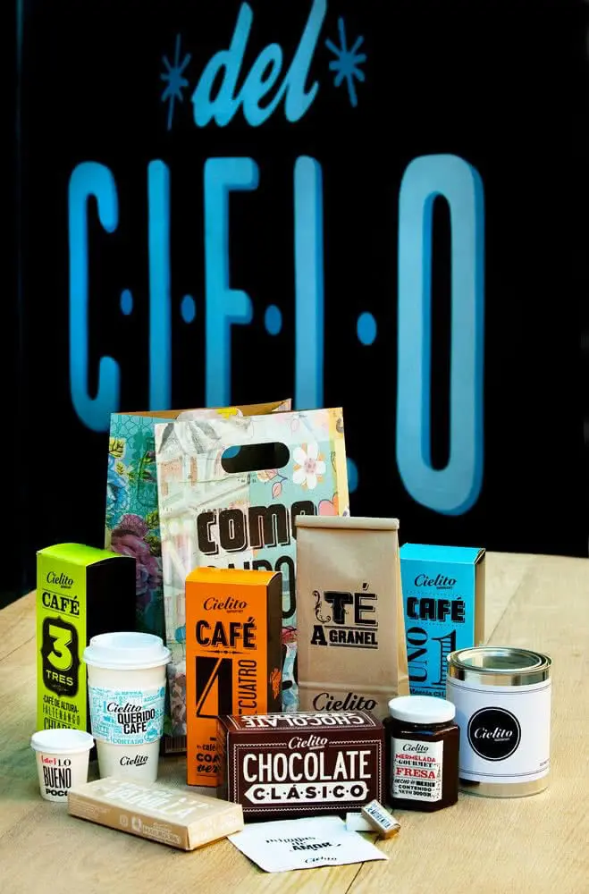
Cielito food packaging.
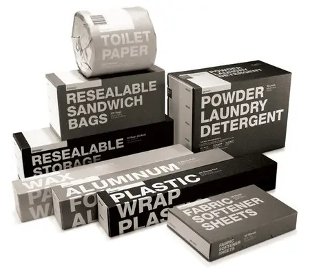
Household product packaging by Jesse Kirsch.
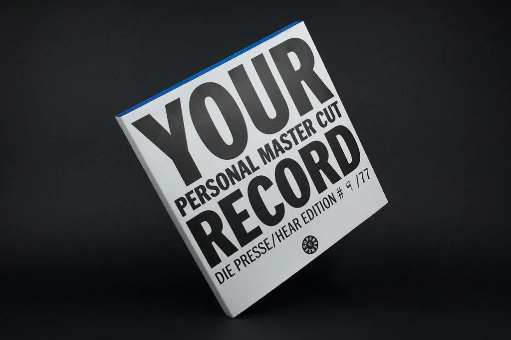
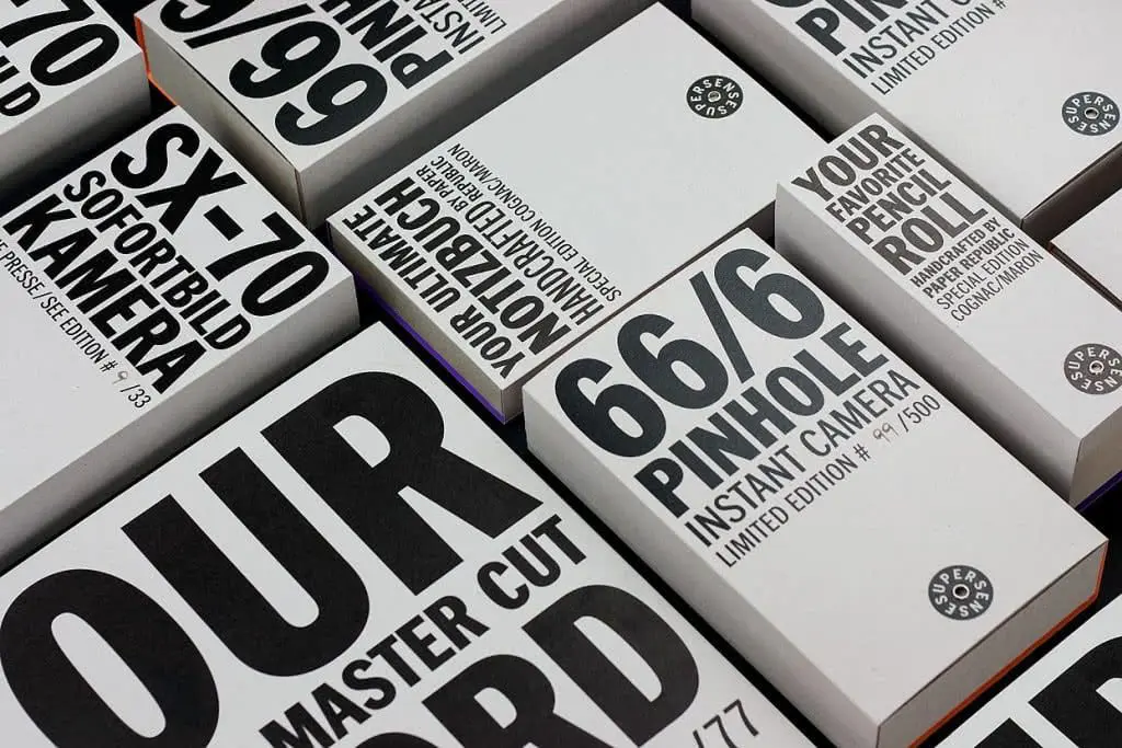
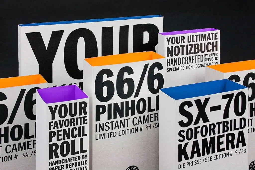
Boxes for Supersense photographic accessories.
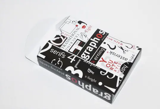
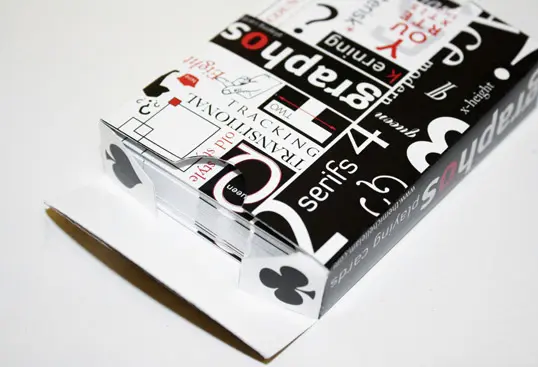
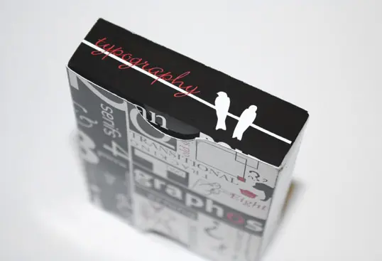
Boxes for Graphos playing cards.
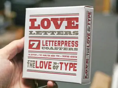
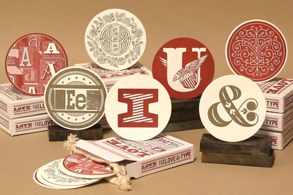
Love Letters typographic packaging.
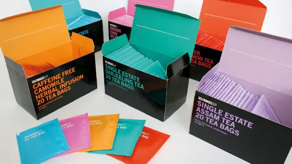
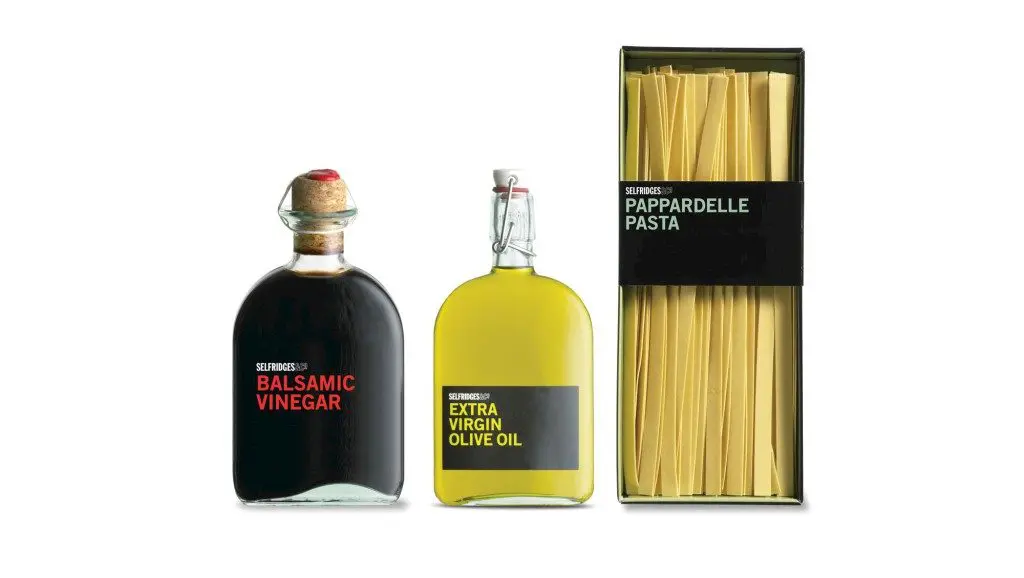
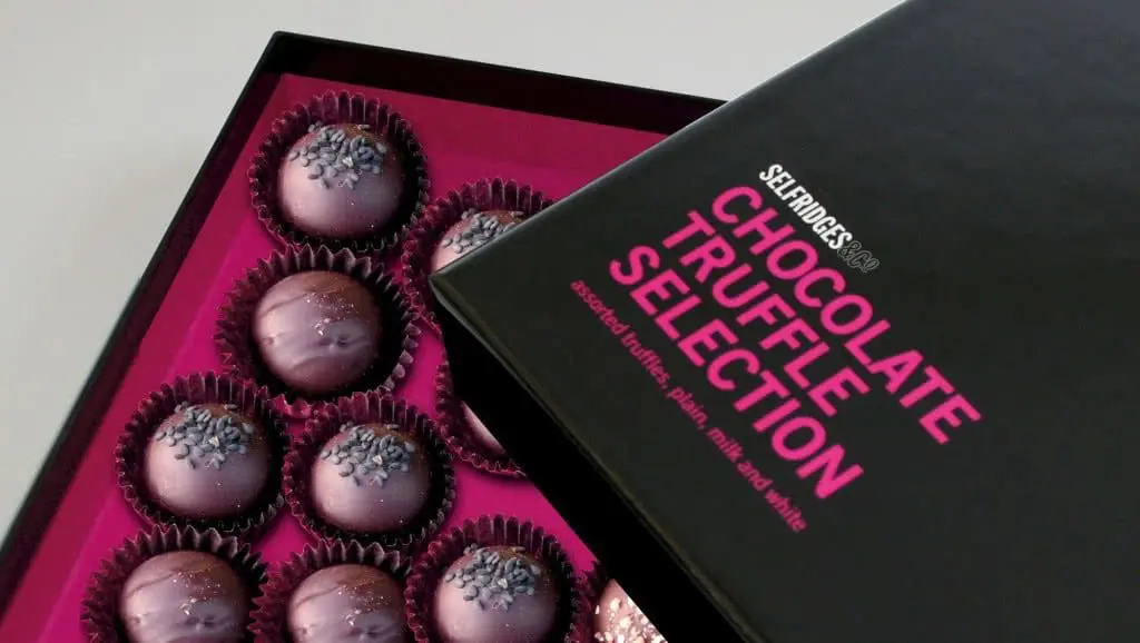
A set of Selfridges food boxes.
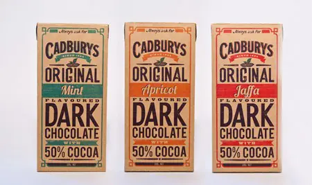
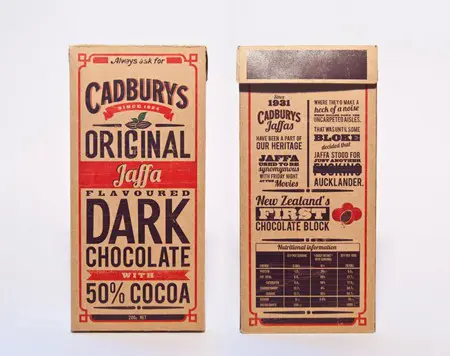
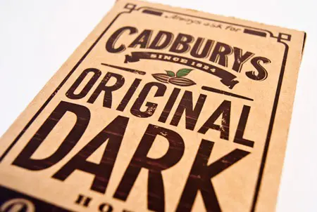
Cadburys chocolate packaging.
