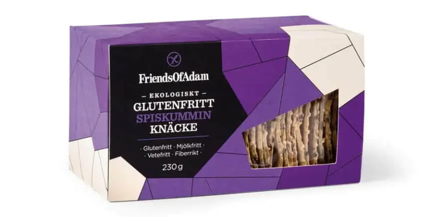
In our article “Packaging: the 5 trends to keep an eye on in 2016” we anticipated the importance of geometric patterns in the packaging world.
Their use has however already spread many years ago and has always influenced the graphical choices of both creatives and non-creatives. The patterns have been used throughout history by numerous ancient civilizations: starting with the Greeks and Romans til it landed and established itself in the Islamic culture.
Let’s start from the beginning. What are patterns? They are geometric shapes (circles, squares, triangles, etc.) or types of motifs that repeat in a certain order on a surface. We usually associate the term “geometric” with the concept of symmetry and order. It’s a natural form of association that derives from cognitive, cultural and social factors. These factors are consistently and extensively studied and give life to consolidated theories on the visual perception of objects and forms.
Linear, uniform, harmonious and precise designs give a sense of organization, efficiency, logic and therefore structure. Geometric patterns are widely used by brands or designers who want to convey precisely this type of sensation. But there’s no guarantee. The creative use of such graphical elements and unconventional geometries could, on the contrary, disrupt customer habits and give rise to unexpected, or even chaotic results. Nevertheless, deliberately inserting elements or bizarre combinations of lines and shapes that repeat and interrupt the uniformity and harmony of a pattern is a great way to win the observers’ attention.
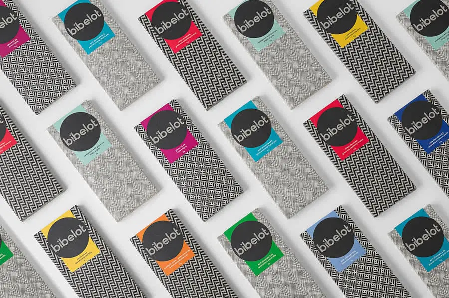
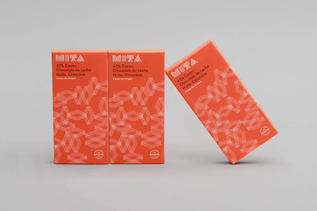
But why exactly are patterns used in modern packaging design? The use of recurring graphical elements could have multiple different purposes which are also based on the objectives in mind. Applying similar textures on a line of items often creates a sense of coordination and consistency.
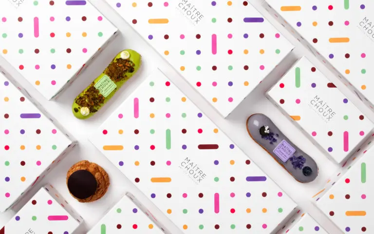
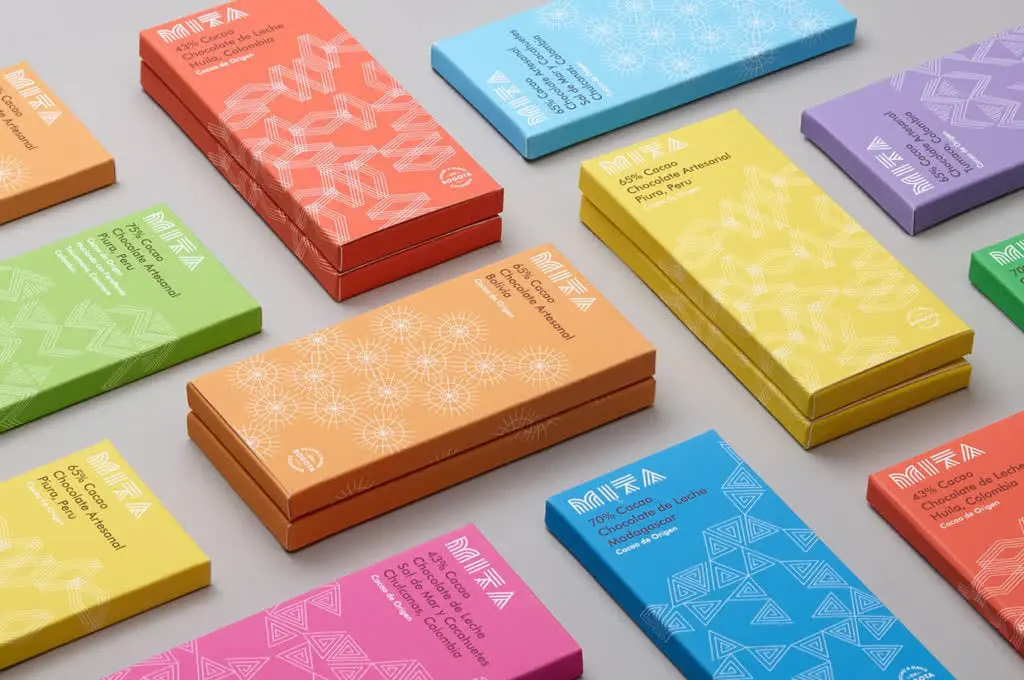
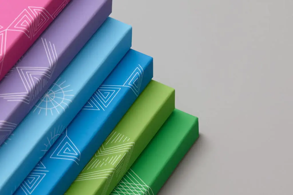
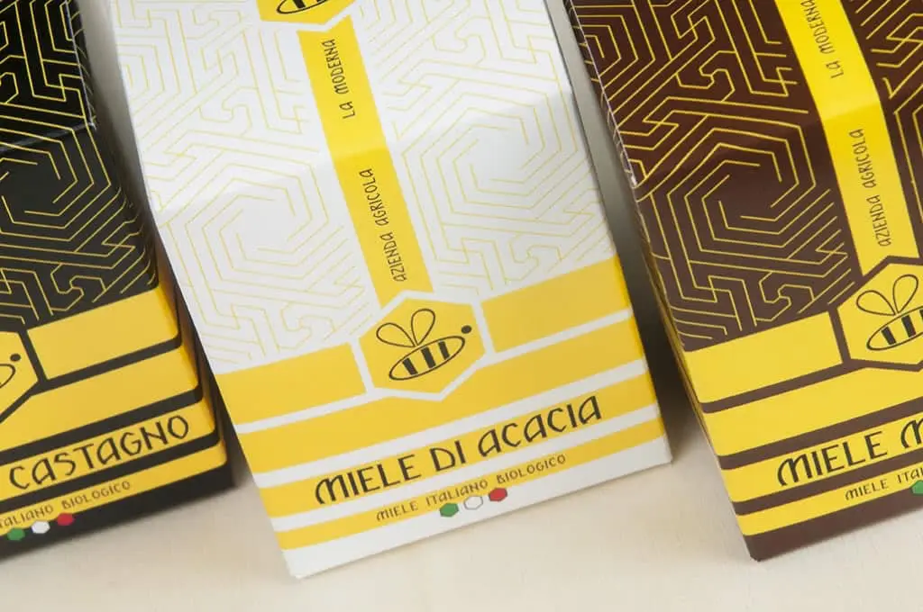
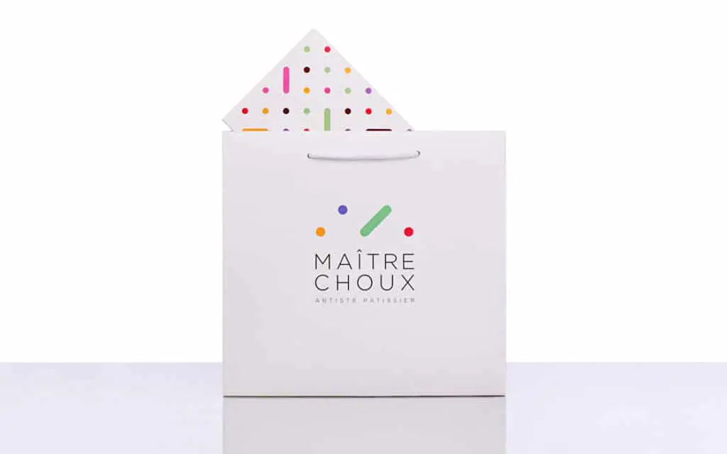
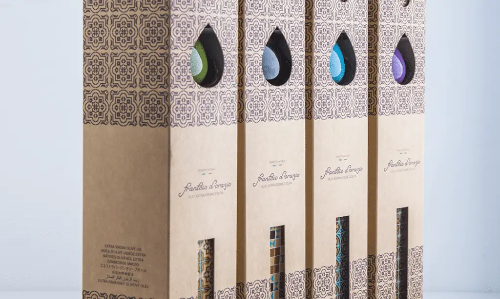
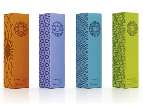
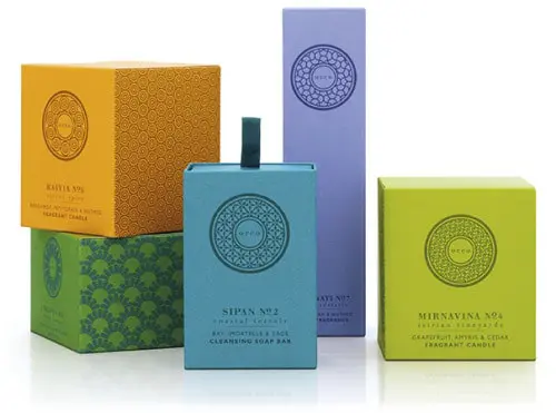
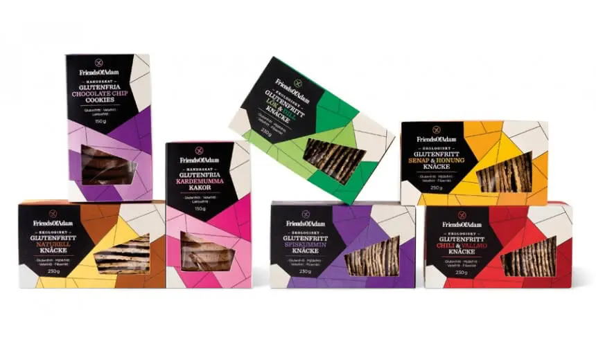
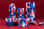
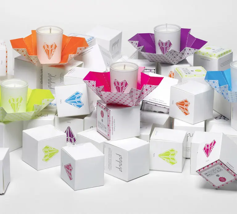
A similar pattern presented in different hues could indicate a difference in the variety of an item. In the case of the image above, for example, each color is associated to a flavor. The same goes for the image below, but regarding the scent.
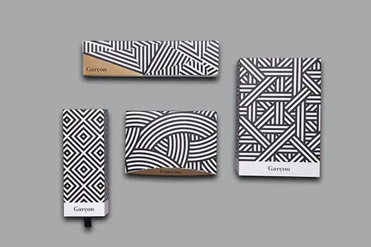
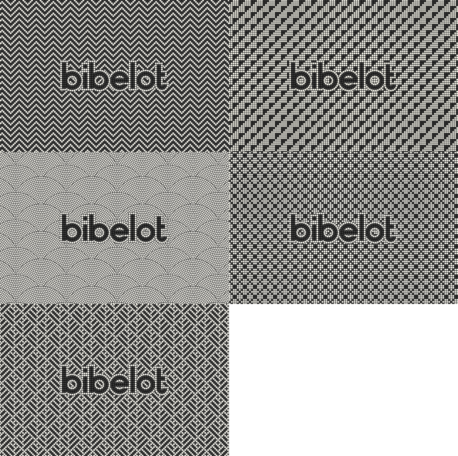
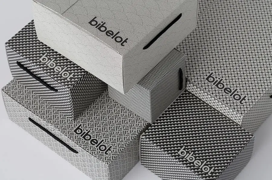
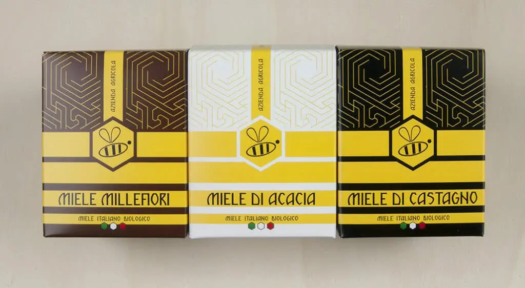
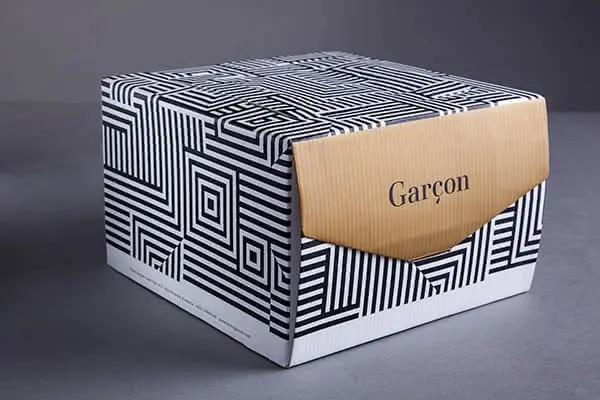
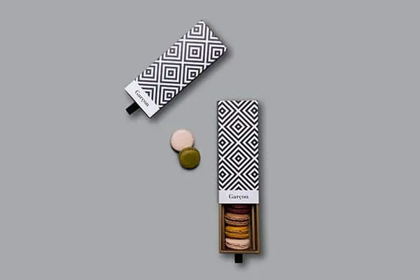
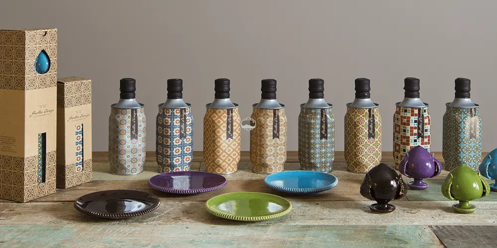
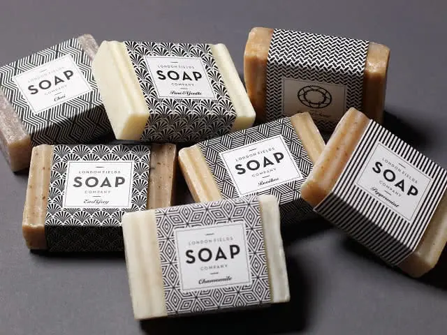
Another idea would be to keep the colors consistent, let’s say black and white, and to use a rane of different patterns to identify each item in your product line.
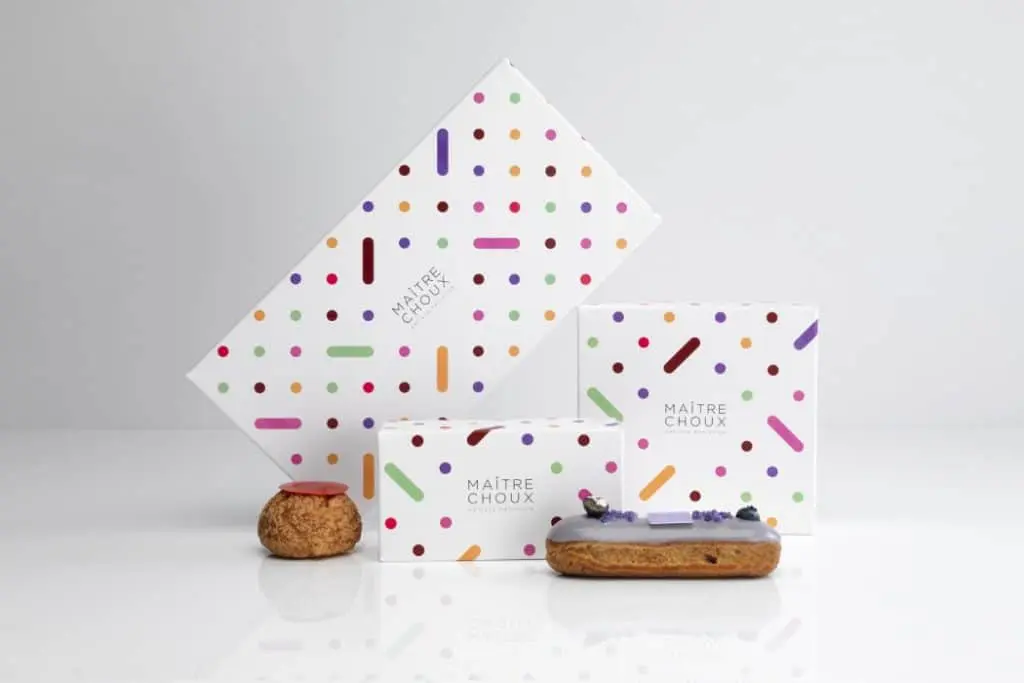
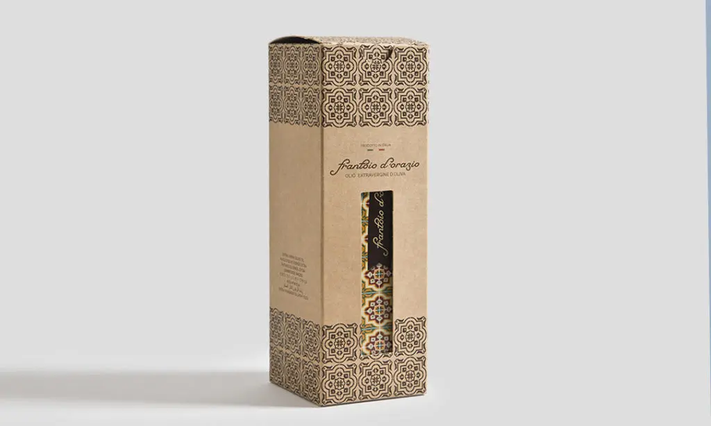
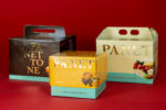
There’s no fire-proof way to use patterns. Different combinations can lead to an infinite array of interesting results. The images below are all selected examples of packaging concepts that make the most out of patterns. See for yourself the enormous potential of this asset and maybe put it to good use by creating your own custom packaging on Packly!
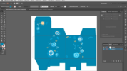
How to create your own patterns: one of the vast number of software solutions that can be useful in the endeavor is definitely Illustrator®. In fact, creating patterns with a vector graphics program takes just few minutes (or maybe even less!). But how to go about it? We’ll explain it right away!
• To create a pattern, make the artwork that you would like to create the pattern from, that is to repeat in the area to be filled. It could be a combination of lines, geometrical shapes, complex elements, etc. Keep in mind: the basic unit of a pattern is a square. The repetition of the said squares will result in a uniform pattern. That being said, start by creating your design within a square document and make sure to make it so that it completes itself with each repetition.
• Once your artwork is done, select it by pressing “Ctrl + A” on Windows or “Cmd + A” on Mac and create a pattern from it by choosing Object > Pattern > Make.
• Now your pattern is ready for use! You’ll find it in the Swatches Panel and you can use it to fill any area with a few clicks!
For more information, take a look at the Adobe technical support page.
