


Packaging for granola. A food that is dominating a niche market and that requires a package capable of balancing ingredients and taste.
Packaging for granola. A food that is very prominent in the segment of superfoods and that requires packaging meeting strict rules on nutritional content information, but also on the features of taste and gluttony.
Advertising, exhibitors in supermarkets, vertical magazines. Although the term granola is not among the most used in our dictionary, it is impossible to have completely escaped commercial communications on this innovative food. It is a mix of cereals and oat flakes, ideal for breakfast or as a snack, perhaps accompanied by a cup of milk or low-fat yogurt with a spoonful of fruit jam. Granola promises many benefits in terms of energy and vitality, without giving up on deliciousness.
But how is the perfect granola packaging achieved for the target consumers? Follow us in a short excursus on this subject.
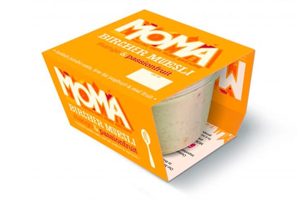
Let’s start with the sportsmen’s breakfast. This muesli package is surrounded by an orange cardboard sleeve which is the perfect expression of what must be highlighted in the packaging. First of all, the colors must be natural, a mango orange in this case. The graphics shall not be excessive. The name of the product is framed by some minimally invasive illustrations. The ingredients are key (muesli, mango and passion fruit) and then there are the usual oats, strictly low-fat yogurt and pieces of real fruit. The right balance between nourishment and taste.
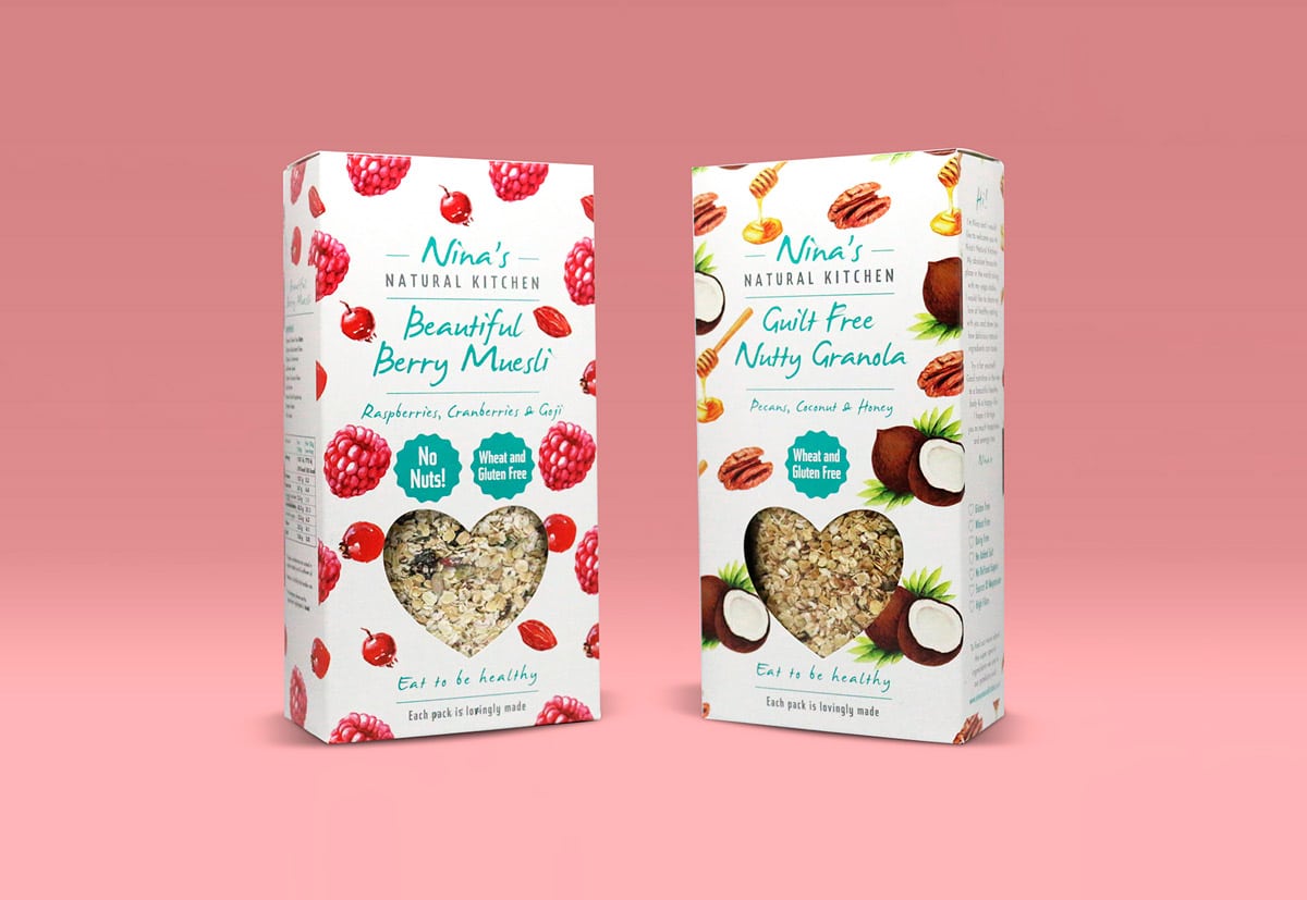
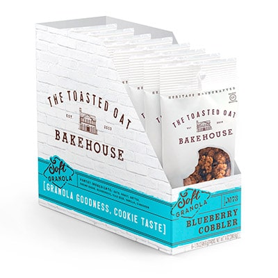
Let’s move on to a cardboard open end display ideal for supermarkets or pharmacies. The must is the simplicity of basic white. Each different granola taste is emphasized by a saturated and realistic reference color. The ingredients are specified, but the emphasis is placed on the flavor, pointing out that the healthiness is that of granola, but the taste is biscuit. In fact, according to a specialized study, the more the advertised product is natural or healthy, the lower the perception of good taste by consumers. It is a myth to overcome and this packaging meets the demand.
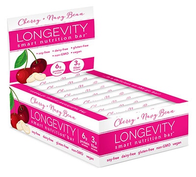
Carrying on with displays, we find one more example suitable for food supplements which contains practical nutritious bars. Here the approach is a little more institutional and typical of the pharmaceutical market. We therefore find on the one hand the specification of fibers and proteins intake and on the other a sort of exclusion list of everything that is not included in the recipe, because the product is intended for vegan consumers, people allergic to gluten or in any case not favorable to GMOs. The longevity benefit is inherent to the name and the snack is called smart. Here too a single tint, magenta, dominates the whole and the photographic illustration is extremely simple.
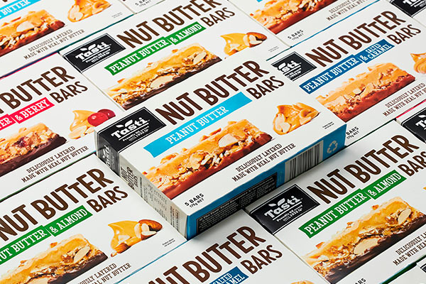
Now let’s move on to bars packed in a linear seal-end box stemming from opposed assumptions. Instead of the lightness and absence of fat ingredients, it relies precisely on the high content of peanut butter. Traditionally the latter is considered as unhealthy, which is not quite true as it is the ideal recharge for sportsmen. Still it helps position the product as yummy and appetizing. In fact, focusing buyers’ attention strictly on the healthiness of a product makes it come off as less scrumptious and less desirable. The nutrition facts label is located on one of the sides within a visually non-invasive black rectangle. Real photography based on gluttony is the core asset with a small color note corresponding to as many varieties of ingredients.
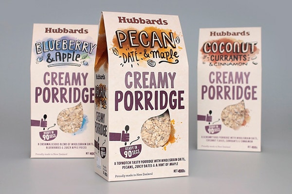
Let’s wrap this up with some more elaborate packaging, which attracts us for being able to reconcile antithetical needs. It is a gable top box filled with creamy porridge. The colors are delicate and less saturated, but the emphasis lies on the very elaborate and prominent typefaces. A charming drop-shaped window stands out, where you can glimpse the contents in a shade innuendo with the cream-colored background. We notice the illustration of a stylized hand holding a spoon with the wording “ready in 90 seconds”. Here, rather than healthiness or gluttony, the emphasis is on the haste to consume a tasty meal, with both natural and yummy ingredients. There is random color spotting on the packaging as if to imply some drooling during the meal.
Conclusions
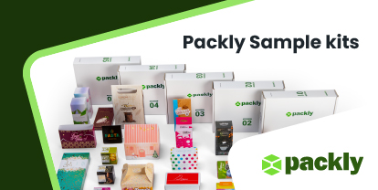
Do you also have a niche food to pack where the nutritional content must bear equal importance with respect to flavor and taste? Have you drawn any inspiration from this roundup of proposals? Create one or more tailor made prototypes from Packly’s extensive catalog and you will find them conveniently shipped to your doorstep in record time.