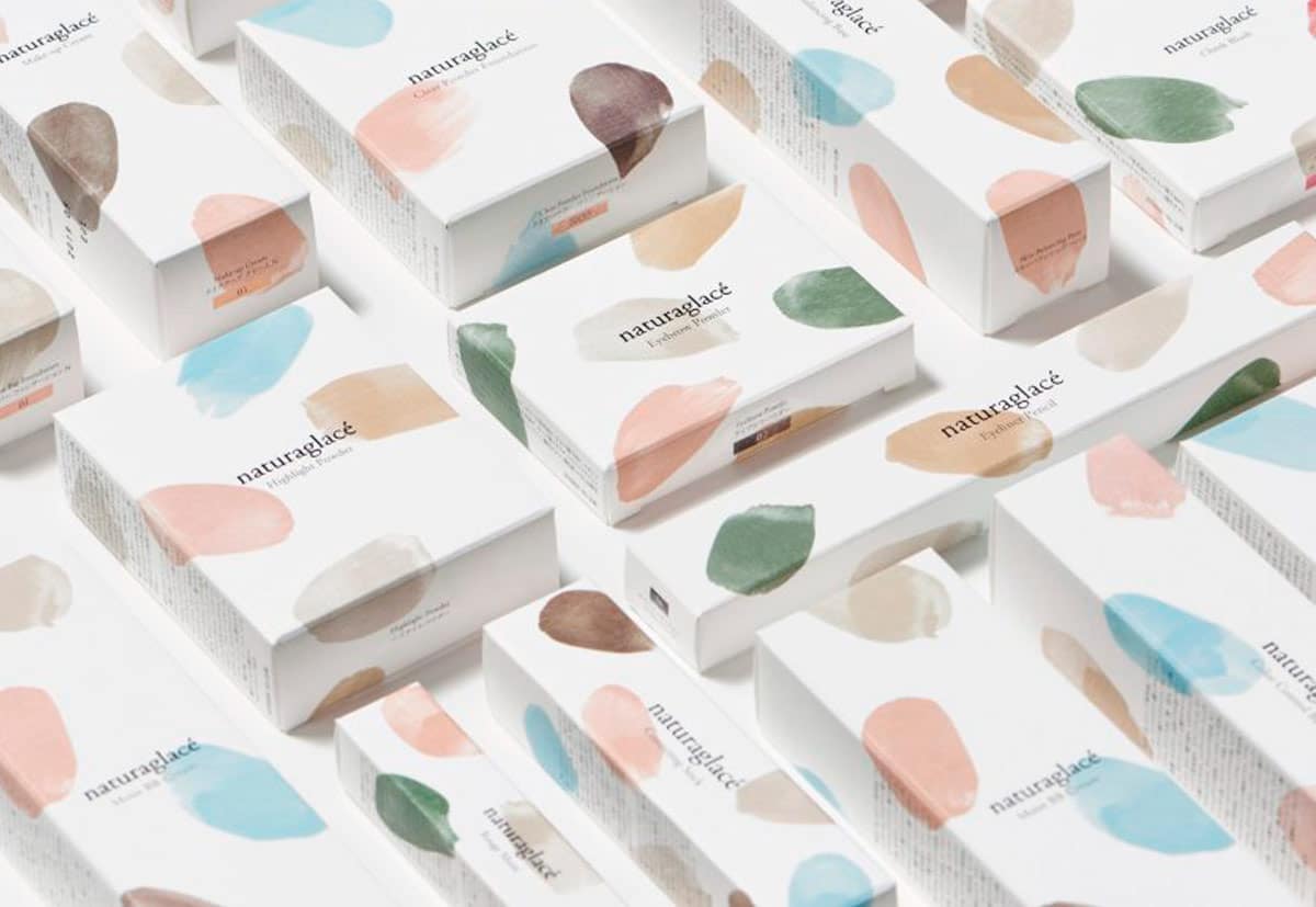
Minimal packaging design: simplicity as a way to generate elegance helps maximizing impact, enhancing the message and being memorable
Here we are with a new beginning and another year dedicated to reflection and inspiration on boxing and packaging. Minimal packaging design is the theme with which we decided to take your hand and accompany you in this new decade of the 2000s.
In reviewing the packaging trends of the last few years, we have seen new orientations, creativity at its top, technological push and attention to new materials. The time has come to take a step back and return to the core, to start up again with the decade that has just begun.
We will leave you with three quotes from as many illustrious spokespersons of timeless international design:
“Simplicity is the ultimate sophistication” (Leonardo da Vinci)
“Simplicity, carried to an extreme, becomes elegance” (Jon Franklin)
“Elegance is not about being noticed, but being remembered” (Giorgio Armani)
The common denominator between the claims of these style gurus is one: minimal design.
Let’s see some examples in which this simple guiding principle has been applied to perfection in the creation of impactful and memorable packaging designs.
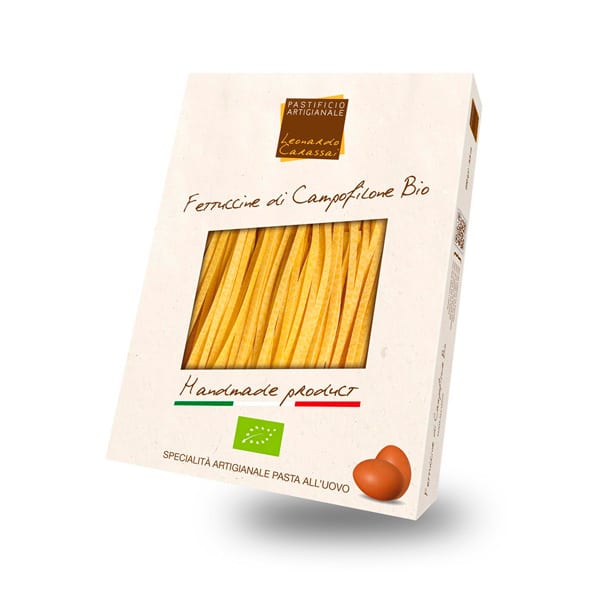
Let’s start, needless to say, with our beloved food. In this example of a cardboard box for organic fettuccine, only two elements strike the observer: the eggs in the lower right end and the pasta itself visible through the window placed in the center and large enough to let the product speak for itself.
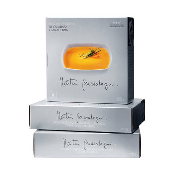
Let’s now switch to soups and velvety soups sold abroad and sponsored by a famous local chef. The background is gray and anonymous, there is a picture of the final dish and the chef’s handwritten signature. Do we need anything else? Probably not, the packaging is served.
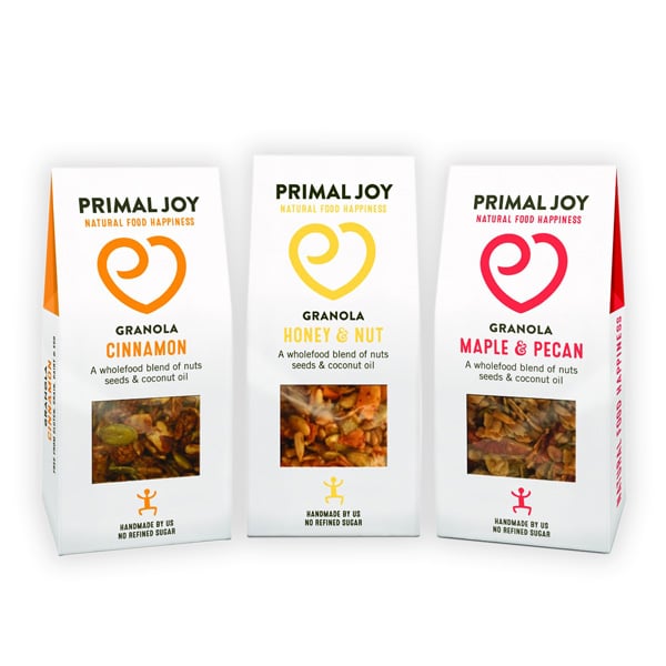
Same goes for superfoods, in this case a protein granola. Simple but bold colors, extremely stylized illustrations and a transparent window. There is no artifice of any kind according to the famous design principle “What you see is what you get”.
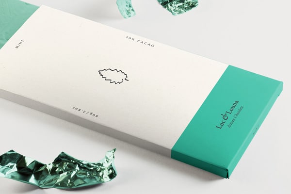
However, the approach can also be much more daring and radical than those presented above and we have a couple of prototypes that will fascinate you. Let’s start with this mint-flavored chocolate bar whose packaging only consists of a stylized leaf in the center and a fresh green color in the final sleeve Boom, the graphic elements are almost completely gone, it sells by hinting to and completely minimizing the container. Even the typefaces are marginal, they outline the perimeter of this beautiful wrapping. In our opinion there is a lot to learn and love in this example.
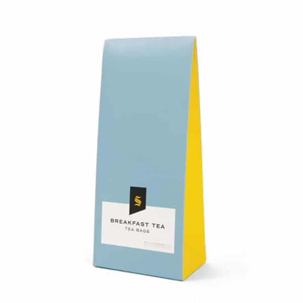
But you can also take the next step. We literally fell for this gable bag box for tea. Bright colors, almost in pop art style, practically zero graphics, minimal logo and typographic characters in a very successful ensemble for essentiality and stylistic balance.
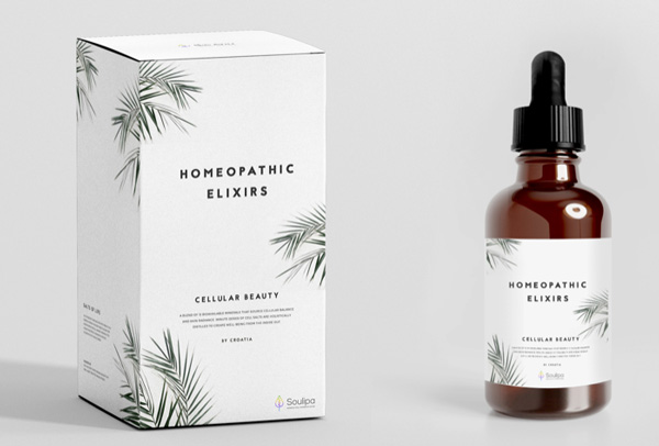
The same logic can also be transposed to the field of personal care. Just look at the packaging for these drops of essential oil. The name of the product and green leaves are the only elements there, everything else is superfluous.
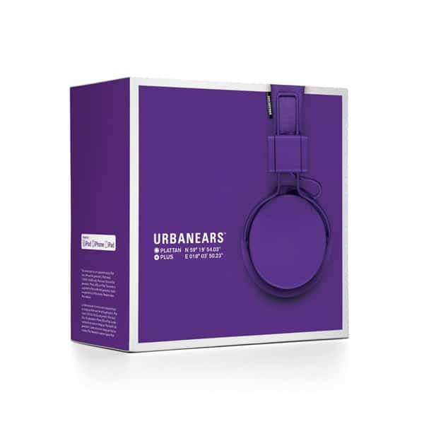
Moving to technology, we would like to feature this packaging for Apple device compatible headphones. A single dominant and striking color, an almost invisible photographic illustration and that’s it.
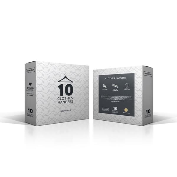
Even for everyday totally uncool objects, minimal packaging design can be a winning approach. Here is a cardboard box containing simple clothes hangers. On the background we find a geometric pattern, a stylized icon and, in large size, the number of pieces included in the box as if to mean that the name and the brand take second place. The content becomes the promoter of its own self.
Turning something complex into a simple output requires careful reflection and planning. Do you already have something in mind? Try building a prototype starting from our rich catalog. With Packly there are no minimum orders and you can experiment with the best solutions for your packaging needs!
