


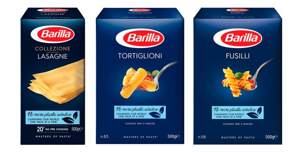
The new Barilla packaging. The new products of the classic line, now available on supermarket shelves, feature a renovated concept based on 5 fundamental assumptions including the domestic production chain and sustainability
The new Barilla packaging. The most attentive observers and the most sensitive buyers will have noticed the launch on supermarket shelves of the new graphic design for Barilla classic pasta. It’s a product and packaging restyling that lasted virtually 30 years. Let’s review the main elements of this transformation.
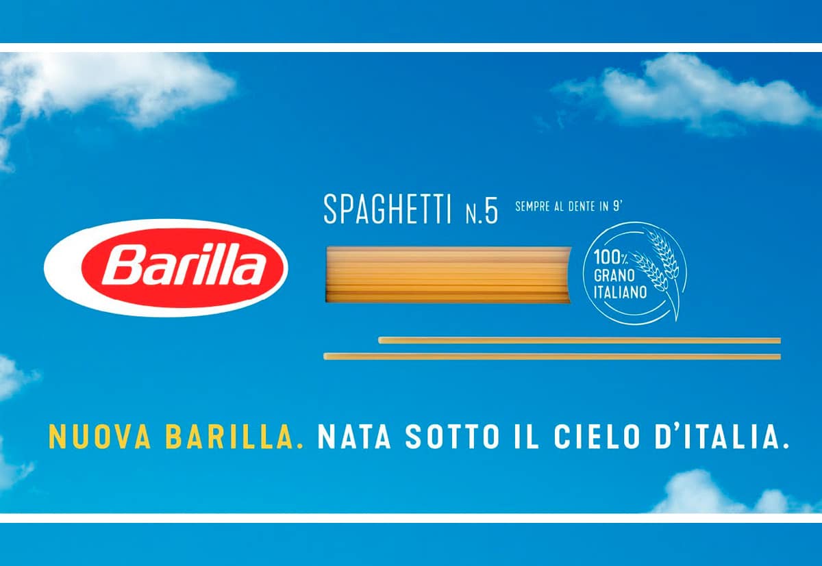
1. 100% Italian wheat
Thanks to agreements with farmers, millers and the entire domestic supply chain, the new Barilla classic pasta in the renovated formats will be produced with 100% Italian wheat. A clear indication of this local origin in the packaging obviously stands out. Other brands, which we will not name here, had previously been sanctioned for having displayed the Italian flag while using raw materials also coming from abroad. An encouraging sign of synergy and recovery for the country.
2. Blue getting lighter
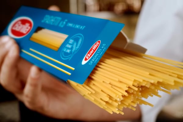
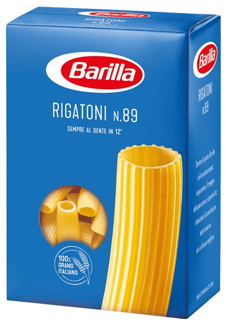
The first thing striking the eye in the new Barilla packaging is undoubtedly a fundamental element: the color. The intense blue that we had been accustomed to recognizing in the supermarket aisles and in the pantries of Italian housewives lightens and becomes a soft bright shade. It is the tint of the clear sky dominating our peninsula most of the time. Light blue, to which we will dedicate a separate post, is a color that symbolizes rebirth, renewed serenity, confidence in the future, youth. Actually in this case it is not necessarily a revolution, but rather a reinterpretation. In fact, Barilla had resorted to this nuance already between the 60s and 70s, for its packaging.
3. The choice of sustainability
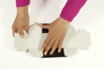
We can mark another interesting novelty in the most famous Italian pasta packs. The box is no longer in recycled cardboard but in virgin cardboard fiber. It’s a sustainable turning point that is ever more necessary and encouraging at a time when the environment has amply demonstrated how our impact on the global ecosystem is mostly harmful. The plastic window revealing the internal content remains, but interestingly it has already been removed in England behind a precise request by consumers: a sign that packaging also evolves according to the taste and preferences of the public.
4. Emotional involvement
The new presentation of traditional products from the Parma factory is also supported by a solid advertising campaign developed on several media. Press, billboards and a dedicated TV investment which was in a certain sense introduced by the delicate “thank you” spot, which aired during the difficult period of confinement due to Covid. The choice of suggestive and “sunny” images, the sweet and reassuring voice of an icon like Sofia Loren, the emotional prose, the unforgettable music reminiscing of childhood, the ancient references that do not fade even in the face of distancing and time make any comment redundant.
5. Values through packaging
Once again we observe how packaging is the first touch-point between the product and the consumer. Even in the case of a historical brand such as Barilla, which does not need to be recognized or persuade buyers, the immutable elements such as the logo, the baseline shade and the distinctive factors such as the transparent window on the packaging have remained. However there was some innovative drive such as illustrations of the raw pasta (unlike the seasoned one that appeared previously), a less traditional tint and a careful eye on sustainability to convey the new value system of the company that merge with the historically consolidated ones. The result is a big splash.
Conclusions
Are you planning on renewing the graphics of a package, the presentation of a product in need of restyling? Draw inspiration from our comments on the new Barilla packaging. Make use of our case studies. Create one or more prototypes now and, thanks to our versatility and many years of experience, we will accompany you towards a new success story.