Packvertising. Packaging is not just the dress with which a product presents to the public, but the most powerful marketing and advertising lever determining the choice of customers
Packvertising. A neologism as curious as it is effective. As a matter of fact, packaging is often the first and last point of contact with consumers and therefore a fundamental part of the marketing mix. In a period characterized by a challenging recession and a fragmented market, this concept takes on an even more fundamental meaning.
The basic principles that guide the success of a packvertising can be summarized as follows:
The brand proposition has to be clear and pervasive
The product has to to speak for itself
The packaging design has to be impressive both on a supermarket shelf and in an online store
Packaging needs to integrate the Brand Experience
Packaging needs to be sustainable
Design has to balance novelty with consistency
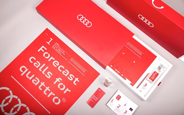
Packvertising works particularly well to support multi-channel promotional campaigns. The first example we want to show you is this kit developed for a guerrilla marketing campaign by Audi. The initiative was aimed at advertising the Quattro all-wheel drive system for driving in the rain. Inside the well-finished package is a stencil accompanied by a water-repellent spray to make the word Audi Quattro appear on any wet surface. The package was sent to Audi dealers so that they could create their own guerilla campaign across the nation. Whenever the forecasts predict rain, it’s time for Audi Quattro the slogan reads. The choice of red as the dominant motif with the Audi logo in white negative is interesting.
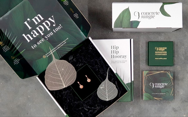
Secondly, we are pleased to introduce you to a line of Geman handmade jewelry built with concrete. Yes, you got it right. Concrete Jungle, which is also a famous song by Bob Marley, has prepared a briefcase box with a patinated look and an elegant, engaging and intense design. For its unique and sustainable artifacts, they chose a premium packaging dominated by an ecological green paint and some gold embellishment bearing the words “happy to see you” while unboxing. The startup manufacturing these accessories also creates furniture and has been awarded for innovation, respect for the environment and the brand positioning enhanced by extraordinary packaging.
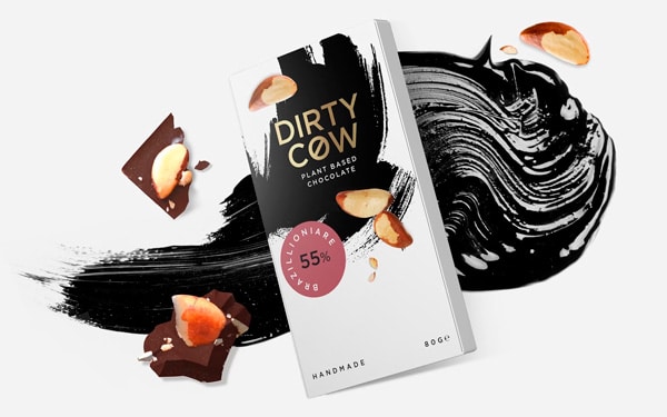
Let’s now please the gourmandiers. We are particularly struck by the tuck end box for Dirty Cow vegan wholly vegetable chocolate. The name already condemns the exploitation of dairy cattle, also symbolized by the prohibition sign incorporated in the letter “o”. The design is characterized by a white essential background surmounted by a black stain perhaps reminiscent of a spotted cow. The finishing touch is the partially peeled chocolate berries to represent the authenticity and naturalness of this delicious item.
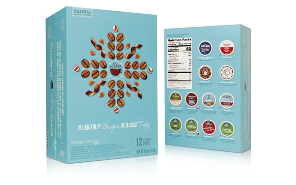
Chocolate and coffee have always gone hand in hand. It is the case for this explosive and varied package of coffee capsules with assorted flavors, enriched by the aroma of cocoa. The packaging is an intense powder blue color. The typefaces are white tending to an almost vintage italics and the presentation is fun, alluring but rigorous in the featuring the ingredients and nutritional values, as happens with superfoods. The photography of the coffee beans interspersed with chocolate curls is also particularly powerful.
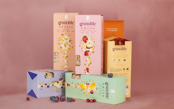
We close with two similar products having chosen two completely different packaging formats. Let’s start with this muesli mix contained inside a same-panel tuck end box. The bcolors are very light, pastel textures with vivid and explosive playful illustrations. The window is interestingly placed not in the center, but on one side of the package so as not to interfere with the graphics.
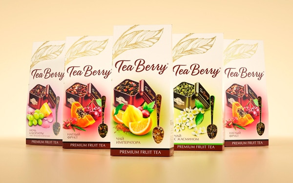
The approach adopted for these gable-top boxes containg tea and infusions is game changing. The graphic is mixed and contains both photography and illustration. The window, however, is here perfectly integrated into the design and shaped as a spoon, so as to perfectly blend into the existing design. The leaf superimposed at the top in gold foil is a nice plus.
Conclusions
If you are about to launch a product or have one in need of distinctive packaging to back up or even replace advertising investments, you are in the right place. Choose a format from our well-stocked catalog. Apply graphics making your brand stand out. Once the prototype is finalized, that’s it. You just have to wait for your limited or large edition boxes to reach you wherever you please.
